Key Takeaways:
- Slowness can be a design decision.
- Layers and transparency create meaning beyond the obvious.
- Analogue techniques encourage me to focus and stay present.
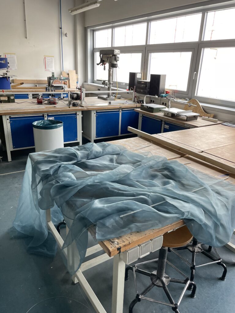
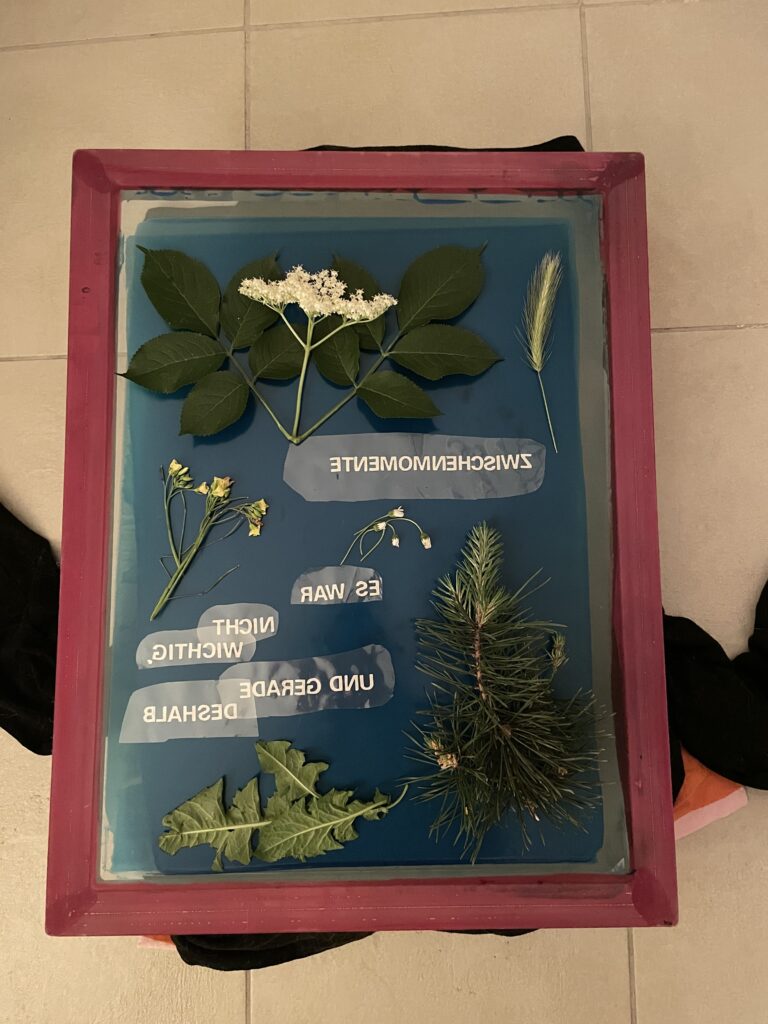
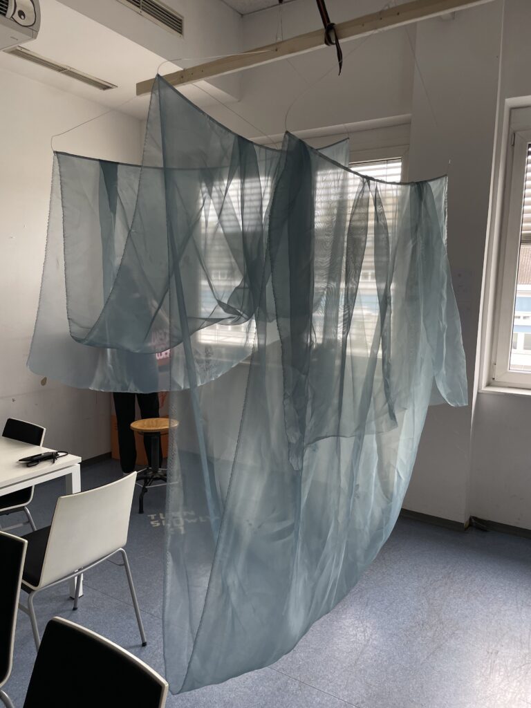
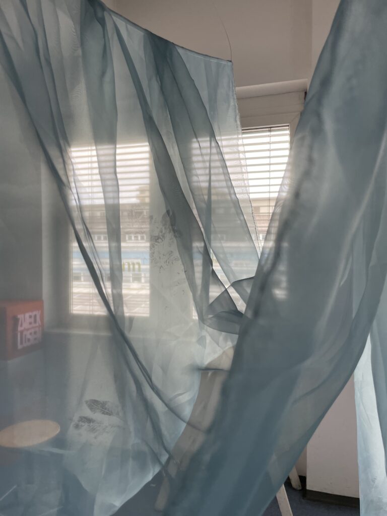
For the “Zwischenmomente” project, I used screenprinting to capture unnoticed in-between moments, like climbing a tree as a kid. To visualize this, I worked with natural materials from my garden. I honestly just followed my gut on this one. I then worked with translucent layers of a blue-ish fabric, minimal forms and some typo, trying to slow down time through looking at the design.

If I would interpreted this in a motorsport context, this experiment is somewhat of a counterpoint to the constant speed of motorsport. Everything there is about seconds, optimization, efficiency. But I wonder: what gets lost when we speed everything up? Can we design for “pause” in a world built for performance? It kind of reminds me that pauses, hesitations, and silence are also part of that system.
I could imagine incorporating this by building a print series that captures the slower sides of racing (for example the prep, the failure, the waiting) for my thesis or master project, using analogue printing to reflect that. I’d love to explore more screenprinting with textured materials, using color transparencies and uneven forms to create a visual language of imperfection. This might become a visual counterweight to the speed-focused elements in my thesis.