Key Takeaways:
- Data can be emotional and tactile.
- Visual language doesn’t have to be flat or digital.
- Textile design offers its own kind of rhythm and logic.
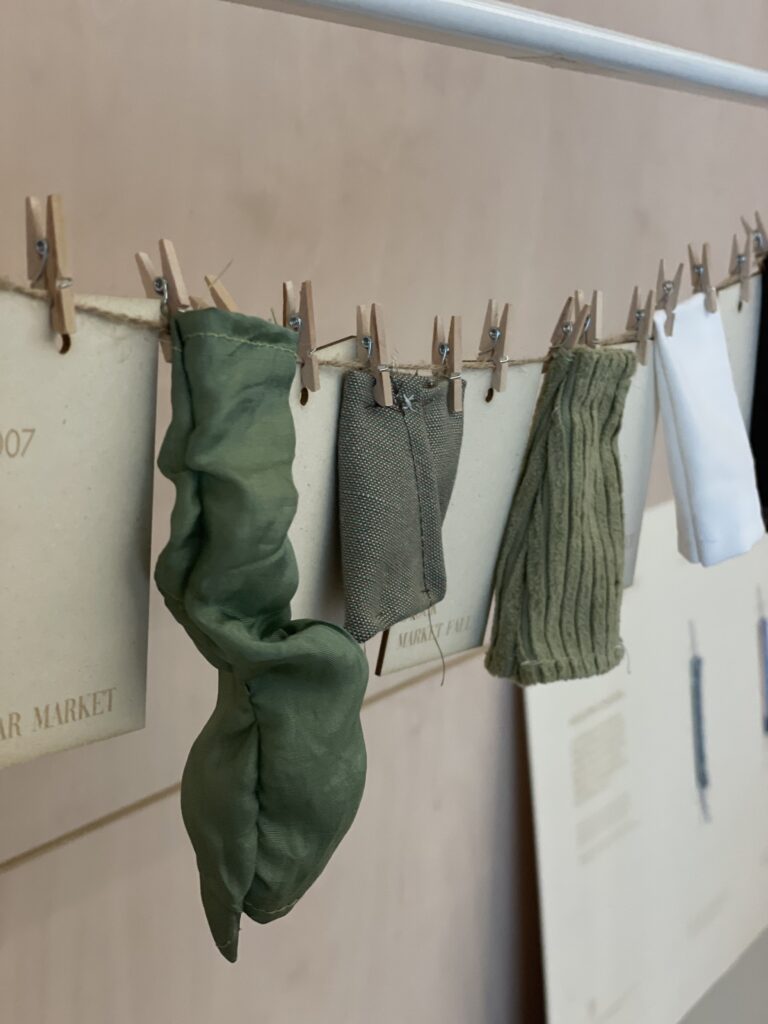
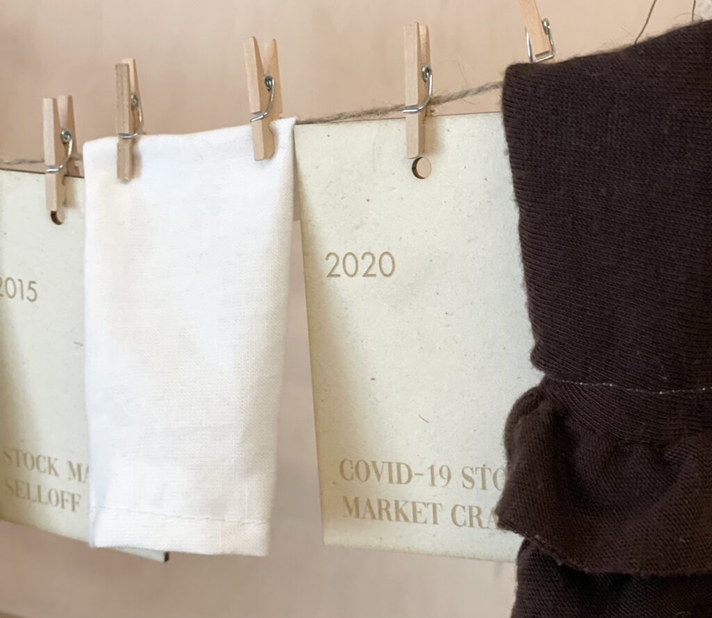
During the international design week here in Graz, I took the course data visualization. During that week, I basically collected a lot of data from vogue covers and sewed some skirts with leftover fabric from a friend (and her sewing machine). So I analyzed the average skirt length of the vogue covers for every year int he last 20 years and sewed little skirts, showcasing how the skirt length is changing. additionally, I looked at how that is correlating with the international and US Stock market and its crashes. But the longest part of this project was actually getting the data, not the sewing. But its got me thinking: there’s so much data, visualized data, but what makes it stand out, good even?
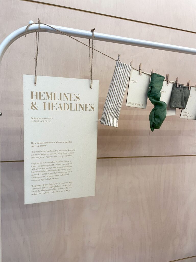
This experiment made me reflect on how emotion, rhythm, and time can be visualized without relying on charts or screens. In motorsport, data is everywhere (telemetry, timing, optimization for example) but what if we visualized it more personally, more emotionally? Could data-driven storytelling be part of my thesis, but done in a softer, less technical way?
I know that I’d love to work more with textiles or tactile design and now Im questioning what kind of data matters.