Prototyping IX: Image Extender – Image sonification tool for immersive perception of sounds from images and new creation possibilities

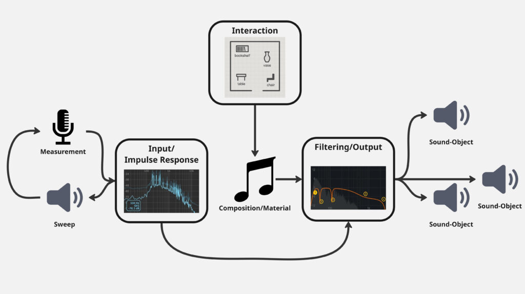
Advanced Automated Sound Mixing with Hierarchical Tag Handling and Spectral Awareness

The Image Extender project continues to evolve in scope and sophistication. What began as a relatively straightforward pipeline connecting object recognition to the Freesound.org API has now grown into a rich, semi-intelligent audio mixing system. This recent development phase focused on enhancing both the semantic accuracy and the acoustic quality of generated soundscapes, tackling two significant challenges: how to gracefully handle missing tag-to-sound matches, and how to intelligently mix overlapping sounds to avoid auditory clutter.

Sound Retrieval Meets Semantic Depth

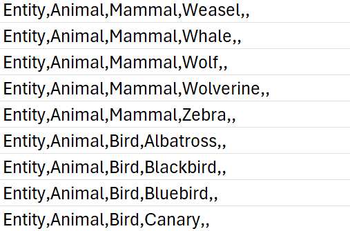
One of the core limitations of the original approach was its dependence on exact tag matches. If no sound was found for a detected object, that tag simply went silent. To address this, I introduced a multi-level fallback system based on a custom-built CSV ontology inspired by Google’s AudioSet.

This ontology now contains hundreds of entries, organized into logical hierarchies that progress from broad categories like “Entity” or “Animal” to highly specific leaf nodes like “White-tailed Deer,” “Pickup Truck,” or “Golden Eagle.” When a tag fails, the system automatically climbs upward through this tree, selecting a more general fallback—moving from “Tiger” to “Carnivore” to “Mammal,” and finally to “Animal” if necessary.

Implementation of temporal composition

Initial versions of Image Extender merely stacked sounds on top of each other by only using the spatial composition in the form of panning. Now, the mixing system behaves more like a simplified DAW (Digital Audio Workstation). Key improvements introduced in this iteration include:

  • Random temporal placement: Shorter sound files are distributed at randomized time positions across the duration of the mix, reducing sonic overcrowding and creating a more natural flow.
  • Automatic fade-ins and fade-outs: Each sound is treated with short fades to eliminate abrupt onsets and offsets, improving auditory smoothness.
  • Mix length based on longest sound: Instead of enforcing a fixed duration, the mix now adapts to the length of the longest inserted file, which is always placed at the beginning to anchor the composition.

These changes give each generated audio scene a sense of temporal structure and stereo space, making them more immersive and cinematic.

Frequency-Aware Mixing: Avoiding Spectral Masking

A standout feature developed during this phase was automatic spectral masking avoidance. When multiple sounds overlap in time and occupy similar frequency bands, they can mask each other, causing a loss of clarity. To mitigate this, the system performs the following steps:

  1. Before placing a sound, the system extracts the portion of the mix it will overlap with.
  2. Both the new sound and the overlapping mix segment are analyzed via FFT (Fast Fourier Transform) to determine their dominant frequency bands.
  3. If the analysis detects significant overlap in frequency content, the system takes one of two corrective actions:
    • Attenuation: The new sound is reduced in volume (e.g., -6 dB).
    • EQ filtering: Depending on the nature of the conflict, a high-pass or low-pass filter is applied to the new sound to move it out of the way spectrally.

This spectral awareness doesn’t reach the complexity of advanced mixing, but it significantly reduces the most obvious masking effects in real-time-generated content—without user input.

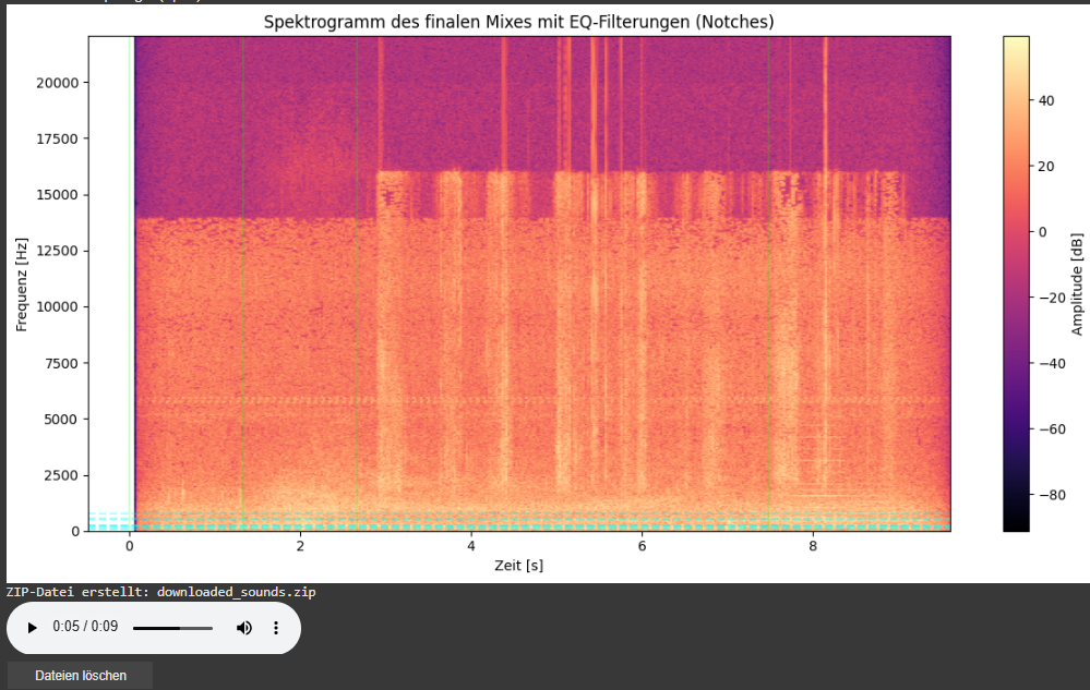
Spectrogram Visualization of the Final Mix

As part of this iteration, I also added a spectrogram visualization of the final mix. This visual feedback provides a frequency-time representation of the soundscape and highlights which parts of the spectrum have been affected by EQ filtering.

  • Vertical dashed lines indicate the insertion time of each new sound.
  • Horizontal lines mark the dominant frequencies of the added sound segments. These often coincide with spectral areas where notch filters have been applied to avoid collisions with the existing mix.

This visualization allows for easier debugging, improved understanding of frequency interactions, and serves as a useful tool when tuning mixing parameters or filter behaviors.

Looking Ahead

As the architecture matures, future milestones are already on the horizon. We aim to implement:

  • Visual feedback: A real-time timeline that shows audio placement, duration, and spectral content.
  • Advanced loudness control: Integration of dynamic range compression and LUFS-based normalization for output consistency.

Empty States: Why They Drive Business Change and Why They Matter in UX

Empty states are often overlooked in UX design, but they can be drivers of substantial business benefits, and if done right, contribute to a more compelling user experience.

One of the UI UX patterns that I came across while working on my data viz project was the pattern/notion of Empty States which can be obsolete for some designers because they may see it as redundant or sometimes they don’t know that its a notion that should be contributing to the user experience as a whole.

Here are a few empty state examples:

Searching for something in Gmail and getting no results.

A new Dropbox screen where no files or folders have been created.

The resulting screen after completing all tasks in a to-do list manager.

Getting an error screen in Slack when a command isn’t supported.

Starting a new social networking account and there are no connections.

Types of Empty States

Here are four types of frequently encountered empty states:

  • First use – Occurs with a new product or service when there is still nothing to show, such as a new Evernote or Dropbox account.
  • User cleared – Occurs when users complete actions such as clearing their inbox or task list, and the result is an empty screen.
  • Errors – These occur when something goes wrong, or when there are issues such as a mobile phone going offline due to network problems.
  • No results/No data – No data found UI design occurs when there is nothing to show. This can happen if someone performs a search and the query is empty or there isn’t data available to show (when filtering for a date-range that has no data for example).

The Benefits of Using Well-designed Empty States

Designing well-thought-out and useful empty state illustrations and screens can help drive product engagement, delight users, and reduce churn. This decreases the chances of losing users to competitor products, thus leaving them frustrated or lost.

When applied to empty state design, these principles can be of great benefit to a business—for example, an increase in product satisfaction, and the lowering of abandonment rates.

Here are three additional areas that can also benefit from good empty state design:

  • User onboarding – Provides an opportunity to build trust and continued use of the product in addition to an elevated user experience.
  • Brand building – Generates awareness and promotes the company in order to build increased brand equity.
  • Personalization – Can be playful, fun, serious, or dynamic in various states of use; creates a sense of a personal touch.

The benefits of well-designed empty states cannot be underestimated. They not only contribute to a compelling customer experience, but as windows of opportunity to keep customers happy and engaged get shorter and shorter, they are just plain good business.

Conclusion

It’s easy to overlook empty states (or empty screens) in UX design because they occur infrequently and aren’t always well understood. However, the benefits to their inclusion are understated because they enhance the user experience and help create a more cohesive product.


What I learned as the Core Principles for Designing Better Quantitative Content

Clutter and confusion are not attributes of data—they are shortcomings of design. – Edward Tufte

Michael Friendly defines data visualization as “information which has been abstracted in some schematic form, including attributes or variables for the units of information.” In other words, it is a coherent way to visually communicate quantitative content. Depending on its attributes, the data may be represented in many different ways, such as a line graph, bar chart, pie chart, scatter plot, or map.

It’s important for product designers to adhere to data visualization best practices and determine the best way to present a data set visually. Data visualizations should be useful, visually appealing and never misleading. Especially when working with very large data sets, developing a cohesive format is vital to creating visualizations that are both useful and aesthetic.

Principles

Define a Clear Purpose


Data visualization should answer vital strategic questions, provide real value, and help solve real problems. It can be used to track performance, monitor customer behavior, and measure effectiveness of processes, for instance. Taking time at the outset of a data visualization project to clearly define the purpose and priorities will make the end result more useful and prevent wasting time creating visuals that are unnecessary.

Know the Audience


A data visualization is useless if not designed to communicate clearly with the target audience. It should be compatible with the audience’s expertise and allow viewers to view and process data easily and quickly. Take into account how familiar the audience is with the basic principles being presented by the data, as well as whether they’re likely to have a background in STEM fields, where charts and graphs are more likely to be viewed on a regular basis.

Visual Features to Show the Data Properly


There are so many different types of charts. Deciding what type is best for visualizing the data being presented is an art unto itself. The right chart will not only make the data easier to understand, but also present it in the most accurate light. To make the right choice, consider what type of data you need to convey, and to whom it is being conveyed.

Make Data Visualization Inclusive


Color is used extensively as a way to represent and differentiate information. According to a recent study conducted by Salesforce, it is also a key factor in user decisions.

They analyzed how people responded to different color combinations used in charts, assuming that they would have stronger preferences for palettes that had subtle color variations since it would be more aesthetically appealing.

However, they found that while appealing, subtle palettes made the charts more difficult to analyze and gain insights. That entirely defeats the purpose of creating a visualization to display data.

The font choice can affect the legibility of text, enhancing or detracting from the intended meaning. Because of this, it’s better to avoid display fonts and stick to more basic serif or sans serif typefaces.

Conclusion

Good data visualization should communicate a data set clearly and effectively by using graphics. The best visualizations make it easy to comprehend data at a glance. They take complex information and break it down in a way that makes it simple for the target audience to understand and on which to base their decisions.

As Edward R. Tufte pointed out, “the essential test of design is how well it assists the understanding of the content, not how stylish it is.” Data visualizations, especially, should adhere to this idea. The goal is to enhance the data through design, not draw attention to the design itself.

Keeping these data visualization best practices in mind simplifies the process of designing infographics that are genuinely useful to their audience.

Disruptive Data Visualisation: From a Sketch to a Lo-Fi Wireframe to a Hi-Fi Wireframe

Introducing Beside You: the Augmented Managment software that will later be introduced as a SaaS (Software as a Service).

Initially, working on this project has been a ride since the beginning, being the sole product designer at a company that specializes in customer experience and business management along with a team of full stack devs and data scientists meant that we either we will get things done or we will get things done.

One of the early challenges was to convert a data driven platform to intuitive and cohesive interface that offers the ease of analysis and untimately efficient decision making.

One of the ‘Pre Design Sprint’ Data Interface that I found when I came onboard.

One of the early challenges was to convert a data driven platform to intuitive and cohesive interface that offers the ease of analysis and ultimately efficient decision making.

Sketching consisted of building a skeleton that will overaly the first foundation that will eventually convey the design language that the software will adopt and in the meantime everything has to be succintly explained to the stakeholders in order for them to grasp the design system and for me to extract more insights from them since they will be the first users of the software.

Moving on to a low fidelity wireframe with the intention of giving more meaning and structure to the interface meant that progress is happening and things are starting to evolve in terms of results from the ideation and the user interviews. Also, the latter gave me the playground to begin building the design system from the layout, color palette, and typography to the spacing and the accessibilty.

First draft of the dashboard’s lo-fi wireframe

Moving on to a highfidelity wireframe that paved the way to add real data to the interface that allowed us as a team to get a realistic first look on how the software will behave in terms of data visualisation and user navigation and from there began our first user test which will give us a direction to make the right adjustments and iterations.

First iteration of the dashboard’s hi-fi wireframe

To conclude, this article is a condensed version of what actually happened and the process behind creating a data driven product from the ground up, otherwise I will have to write a journal that won’t serve nobody but nonetheless it is always beneficial to write about a design process that was complicated and challenging at times, the benefits are a documentation and a clarity that will even pave the way to iterate better on the next stages of the product life cycle.

Exploring the Edges of Concert Design: Between Practice and Research

Title image: Luis Miehlich, “Cartographies – Ein Halbschlafkonzert (2023) – Pieces for Ensemble, Electronics & Video,” luismiehlich, accessed May 25, 2025, https://luismiehlich.com/.

In addition to developing the idea of a technical tool-set, I’ve started to dig a little bit deeper into the research part of my project, trying to better understand the evolving field the creative and technical work inhabits. What started as an effort to clarify the conceptual underpinnings of my practical project turned into a broader exploration of a field that is, in many ways, still defining itself: concert design.

This term may sound straightforward, but its scope is definitively not. Concert design is not just about programming a setlist or choosing a venue; it’s about crafting the entire experiential and spatial context of a performance. It treats every element of the concert, starting from basic things like the seating arrangements (or why not just laying down for example?) to interactivity, from sonic spatialization to the architecture of the space. Everything is understood as part of the creative material designers can work with.

A Field Still Taking Shape

What struck me early on is how fragmented this field still is, even though there are of course some technical resources in more specific aspects like e.g. stage lighting. But there are only a handful of academic sources that explicitly use the term concert design, understanding it as a more holistic view and even fewer that attempt to define it systematically. Among them, people like Martin Tröndle stand out for their efforts to create a structured framework through the emerging field of Concert Studies. Another name, more in the field of practical work, is Folkert Uhde.

Yet, when looking beyond academic texts, I found countless artistic projects that embody the principles of concert design even if their creators never labeled them as such. Here I want to point out the ambient scene with early experiments and even non-scientific reflections from Brian Eno up until very recent formats from Luis Miehlich for example. This suggests a noticeable gap: while practice is vibrant and evolving, theoretical reflection and shared language are still catching up.

Research Process

To navigate this space, I tried out different keywords relating disciplinary intersections; terms like “immersive performance,” “audience interaction,” “spatial dramaturgy”.

With that I found other fields that may offer interesting works, that are worth getting into:

Theater studies turned out to be a goldmine offering both practical and theoretical insights into spatial and participatory performance. There seems to be a howl tradition featuring big names like Berthold Brecht.

But what really surprised me, even though it might seem obvious, was the relevance of game design. The inherent interactive nature impacts of course the work with sound and music. The spaces were players interact with it might be of virtual nature, still the interaction of recipients with there surrounding has to be thought of during the design process. I think there might be a huge potential to examine as well, though it opens the frame to an extend that exceeds this project.

Future Steps: From Reflection to Contribution

The more I researched, the clearer it became that it is hard to just rely on existing research. A way to deal with that can be to contribute to the field as both a designer and researcher. This could be in the following ways:

  • Provide an overview of the evolving field, both as a practical discipline and as an academic field. This may be a starting point.
  • Reach out to leading voices in the field (e.g., Martin Tröndle, Experimental Concert Research) for interviews. This may lead to the following observations.
  • Identify needs and gaps, from the perspective of practitioners and researchers: What do they lack? What could help them frame, evaluate, or communicate their work?

Ultimately, this could lead to the development of a manual or evaluation guid; something that can serve as a conceptual and practical tool for artists and designers, help them providing to the exploration performative spatial sound and the field of concert design.

From Sound Design to Concert Design

This research journey runs in parallel to my technical development of a spatial sound toolkit (→ previous blog entry), but it also stands on its own. It’s an interesting experience for me, locating my work within a broader context and trying to build some kind of bridge between my individual artistic practice and shared disciplinary structures. This might not be my future field of work, still I have the feeling, I can take this locating approach as a strategy with me and implement in future projects, to elevate them and for better communication towards outsiders.

Sources:

Martin Tröndle, ed., Das Konzert II: Beiträge zum Forschungsfeld der Concert Studies (Bielefeld: transcript Verlag, 2018), https://doi.org/10.1515/9783839443156.

“Folkert Uhde Konzertdesign,” accessed May 25, 2025, https://www.folkertuhdekonzertdesign.de/.

Brian Eno, “Ambient Music,” in Audio Culture: Readings in Modern Music, ed. Christoph Cox and Daniel Warner (New York: Continuum, 2004).

Luis Miehlich, “Cartographies – Ein Halbschlafkonzert (2023) – Pieces for Ensemble, Electronics & Video,” luismiehlich, accessed May 25, 2025, https://luismiehlich.com/.

“Re-Cartographies, by Luis Miehlich,” Bandcamp, accessed May 25, 2025, https://woolookologie.bandcamp.com/album/re-cartographies.

From Public Piazza to Private Practice: Re-thinking Site-Specific Sound Design

When I first planned my project “Sounds of the Joanneum Quarter”, the goal was ambitious: a site-specific ambient music installation, deeply integrated into the architectural and acoustic landscape of the Joanneum Quarter in Graz. Inspired by these unique sounding conical glass funnels and spatial openness of the site, I imagined turning the piazza into a dynamic concert space; one where the audience’s movement and the physical structures would shape the sonic experience.

However, during this semester a certain “reality check” demanded a shift in direction. Logistical constraints, timing and access issues meant that the Joanneum setting wouldn’t be possible for this phase of the project. Still, this place holds a special place in my heart, because it gave me a lot of inspiration to dig deeper into this topic. Together with my supervisor I brainstormed about re-approaching the topic: how could I scale the core ideas of spatial interaction, site-responsiveness, and ambient composition down to a format that’s more flexible, portable, and even testable at home?


A Scaled-Down Version with Broader Potential

The new direction retains the essence of the original project – interaction, spatial sound, resonance, and ambience – but re-frames it within a more universally accessible framework. Instead of relying on a single, monumental site, the project now aims to create a tool-set for composers and installation-makers, enabling them to transform any room or environment into a site-specific sound installation.

This smaller-scale approach not only makes the concept more versatile regarding the adaptability for different locations, but also supports a hands-on, iterative development process. I can now begin building, testing, and refining the tools at home and FH, implementing a workflow that builds a bridge between research and practice.


Building the Infrastructure: Tools for Room-Scale Sound Art

At the heart of this shift is a technical infrastructure that turns any kind everyday objects within a room into potential sound objects. The toolkit consists of both hardware and software components:

  • Hardware: Contact microphones or measuring microphones as input, and transducers as output
  • Software: A modular environment built in Max/MSP within the Max4Live framework, tailored to site-specific sound creation.

One of the tool-kit’s key features is its ability to identify an object’s natural resonances via impulse response measurements (input). These measurements inform the creation of custom filter curves that can be used to excite those resonances musically (output). In this way, a bookshelf, table, a metal lamp or even a trash-can becomes a playable, resonant sound object.


Interactive Soundscapes in Everyday Spaces

A third component of the tool-set introduces basic interaction mechanics, allowing potential users or audiences to engage with the sound installation. These control objects can be mapped to a digital version of the room (upload of a literal map) and may include for examples:

  • Panners that move sound from object to object.
  • One-shot triggers that activate specific objects.

With these tools, rooms become navigable soundscapes, where UI interaction can influence sonic outcomes, echoing the spatial interactivity originally imagined for the Joanneum Quarter, but within reach of smaller spaces.

schematic view of the framework


From Site to System

While the grand setting of the original concept served as a powerful starting point, the shift toward a modular, adaptable toolkit has opened up new creative and technical possibilities. What began as a site-specific composition approach can now be framed maybe as a site-adaptive system; one that gives myself or others the opportunity to explore the relation between sound, space, and interaction in their own settings.

The essence remains: redefining how music and sound inhabit space. But now, instead of building for one site, I’m building a foundation that others can use in many.

WebExpo Conference: Survival Kit for the Advertising Jungle

This talk broke down the chaos of modern advertising into something a little more manageable through metaphors. I found it interesting and helpful because it gave specific tips and thoughts about a topic that can seem a bit overwhelming sometimes. Even though I was a bit late I gained some good takeaways from this talk:

1. Hunt one Animal

In the jungle, you won’t catch anything if you’re chasing ten animals at once. The same applies to advertising: focus on one clear objective. Whether it’s brand awareness, conversion, or engagement, trying to do everything at once will dilute your message and waste your resources. The speaker emphasized that clarity and focus are essential, especially when budgets and attention spans are limited.

2. Stay on the Path

Consistency is your compass. A consistent design language across all campaigns strengthens brand identity and trust. The talk referenced research suggesting that consistency alone can boost brand understanding dramatically—raising audience awareness from 20% to 40% in some cases. Every campaign should feel like a chapter from the same book, not random excerpts from different genres.

3. Take a Buddy

Having a mascot or a recurring character can supercharge your campaigns. Whether it’s a lovable goof like Duolingo’s owl or an edgy troublemaker like a Panda, a mascot creates recognition and emotional connection. But the speaker pointed out that a mascot doesn’t need to be a literal character—it can be a tone, a type of humor, or even a recurring visual motif that lives across your brand ecosystem.

4. Climb the Tree for better Perspective

Perspective is everything. Don’t just follow the herd—look for the unexpected. The jungle metaphor here encourages thinking outside the box, both in terms of creative ideas and media placement. Why not use a parking space as ad space? With enough fantasy anything can be an effective advertising space.

5. Follow the River Flow

Understand trends—but know the difference between a trend moment and a trend force. Trend moments are fleeting waves of attention (think TikTok sounds or meme formats); they’re great for short-term engagement if done quickly and cheaply but wont do much for your brand beyond that. Trend forces, on the other hand, are deep cultural shifts. Aligning your brand with a trend force takes time and effort, but the payoff can be huge.

6. Cooperate with indigenous People

In the jungle, you’d turn to locals for guidance. In advertising, that means influencers or niche community figures. The key is authentic fit—don’t force a collaboration just for reach. When the values align, partnerships can be powerful and persuasive.

7. Celebrate at the End

After surviving the jungle, don’t forget to enjoy the view. Celebrate your wins, analyze your performance, and let your team share in the success. Advertising is hard work—it’s okay to appreciate the milestones.

All in all this talk provided a nice and memorable framework for navigating the chaotic world of advertising and marketing. Even though advertising or marketing isn’t my main focus I can still learn and apply these learning in other fields.

👩🏽‍💻 WebExpo Conference: 12 core design skills by Jan Řezáč

At this year’s WebExpo Conference, Jan Řezáč delivered one of the most insightful and practical talks I’ve heard in a long time. His talk, titled “12 Core Design Skills,” focused not on tools or trends, but on the essential skills that make a designer truly effective. Instead of obsessing over Figma or pixel perfection, he urged us to zoom out and look at the broader responsibilities of a designer.

One of his most striking points was that Figma is not design, it’s documentation. This might sound surprising at first, especially since many of us use Figma daily. But his message was clear: design happens before the tool. Real design is about solving problems, not just arranging rectangles on a screen. Figma, like Corel Draw or Photoshop before it, is just one of many tools to express an idea, but it’s the thinking behind the idea that matters most.

Jan criticized the tendency to focus only on the last phase of the double diamond process, execution. By doing so, we ignore the equally important stages of discovery, definition, and ideation. This is where his list of 12 core skills came in, but rather than listing them all, I want to highlight the ones that stood out the most to me:

  • Design Thinking: Jan called this “creative problem-solving.” He emphasized being intentional with whichever design process we choose. What matters is not the method itself, but how we use it to explore and solve problems.
  • Business Thinking: Designers need to understand business goals. Learning to speak the language of strategy, money, and spreadsheets allows us to have better conversations with managers and stakeholders. Without this skill, good design ideas often fail to get implemented.
  • Workshop Facilitation: This was a key point. While junior designers may come in with strong ideas and enthusiasm, experienced designers know how to guide a team through a process. Good facilitation involves tactical empathy, structure, and the ability to improve outcomes by leading people, not just projects.
  • Customer Research: Jan talked about using both qualitative and quantitative methods: interviews, surveys, testing, analytics. The takeaway: good designers don’t just guess; they listen, observe, and test. Senior designers carry this mindset with them all the time, not just during research phases.
  • Testing Business Ideas: A great reminder that ideas need to be tested early and often. Jan suggested testing 20–100 ideas per week. It sounds intense, but it shifts the mindset from perfection to learning.

Throughout the talk, Jan returned to one core message: the most important tool we have is our brain. Tools change. Trends come and go. But the ability to think critically, communicate clearly, and collaborate strategically is what defines a strong designer.

This talk encouraged me to step back from the screen and refocus on the bigger picture: problem-solving, strategy, and working with people. It was a refreshing and important reminder of what design is really about.

WebExpo Conference: Accessibility in Everyday Interfaces (A Talk That Changed My Perspective)

On the first day of the WebExpo I attended a talk on accessibility that really made me stop and think not just about design in general, but specifically about my own research topic on EV charging stations. The session started by showing the common issues people with disabilities face in daily life when interacting with digital interfaces. Then the presenters (including three people with real-life impairments) gave us a deep look into their world.

One of the speakers was visually impaired and had only 1% vision. Another was in a wheelchair and one had a chronic condition like diabetes. Hearing them speak about their everyday struggles with things that most of us take for granted, like picking up a package from a pick up post station or using a touchscreen, was eye opening. It made me realize how exclusive some of our current designs still are.

One key problem they highlighted was the rise of touchscreenonly interfaces. These don’t give any tactile feedback and are often completely inaccessible to blind users. As a solution, they showed us a great concept: when a user holds their finger longer on the screen, a voice (through text-to-speech) reads aloud what the button does. This gives blind or visually impaired users the confidence to use touch interfaces, especially when there are no physical buttons or guidance cues.

They mentioned the use of the Web Speech API, which made the solution sound very practical and implementable. What I found really interesting was how this solution could relate to my own research on EV charging stations. Right now, many charging stations already have touch displays. But what happens if a blind passenger, maybe not the driver, wants to start the charging process? Or what if we think further into the future, where self-driving cars are common, and blind or wheelchair users are traveling alone?

This made me realize: accessibility shouldn’t be an “extra”, t should be part of the core design, especially for public infrastructure. I was also thinking about the aspect that probably sometimes stakeholders or companies don’t believe accessibility is needed because they assume disabled people are not part of their target audience. This is a dangerous assumption. Everyone deserves access.

Furthermore about the text to speech interface I asked myself: “How do visually impaired people even know that a product has a long-press text-to-speech function?” I need to write the speaker about this because they didn’t mention it.

The talk has truly influenced how I think about my EV charging station prototype. I now feel it’s essential to at least consider how someone with limited sight, or physical ability, might interact with the interface. Whether that means adding text-to-speech, or voice control, or rethinking the flow entirely, accessibility should be part of the process.

I’m also planning to write to the speaker to ask some follow-up questions. It’s clear to me now: accessible UX is not just nice to have, it’s a necessity for a more inclusive future.

Late Thoughts on NIME’s Exploration of Gugak Instruments

The paper Overview of NIME Techniques Applied to Traditional Korean Instruments by Michaella Moon et al. is a timely contribution to the New Interfaces for Musical Expression (NIME) community. For a field often dominated by Western-centric instrument innovation, it’s refreshing to see attention turned toward the rich, underexplored landscape of traditional Korean music—Gugak—and how it’s adapting to the modern digital era. But while I appreciate the paper’s ambition and its celebration of Korean heritage through technology, there are some conceptual and critical tensions worth exploring.

First, the Good: A Thorough Map of Innovation

This paper does a fantastic job of surveying a wide range of tech interventions across Gugak instruments. It categorizes these innovations into four clear themes:

  • Acoustic augmentation
  • Physical redesigns using modern materials
  • Expanded control schemes and interaction design
  • Software ecosystems for education and virtual performance

I especially appreciated how it tackled not just technical design but also performance, cultural, and educational dimensions. This multifaceted approach is necessary when working with traditional instruments that are so deeply embedded in cultural identity. The paper even dives int how developers are rethinking the physicality of instruments. For instance, removing the resonant bodies or string altogether, raising fascinating questions about the essence of an instrument and challenging traditional views.

Now, the Critique: Cultural Identity vs. Technological Utility

While the technical documentation is commendable, the paper largely skirts around a deeper critical discussion: At which point does a technological augmented instrument stop being “traditional”?

Projects like the AirHaegum, which strips the instrument down to a skeleton frame with no strings or resonant body, are remarkable feats of engineering but I couldn’t help but wonder: if the physical form, material, playing method and even the sound are replaced or abstracted into the digital, is it still a Gugak instrument or a new instrument entirely, merely inspired by Gugak?

I don’t think the authors needed to answer this question definitively but I do wish they’d given the cultural tension here more attention. Many of the interfaces are being presented with minimal reflection to what gets lost, or fundamentally changed, in the process of modernization.

Another point of critique is the uncritical reliance on western interface paradigms. I fully understand the practicality of using piano roll inputs, step sequencers, and AKAI-style pads in Gugak educational software. It’s efficient, familiar, and accessible. But it also risks flattening the unique logic of Gugak musicality into Wester molds.

The paper briefly acknowledges this issue but doesn’t really explore alternatives. I see an opportunity here to explore a new form of input that honors Gugak’s non-western structures. One that feels inherently Korean in gesture, rhythm and structure. Maybe using calligraphic strokes, traditional dance movements or symbolic korean notation systems? I am not entirely sure but there is enormous creative potential here and the field would surely benefit from artists and technologists leaning into this difficult question instead of taking comfort in known MIDI keyboards.

The Educational Angle: Huge Untapped Potential

The section on educational tools is where the paper really shines.
The authors point out that while many instructional materials exist for Gugak, most are in Korean, limiting global access. Their proposed future work – a responsive, digital education platform rooted in genre authentic logic – is the paper’s most exciting promise.

Still, the educational tools discussed feel in their infancy. It would have been great to see more analysis on how these tools could teach not just technical proficiency, but also cultural nuance. Things like phrasing, ornamentation, or emotional subtleties unique to Korean performance. Tha’s hard to code but it contains the soul of the genre.

Summary

All in all this paper is an important stepping stone in legitimizing and expanding Gugak. It’s thorough, respectful, and technically sharp. But it’s also cautious – perhaps too much so – in confronting the bigger philosophical questions that emerge when tradition meets innovation.