Introduction
Sustainable design is often associated with big-picture strategies, green hosting, carbon-efficient code, or minimalistic interfaces. However, small decisions at the UI level can also contribute meaningfully to lowering environmental impact. In this entry, I will test how minor visual and structural choices, such as omitting unnecessary elements or optimizing screen content, can reduce energy consumption and improve clarity.
The Power of Microefficiency
UI designers often overlook the cumulative cost of “small” visual choices. But these design patterns appear thousands of times across devices. Think about a simple time display on a phone:
Do we need to show “09:00” or is “9:00” sufficient?
Real-World Examples
- Typography in Clocks & Timers
- Removing leading zeroes (e.g. 09 → 9) can reduce pixel rendering, especially with high-resolution custom fonts.
- On OLED screens, fewer illuminated pixels = lower energy use (Jedlicka, 2009).
- Battery & Network Icons
- Using low-complexity vector icons vs. bitmap sprites saves data and rendering effort.
- Minimal animation or refresh frequency can reduce processor load (Dougherty, 2008).
- Compact UI Layouts
- Removing redundant visual elements (shadows, gradients, unnecessary labels) lowers energy load, especially in dark mode (Birkeland, 2002).
- Reduced Decimal Precision
- Showing “Battery: 75%” is clearer and less data-heavy than “75.23%” without functional loss.
Exercise: Sustainable UI Redesign
Step 1 – Choosing a Device Interface
For this practical exploration, I selected a common element of mobile design: the status bar. This small UI component is constantly visible, yet often contains visual elements that add unnecessary weight, visually and digitally. The goal: Test how simplifying the UI can contribute to sustainable design with minimal effort.
Step 2 – Identifying “Unnecessary Visuals”
Typical status bars often include:
- Leading zeros (e.g.,
09:00) - AM/PM indicators (in regions using 12-hour format)
- Custom fonts loaded via the web (adds bandwidth)
- Visual effects such as shadows or gradients
- Colorful icons that increase rendering effort
Each of these elements, while small, can be optimized or removed entirely for a more efficient interface, especially when used at scale.
Step 3 – Redesign
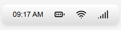
Original Status Bar – Typical Implementation
This version mimics the kind of default or overly styled component you’d find in many apps or UI libraries.
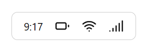
Optimized Version – Sustainable Redesign
This version simplifies everything: uses a system font, removes styling effects, omits redundant time formatting, and uses CSS masking for icons.
Step 4 – Test
The redesign showed a noticeable reduction in DOM size, eliminated external font loading, and improved rendering simplicity. While the savings are small in isolation, this practice scales meaningfully across larger design systems or global apps.
Conclusion
Good design doesn’t need to shout. By paying attention to microelements, we not only create cleaner interfaces but also reduce environmental impact in subtle yet scalable ways. Sustainable design isn’t always about grand gestures, it’s often in the details.