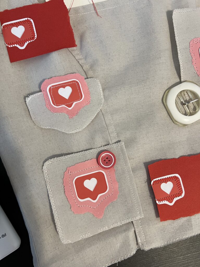
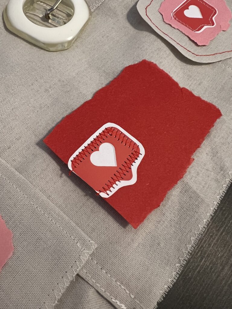
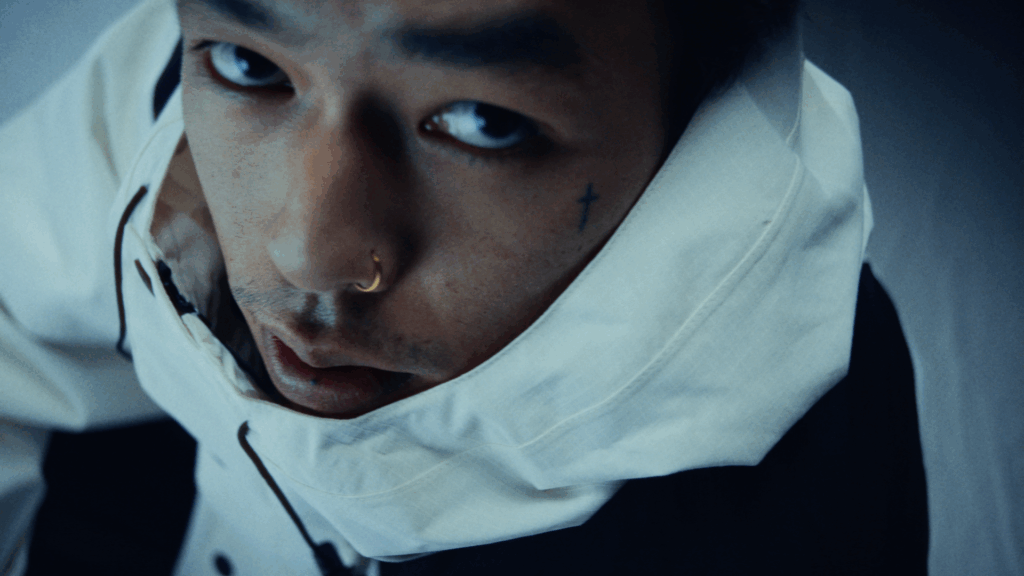
For this experiment I took inspiration from mixed media artists and tried to see which shapes I can create with my sewing machine.
As a visual hook/element I decided to use a red threat and pink paper.
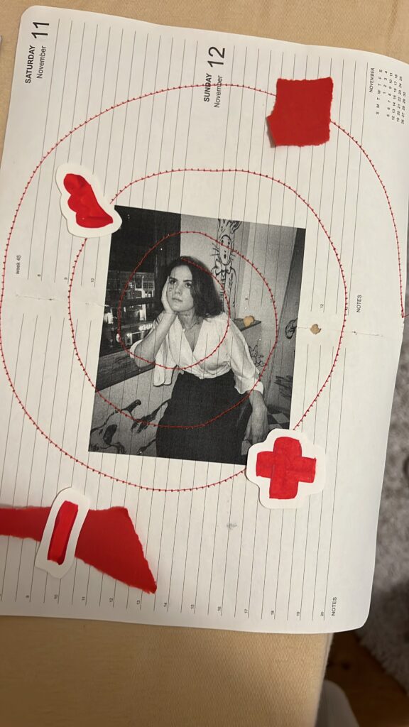

For this experiment I took inspiration from mixed media artists and tried to see which shapes I can create with my sewing machine.
As a visual hook/element I decided to use a red threat and pink paper.
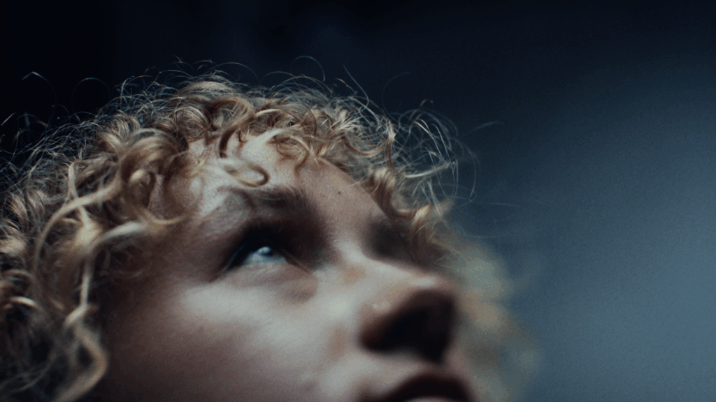
During my explorative phase, I’d like to take a closer look at the intersection of genre aesthetics and gender identity expression in the visual presentation of K-Pop groups. Using an experimental, practice-based design approach, the project seeks to reimagine K-Pop through the stylistic lenses of other musical genres to investigate how genre conventions shape visual narratives, particularly in relation to fashion, makeup styling, and album package design. The ultimate aim is to unpack the flexibility of gender representation in K-Pop and to question how these expressions might shift when situated within different cultural and sonic contexts.
Introduction: Genre as Aesthetic and Cultural Code
Musical genres are not only categorizations of sound, they are cultural ecosystems. Each genre develops its own set of visual codes, aesthetic expectations, and symbolic associations that extend far beyond music, influencing everything from stage design to fashion and album packaging. These visual languages help audiences identify, interpret, and emotionally connect with artists. They also carry implicit and explicit ideas about identity, gender roles, authenticity, and performance.
While genres like rock or hip-hop might emphasize rebellion, masculinity, or street credibility, others like classical or ambient might evoke refinement, calm, or intellectualism. These aesthetics shift with time, geography, and audience. Yet, genre conventions still provide a powerful structure for how artists are visually framed and understood.
In this context, K-Pop stands out as a highly stylized, precisely curated genre that frequently plays with and challenges gender norms, particularly through the fashion and makeup styling of male idols. K-Pop visuals are often hyper-modern, experimental, and emotionally expressive, leveraging androgyny and fluidity in ways that resist or complicate Western norms of masculinity.
Experimental Approach
By adopting the visual and conceptual frameworks of selected genres, I aim to analyze how gender expressions might shift or be reinterpreted across aesthetic contexts.
This involves three core steps for each genre:
Chosen Genres for Exploration
For this phase of the research, I have selected three musically and visually distinct genres:
1. Electronic
Electronic music is associated with futurism, nightlife, and technology. Visually, it leans toward bold colors, metallics, synthetic textures, and high-contrast lighting. Gender expressions in this genre often embrace the avant-garde, with space for both hypermasculine and androgynous stylings. I will explore how these aesthetics can reshape the image of a K-Pop group, how futurism and abstraction might emphasize or erase gendered styling.
2. Lofi
Lofi hip-hop, often linked to digital nostalgia and internet aesthetics, evokes a sense of intimacy and introspection. Its visual language includes soft tones, vintage textures, hand-drawn elements, and domestic or solitary settings. In this context, I will investigate how understated, “authentic” visuals interact with the typically high-gloss image of K-Pop, and whether subtle, emotionally grounded styling can still communicate complex gender narratives.
3. Classical
The classical genre draws on centuries of cultural tradition, evoking elegance, discipline, and refinement. Visual aesthetics may include formal wear, muted color palettes, and references to art history or architecture. This genre offers a contrasting lens to the youth-centric energy of K-Pop and presents an opportunity to explore how traditional ideas of masculinity and femininity are preserved or challenged in this visual context.
Next Steps
In the upcoming weeks, I will document each stage of this process, beginning with the Electronic genre.
This phase of experimentation is not intended to reach final conclusions but to serve as a tool for critical reflection and creative inquiry. Through recontextualizing K-Pop visuals across diverse genre aesthetics, I hope to uncover new insights into how gendered identities are visually constructed, destabilized, or reimagined.
Ausgangslage
Für den ersten Prototyp meines Semesterprojekts verwende ich ein bereits bestehendes Video, das aus verschiedenen Drohnenflügen der letzten Jahre zusammengeschnitten wurde. Der Clip ist bewusst schnell geschnitten und kombiniert unterschiedliche Landschaftsaufnahmen in schneller Abfolge. Ziel des Experiments ist es, einen Teil dieser realen Aufnahmen durch KI-generierte Bilder zu ersetzen und anschließend zu überprüfen, ob der Unterschied für den Betrachter unmittelbar erkennbar ist.
Wichtig ist hierbei die Einschränkung, dass ausschließlich Landschaftsbilder verwendet werden. Aufnahmen mit Menschen werden bewusst vermieden, da dies sowohl den Generierungsprozess als auch die spätere Bewertung der Ergebnisse erheblich erleichtert.
Das Ziel dieses Prototyps ist es, die Grenzen zwischen realen Drohnenaufnahmen und KI-generiertem Footage auszutesten. Dazu ersetzte ich im Originalvideo einige der Drohnenszenen durch von HailuoAI und Sora erstellte Sequenzen.
Prototyp
Im ersten Schritt tauschte ich gezielt einzelne Drohnenshots durch die generierten B-Roll-Clips aus, wobei besonderes Augenmerk auf die Vergleichbarkeit gelegt wurde.
Der Fokus der Analyse liegt darauf, zu untersuchen, wie deutlich sich die KI-Bilder von den echten Aufnahmen unterscheiden, auch hinsichtlich der subjektiven Wahrnehmung durch die Betrachter:in.
Um dies zu überprüfen, werde ich im nächsten Schritt eine kleine Umfrage durchführen. Dabei werde ich ausgewählte Ausschnitte aus dem Video zeigen und die Teilnehmer:innen bitten, anzugeben, welche Szenen sie als real und welche sie als KI-generiert einschätzen.
Und hier das aktuelle Video mit KI-Teilen
Frage an sich selbst: Erkennt man die KI Parts deutlich?
Hier einen Ausschnitt des Original Videos:
Herangehensweise
Zu Beginn meines Versuchs wollte ich mit Hilfe eines Prompts ein Video eines schönen Sonnenuntergangs erstellen. Die erste Eingabe lautete:
„Drohnenflug, Sonnenuntergang, über den Wolken, schöne und cinematische Lichtstimmung, leichter Anstieg.“
Das Ergebnis entsprach jedoch nur bedingt meinen Vorstellungen. Zwar wurde ein Sonnenuntergang generiert, allerdings war in den meisten Clips die Drohne selbst im Bild zu sehen, was der angestrebten Ästhetik widersprach.
Um das Problem zu beheben, passte ich den Prompt an und ergänzte die Anweisung, dass die Drohne nicht sichtbar sein sollte:
„Drohnenflug (Drohne nicht im Bild), Sonnenuntergang, über den Wolken, schöne und cinematische Lichtstimmung, leichter Anstieg der Drohne im Bild.“
Trotz dieser genaueren Formulierung blieb das Resultat hinter den Erwartungen zurück. Die Drohne tauchte weiterhin in den generierten Videos auf, sogar sehr präsent im Bild.
Ein dritter Anlauf folgte mit einer leicht vereinfachten Formulierung:
„Drohnenflug (Drohne nicht im Bild), Sonnenuntergang, über den Wolken, schöne und cinematische Lichtstimmung.“
Doch auch dieser Versuch führte nicht zum gewünschten Ergebnis. Die KI interpretierte die Angaben nicht konsequent, sodass immer wieder Bildelemente auftauchten, die nicht der Vorstellung eines klaren, „drohnenlosen“ Himmelsflugs entsprachen.
Nach mehreren erfolglosen Prompt-Varianten entschied ich mich für eine alternative Herangehensweise: Anstatt nur mit Textvorgaben zu arbeiten, lud ich ein eigenes Ausgangsbild hoch. Dafür wählte ich jeweils den ersten Frame eines geeigneten Drohnenvideos.
Bei HailuoAI gibt es die Möglichkeit, auf Basis eines hochgeladenen Bildes einen kurzen Clip zu generieren. Zusätzlich kann man Anweisungen zur gewünschten Kamerabewegung formulieren. Diese Funktion nutzte ich gezielt, um die Bilddynamik nachzustellen, etwa durch einen sanften Anstieg oder einen leichten Schwenk, um den Eindruck eines realen Drohnenflugs zu verstärken.
Insgesamt funktionierte diese Methode deutlich besser als die reine Prompt-Eingabe. Die Resultate wirkten stimmiger und entsprachen eher der ursprünglichen Vision.
Natürlich gab es auch hier kleinere Fehler und Unstimmigkeiten, die sich nicht ganz vermeiden ließen. Ein „Best of“ der Fehlversuche.
Vergleich: Sora von OpenAI und HailuoAI
Zunächst plante ich, die Erstellung der KI-generierten B-Roll mit Sora von OpenAI umzusetzen. Sora versprach durch seine Text-to-Video-Technologie hochwertige Ergebnisse und schien zunächst eine vielversprechende Wahl zu sein. In der praktischen Anwendung zeigten sich jedoch einige Schwierigkeiten. Während der Generierungsversuche traten wiederholt Fehlermeldungen auf, die den Prozess unterbrachen oder komplett verhinderten. Zusätzlich kam es zu sehr langen Wartezeiten, und die Plattform machte oft keine klaren Angaben über die voraussichtliche Dauer der Erstellung.
Diese wiederholten Probleme führten schließlich dazu, dass ich mich intensiver nach Alternativen umschaute.
Nach eingehender Recherche (mehr dazu im 4. Blogpost) entschied ich mich, HailuoAI zu testen. Ein entscheidender Vorteil von HailuoAI war das flexible Preismodell. Nutzer erhalten beim Anlegen eines kostenlosen Kontos 1100 Credits, wobei die Generierung eines Videos 30 Credits kostet.
Storyboarding is the magic that makes a commercial actually happen. Before spending real money on a camera crew, actors, props, and locations, you need a solid plan. A storyboard lays out the commercial shot by shot so everyone knows what’s supposed to happen before the first person steps foot on set. When it comes to putting a storyboard together, there are a few main ways to do it: sketching, previs, or searching for similar frames online. Picking the right method can seriously change how smooth your whole project runs.
Sketching is probably the most classic way to storyboard. It’s quick, cheap, and all you need is a pen and paper. Especially early on, sketching is super helpful because you can brainstorm different ideas without overthinking it. You can map out tons of different options for a scene without getting stuck on the details.
But sketching isn’t always the most accurate way to show your ideas, especially if you’re like me and aren’t super confident in your drawing skills. If the sketches are too rough or messy, there’s definitely a risk that other people won’t really get what you’re trying to say. But honestly, that’s kind of fine when you’re just getting started. Sketching keeps everything loose and flexible, which is exactly what you need at the beginning. I still hate it tough
Previs has gotten way easier lately, especially for commercial work. You don’t need expensive software anymore — just grab your phone and shoot rough videos or stills. Shooting previs on your phone lets you block out real scenes with real people and props, which gives you a much better sense of how timing, movement, and camera angles will actually feel. Plus, making quick edits from your phone clips can show you problems with pacing or weird transitions before you even get to the set.
It’s honestly the fastest way to figure out if your idea is going to work once you actually start shooting. The only downside is that most of the time, you do have to leave the house. If you’re still collecting ideas or trying to figure out the rough storyline, it’s probably smarter to stick to sketching at first. Even if you can’t draw well, you know what your own sketches mean — and when it’s time to show someone else your vision, you can shoot a rough previs or, if you’re feeling lazy and don’t want to go outside, just search the web for frames.
Searching for similar frames is another solid option, especially when you’re pitching your idea. You can pull images from movies, ads, or photography and build a quick mood board that shows the vibe, style, and energy you’re going for. Actually the last spec ad we shot was 90% planned just by pulling frames from Pinterest and Frameset. It worked perfectly. Clients especially love this because they can instantly see what you’re aiming for, without you needing to explain it for half an hour.
The only real downside to this method is that if your idea is super original, it might take forever to find the right frames. You can easily spend hours searching and still not find something that matches exactly. Plus, this method doesn’t solve how the shots connect or flow together — it’s more about the look, not the structure — so you’ll still need a real storyboard or previs later if you want a full plan.
On real projects, the best storyboards usually end up being a mix of all three techniques. Sketch first to throw down ideas fast. Gather reference frames to lock in the style and mood. Then shoot quick previs videos to make sure the scenes actually work. Especially in commercial work, where budgets are tight and timelines are even tighter, using all three methods together can save you a ton of stress, money, and last-minute disasters.
At the end of the day, the best storyboard is the one that makes your idea clear — whether you sketch it badly on paper, film it on your phone, or build a vibe board from random internet screenshots. Whatever gets your team (and your client) on the same page is the way to go.
Hulett, S. (2018). The Art of Previs: Planning Before Shooting. Animation World Network Press.
Masaki, Y. (2019). Storyboard Sketching: The First Step of Visual Storytelling. Creative Media Publishers.
Parry, K. (2020). how to storyboard (even if you can’t draw) [YouTube Video]. YouTube. https://www.youtube.com/watch?v=EaLMz5Y5t9A
Simon, L., & Jozwiak, K. (2021). Reference Images in Modern Production: How to Build Effective Mood Boards. Filmmaker’s Journal, 17(3), 35–42.
I recently thought a lot about an experience from our last spec ad shoot. We didn’t do a lot of traditional pre-production. We mainly searched for some cool shots and visuals we liked but skipped detailed storyboarding. During the two shooting days, many ideas just came up on the spot. This made me wonder: does doing less pre-production open doors for more creativity?
Obviously, pre-production is a super important part of filmmaking because it helps avoid problems and makes sure everything runs smoothly. But too much planning can sometimes kill creativity. People tend to be more creative when they have the freedom to explore and take risks.
In our case, the loose structure helped a lot. We were flexible and open-minded, and new ideas just kept coming. Creativity often happens “in the moment,” especially when people are improvising together. Being able to adjust and try new things without being tied to a strict plan made a big difference.
Psychology studies show that people who are given fewer rules during a creative task often come up with more original ideas. So having just a rough plan for a film shoot might actually help new, better ideas happen on set.


A lot of the shots above just “happend” during our shoot and still tell our initial story but none of them were planned.
Of course, skipping pre-production completely can be dangerous, especially in commercial filmmaking where time and money are tight. So it’s about finding the right balance. Creativity tends to peak when there is enough structure to give clear goals but also enough freedom to experiment. In film, this means having a general idea of what you want but staying flexible.
Thinking back to our spec ad, the best shots came from moments we hadn’t planned. Maybe it was a sudden change in light or a spontaneous move by the talents. Random, lucky moments like these can really boost creativity — if you’re open to them.
Still, it wouldn’t have worked without pre-production. It gave us a direction, helped with logistics, and got everyone on the same page. But it didn’t have to be super detailed. Plans should be flexible and able to change quickly, especially in fast-moving environments like film sets.
From my still limited experience as a director, a “light” version of pre-production has two big advantages: it lets everyone on set bring in fresh ideas, and it helps the project adjust to new opportunities. But for this to work, you need to trust your crew and be ready to let go of some control, which is really hard for me sometimes but giving people space and trusting them is key for creative teamwork.
In the end, doing less pre-production doesn’t mean being unprepared. It can actually be a smart move to leave space for real creativity to happen. It completely depends on the project: are there a lot of locations? How many shooting days are there? How big is the crew? These are all questions you need to ask yourself before deciding to work with a smaller pre-production plan. The bigger the crew and the more locations, the harder it will be to not have a detailed storyboard. But still, our spec ad showed me that letting things evolve naturally on set can lead to surprising results. Finding the balance between preparation and flexibility seems to be a secret weapon, when used right, for creative success in commercial filmmaking.
Csikszentmihalyi, M. (1996). Creativity: Flow and the psychology of discovery and invention. HarperCollins.
Mumford, M. D., Scott, G. M., Gaddis, B., & Strange, J. M. (2002). Leading creative people: Orchestrating expertise and relationships. The Leadership Quarterly, 13(6), 705-750.
Rabiger, M., & Hurbis-Cherrier, M. (2020). Directing: Film techniques and aesthetics (6th ed.). Routledge.
Sawyer, R. K. (2012). Explaining creativity: The science of human innovation (2nd ed.). Oxford University Press.
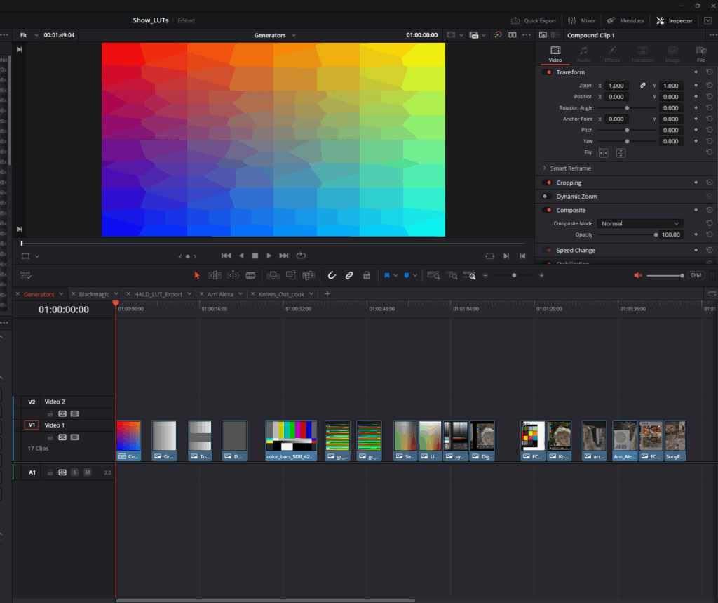
Following the preparation of both the source and target ColorChecker datasets, the subsequent step involves generating a color transform through mathematical alignment. For this purpose, the tool Camera Match developed by Ethan Ou provides an effective and streamlined solution. This Python-based application enables the creation of LUTs by computationally matching the color responses of the source dataset (e.g., digital camera footage such as ARRI Alexa imagery) to a target dataset (e.g., film scans or alternative camera profiles).
Camera Match is accessible both as a downloadable script and via a browser-based interface (Camera Match GitHub Repository). The basic workflow for LUT generation using the browser interface is as follows:

Once created, the LUT can be implemented in post-production applications such as DaVinci Resolve, Lattice, or any system capable of ingesting standard LUT formats. The process is highly efficient, offering a rapid turnaround from dataset preparation to deployable LUT creation.

While this approach enables the user to quickly produce functional LUTs, it is important to acknowledge that the quality of the input datasets—particularly the preparation of the ColorChecker charts—significantly influences the final result. In subsequent discussions, we will explore more advanced methodologies for chart preparation, focusing on best practices for achieving scene-referred workflows compatible with color-managed environments such as DaVinci Wide Gamut Intermediate and ACES.
Although this preparation phase remains time-consuming, it is a critical component for those seeking the highest levels of color accuracy and transform reliability.
Reference:
DeMystify Colorgrading. (n.d.). Film Profile Journey: 20 – More Automation, Less Tedious Manual Work. Retrieved April 28, 2025, from https://www.demystify-color.com/post/film-profile-journey-20-more-automation-less-tedious-manual-work
Developing a LUT tailored specifically to the needs of a project may initially seem complex, but the process is more straightforward than it appears. In essence, one builds a specific look within DaVinci Resolve and subsequently renders this look into a LUT file. The technical steps for generating and exporting the LUT will be discussed in detail later in this series of posts, as they are relatively direct once the foundational elements are established.
In order to approach the creation of a true Show LUT, we must move beyond subjective grading and work systematically by profiling real analog film stocks. Specifically, we will be extracting data from ColorChecker charts photographed on film and generating a modified version aligned with our own creative preferences.
It is important to note that film profiling itself is an expansive discipline, comprising numerous methodologies and technical variations. A full exploration of these methods would require not merely additional blog entries, but likely an entire master’s thesis in its own right. To streamline the process for practical application, this discussion will focus exclusively on the automated film profiling workflow presented by Nico Fink in his Film Profiling Course.
Extraction of ColorChecker Values
The first essential step is the acquisition of RGB data from both the reference charts and the film-exposed charts. To facilitate this process efficiently, we use the command-line tool “Get ColorChecker Values”.
This tool automates what would otherwise be an extremely laborious manual task: sampling and recording the 24 patches of a ColorChecker chart across multiple exposures. Rather than hovering over each patch, sampling color values individually, and manually entering data, the tool extracts and compiles the colorimetric information automatically into a structured CSV file.
The script and relevant resources can be found here:
Dataset Preparation
Prior to running the script, the film scans and the reference (digital) captures must be organized carefully:

Before exporting the images to the directory, additional preprocessing in Adobe Photoshop is required:
The resulting images should resemble standardized color chart references suitable for automated analysis.

Running the Script
After preparing the datasets, the next step involves executing the script through the Terminal application on the computer:


Upon successful execution, the script generates a comprehensive sheet of numerical RGB values for each chart. This replaces what would otherwise be a time-consuming manual process.
It is essential to repeat this process separately for both your film-based charts and your digital reference charts, thereby creating two distinct datasets. These datasets form the empirical basis for the subsequent LUT construction, wherein the desired film look will be derived and mathematically mapped.
Summary
By automating the extraction of ColorChecker values, we establish a foundation of objective data that can be used to model the film response curve. This not only accelerates the LUT creation workflow but also enhances accuracy and repeatability, which are critical for professional color pipelines.
The next phase will involve analyzing and comparing these datasets in order to generate a transform that authentically replicates the desired film look while allowing for tailored creative adjustments.
Reference
DeMystify Colorgrading. (n.d.). Film Profile Journey: 20 – More Automation, Less Tedious Manual Work. Retrieved April 28, 2025, from https://www.demystify-color.com/post/film-profile-journey-20-more-automation-less-tedious-manual-work
Importance of Diverse Source Footage
In the process of designing a show LUT, one cannot rely solely on a narrow selection of material. The end goal is to build a transform that behaves consistently, no matter the variations in camera sensor, lighting condition, or scene composition. A LUT tested on limited footage is unlikely to generalize well across the complexities of an actual production environment.
Footage must therefore be drawn from a wide array of scenarios: sunlit exteriors, dim interiors, high-contrast night scenes, and environments illuminated by mixed light sources. Moreover, it is necessary to incorporate material from multiple camera manufacturers—each bringing its own interpretation of color science and sensor response to the equation. Without such diversity, the LUT may perform well under certain conditions but break down unpredictably when the variables change.
This is not merely a technical requirement; it is a philosophical one. A LUT must serve the story without introducing artifacts that pull the viewer out of the experience. As Poynton (2012) points out, wide testing ensures that color transforms survive the real-world unpredictability that defines filmmaking.
The Role of Controlled References
Including color charts within the test material is equally critical. These references, such as the X-Rite ColorChecker or similar calibration tools, provide fixed targets against which LUT behavior can be measured. They offer a set of known quantities—neutral grays, primary colors—that allow the colorist to observe exactly how the LUT manipulates standard values.
This step moves the process from subjective taste toward empirical validation. Without color charts, evaluations become reliant on intuition alone, which may fail to detect subtle but cumulative errors over the course of a feature-length project.
The ICC (2022) highlights that such controlled references are essential to maintaining fidelity not just within a shot but across the complex interrelation of shots, scenes, and acts. When the same reference yields different results across multiple lighting conditions or cameras, one can be confident that the problem lies within the transform, not within the footage.
Necessity of a Neutral Evaluation Pipeline
A show LUT can only be meaningfully assessed if all other variables are controlled. This principle demands that the footage be stripped of in-camera looks, hidden LUTs, and uncontrolled image processing prior to evaluation. Only through this neutralization can the true effect of the show LUT be isolated.
Otherwise, as Arney (2021) warns, observed issues may stem not from the LUT but from a polluted pipeline, leading to incorrect conclusions and wasted revision cycles. It becomes impossible to know whether a magenta shift, for instance, is caused by the LUT itself or an unnoticed RAW processing setting.
Neutralization, therefore, is a prerequisite—not a preference. It guarantees that the feedback loop between observation and correction is valid, allowing genuine issues to be identified and addressed with confidence.
Designing Test Structures with Purpose
Simply gathering footage is not enough; it must be organized and sequenced thoughtfully. Test timelines must be constructed to reveal different failure modes: rapid shifts from bright exteriors to dim interiors, extreme saturation to near-monochrome, natural daylight to heavy artificial lighting. Each transition becomes a test of the LUT’s resilience.
Furthermore, footage should be juxtaposed to maximize stress on the transform. For instance, placing a RED clip next to an ARRI clip, or alternating between footage with and without deep shadows, forces the LUT to reveal its behavior under changing conditions.
In this way, the colorist is not waiting for issues to arise by accident but actively provoking them. As van Hurkman (2014) suggests, the integrity of a color transform is proven not in ideal conditions but when subjected to extremes.
Conclusion
The creation of a show LUT is ultimately a scientific inquiry wrapped in artistic purpose. By committing to footage diversity, employing objective reference points, maintaining pipeline neutrality, and designing tests that actively seek out failure, the colorist ensures that the final transform will not merely look good on a single shot but will endure the realities of production.
A show LUT, if built properly, becomes invisible—supporting story, mood, and emotion without drawing attention to itself. Achieving this level of reliability requires more than technical skill; it demands a methodological rigor rooted in the understanding that visual storytelling is at once a technical craft and an expressive art.
References
Arney, D. (2021). Practical Color Management in Film and Video Postproduction. Postproduction Journal, Vol. 19
Since the initial freesound.org and GeminAI setup, I have added several improvements.
You can now choose between different object recognition models and adjust settings like the number of detected objects and the minimum confidence threshold.
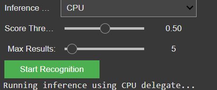
I also created a detailed testing matrix, using a wide range of images to evaluate detection accuracy. Due to that there might be the change of the model later on, because it seems the gemini api only has a very basic pool of tags and is also not a good training in every category.
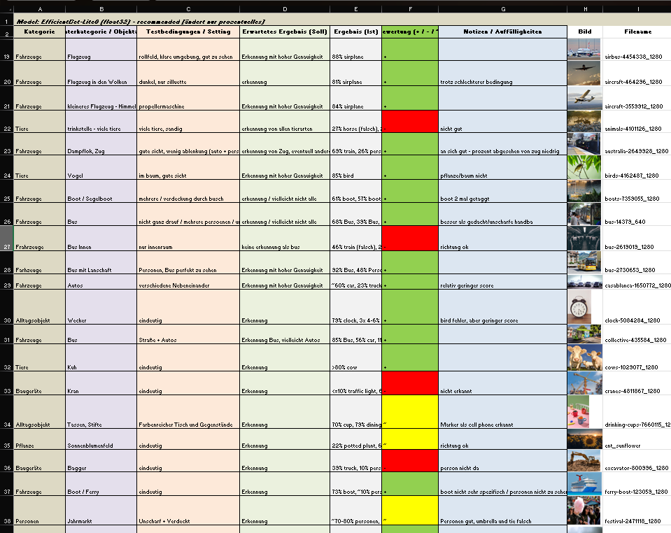
It is still reliable for these basic tags like “bird”, “car”, “tree”, etc. And for these tags it also doesn’t really matter if theres a lot of shadow, you only see half of the object or even if its blurry. But because of the lack of specific tags I will look into models or APIs that offer more fine-grained recognition.
Coming up: I’ll be working on whether to auto-play or download the selected audio files including layering sounds, adjusting volumes, experimenting with EQ and filtering — all to make the playback more natural and immersive. Also, I will think about categorization and moving the tags into a layer system. Beside that I am going to check for other object recognition models, but I might stick to the gemini api for prototyping a bit more and change the model later.
In my previous exploration, I developed the prototype for Breathing Circle: a tactile, screen-free tool designed to guide users toward calmness. Building upon this, I’ve delved into existing analog relaxation devices to understand how current innovations align with or diverge from the principles of intuitive, low-effort emotional regulation. This journey aims to highlight the value of physical, non-digital tools in promoting well-being.


Komuso Breathing Necklace: a sleek pendant that slows exhalation when breathed through, promoting relaxation and reducing anxiety. Its discreet design makes it suitable for use in various settings.
Tibetan Singing Bowls: traditional instruments producing resonant tones that aid in meditation and stress relief. Their use underscores the enduring value of simple, auditory tools in promoting mental well-being.
Expandable Breathing Ball: a colorful, collapsible sphere that expands and contracts, visually guiding deep breathing exercises. Its engaging design makes it a popular tool for both children and adults seeking mindfulness and stress relief.
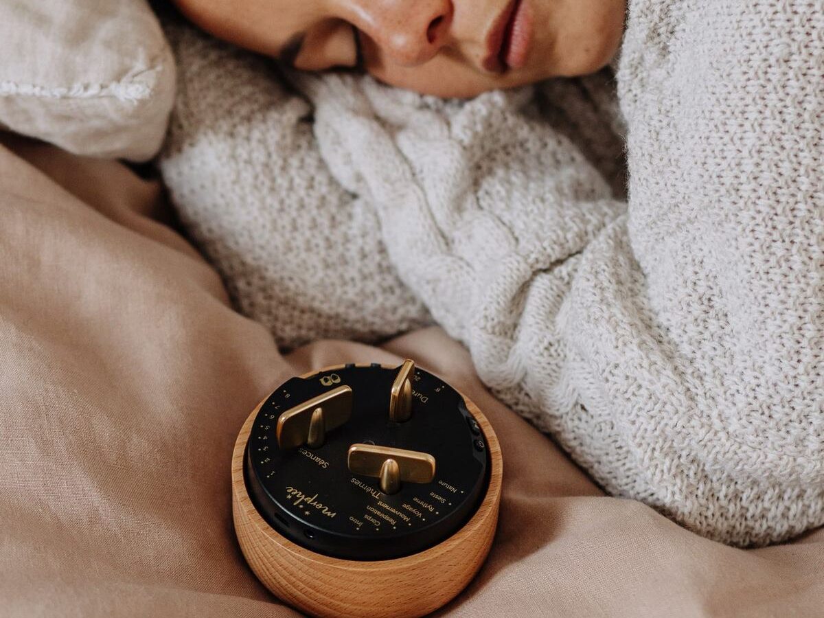
Morphée Meditation Box: a screen-free device offering guided meditation sessions through a tactile interface. Its design encourages users to engage in mindfulness without digital distractions.
Analog Productivity System by Ugmonk: a physical task management system using cards to prioritize daily activities. It emphasizes focus and intentionality in task execution.
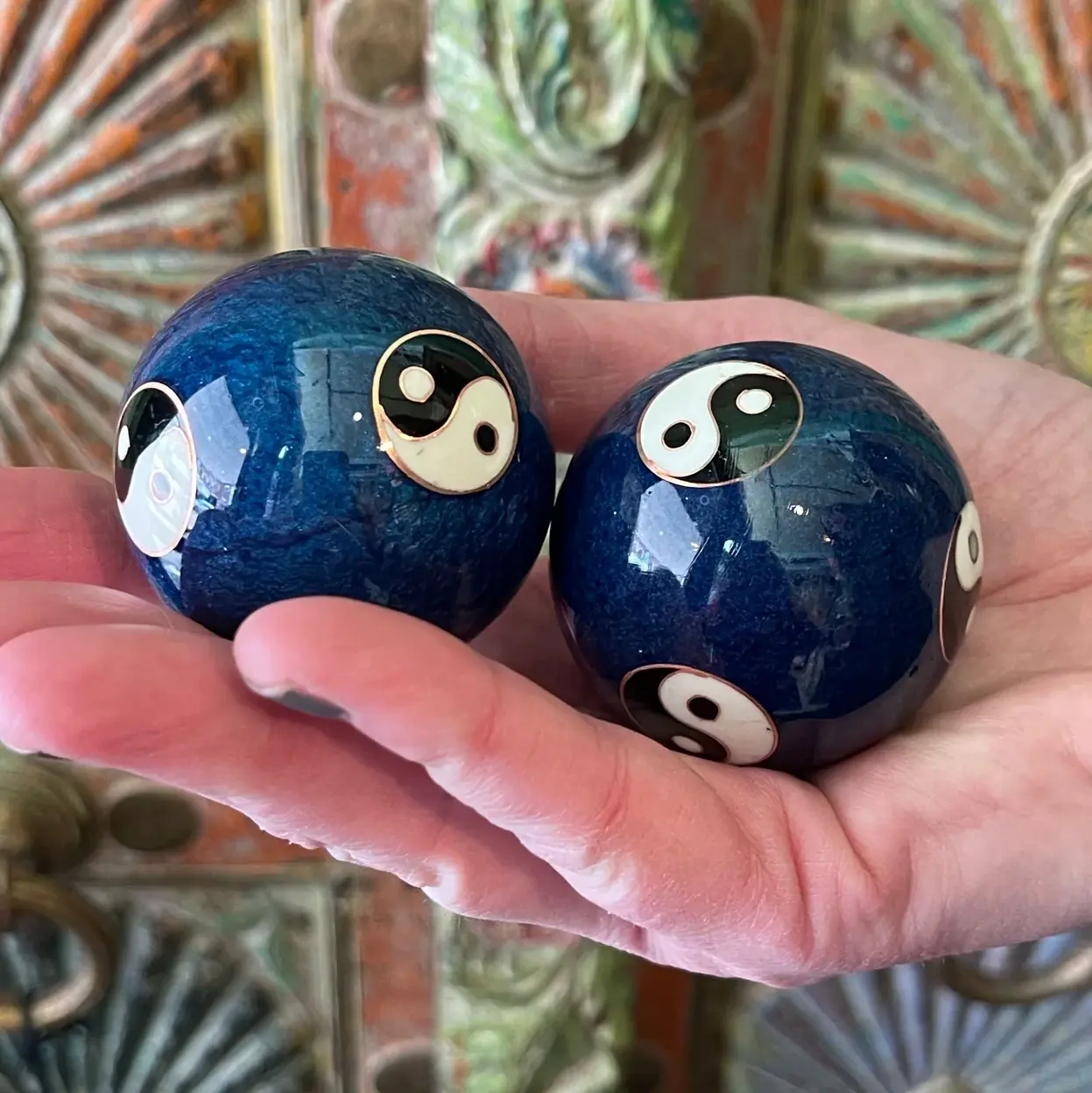


Baoding Balls: traditional Chinese stress-relief tools that promote relaxation and hand dexterity through rhythmic movement.
Acupressure Mats: mats embedded with spikes that stimulate pressure points, helping to relieve tension and improve circulation.
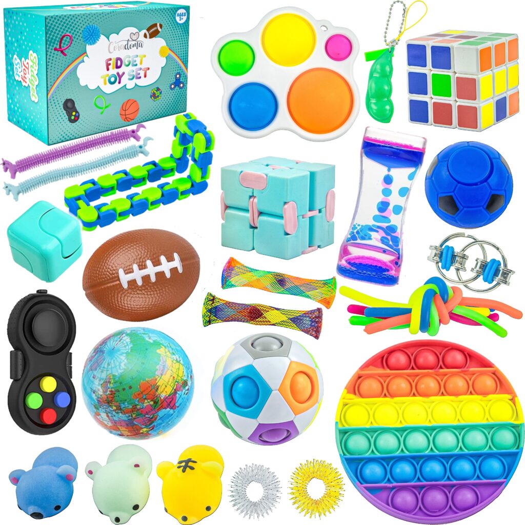
Fidget Cube: a compact, six-sided device featuring buttons, switches, and dials designed to keep hands engaged and minds focused. Each side offers a different tactile experience, catering to various sensory preferences.
Fidget Spinner: a small, ball-bearing device that spins between the fingers, providing a soothing sensory experience. Fidget spinners have been popularized as tools to aid focus and relieve stress, especially for individuals with ADHD or autism spectrum disorders. While scientific evidence is limited, many users find the repetitive motion calming and helpful in managing anxiety.
Additional Fidget Devices and Toys: beyond the Fidget Cube and Spinner, a variety of tactile tools offer sensory engagement and stress relief. Tangle toys consist of interconnected, twistable segments that can be manipulated into various shapes, providing continuous, quiet movement to aid concentration and reduce anxiety. Infinity Cubes are handheld devices made of smaller interconnected cubes that can be folded and unfolded endlessly, offering a repetitive motion that has a calming effect and helps maintain focus. Pop Its are silicone-based toys with bubble-like protrusions that can be pushed in and out, mimicking the sensation of popping bubble wrap; they offer tactile stimulation and are popular for stress relief. Stretchy Strings are elastic, colorful strings that can be stretched, twisted, and squeezed, providing sensory input useful for calming and focusing the mind. Wacky Tracks are interlocking, snap-together links that can be twisted and shaped into various forms, offering tactile feedback beneficial for fine motor skills and stress relief. Weighted Sensory Pillows are small, weighted pillows that provide deep pressure stimulation, promoting relaxation and reducing anxiety, often used in sensory integration therapy.
The exploration of these analog devices reveals a shared commitment to facilitating emotional regulation through intuitive, tactile means. Their simplicity and portability make them accessible tools for individuals seeking screen-free methods to manage stress and anxiety. In the upcoming blog posts, I will focus on refining the Breathing Circle prototype. This will involve enhancing its design and functionality, followed by user testing to assess its effectiveness in promoting relaxation and emotional well-being. Through this process, I aim to gather insights that will inform further development and potential applications of the Breathing Circle.