Introduction: A Thought Experiment in UX Design
How would you design an elevator interface for a 1000-story building? While this scenario may seem surreal, it presents an exciting challenge in user experience design. Inspired by a Google interview question, I decided to explore this concept and create a lo-fi prototype. The goal was to think through the navigation experience in such an extreme case, considering how users would interact with the system efficiently and intuitively.
Defining the Context & Target Users
To make this concept work, I first established some basic assumptions:
- The building serves both residential and office purposes, potentially housing thousands of people
- Multiple elevators exist, but each one needs a way to direct users efficiently
- The elevators operate using a restricted access system where only authorized individuals can reach specific floors
The target users would include:
- Residents – People living in the building
- Employees – People working in office spaces
- Visitors – Guests visiting residents or businesses
- Security Persons – Ensuring safety and restricted access where necessary
The Prototype: Navigating this big Skyscraper
My prototype focused on the elevator interface, aiming to make navigation simple despite the overwhelming number of floors. In that 20 Minute Prototype Session was included:
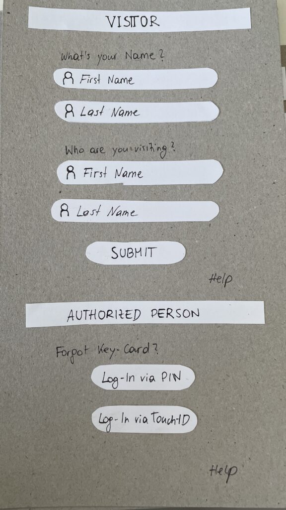
- Entry Screen – Users authenticate using an NFC card, PIN, or biometric login to verify access / Guests login via their name and the name of the host
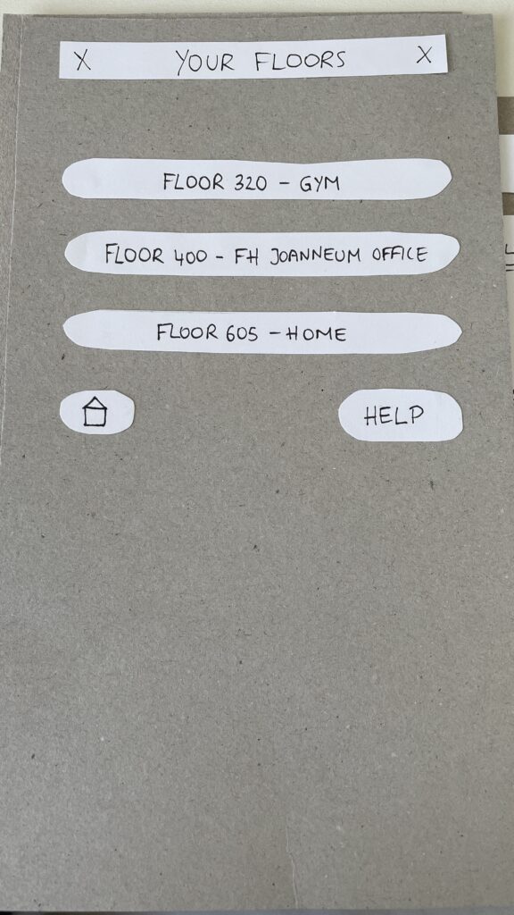
- Floor Selection – A personalized interface displaying only authorized floors to reduce cognitive overload
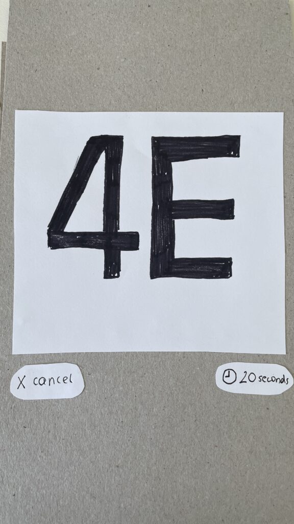
- Elevator Assignment – Users are directed to a specific elevator to optimize efficiency
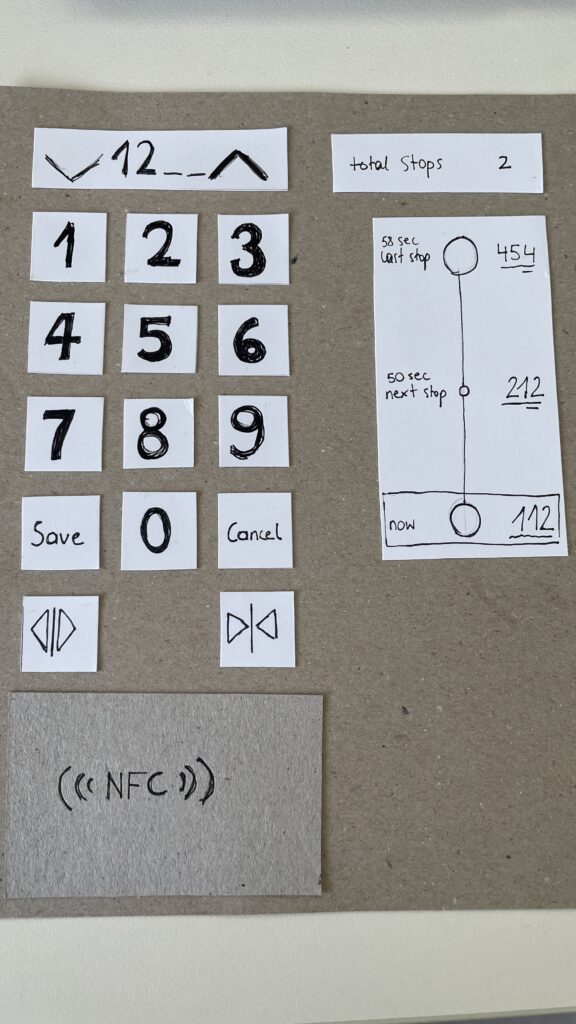
- In-Elevator Controls – A secondary screen inside the elevator allows floor changes or emergency actions, ensuring flexibility mid-ride


Speed-Dating Prototype Discussion: Key Takeaways
The Speed-Dating session provided invaluable feedback from different perspectives. Here are some key insights:
1. Initial Reactions – What Problem Am I Solving?
- Many participants struggled to recognize the interface as an elevator control system
- Some assumed it was a hotel check-in or a security login screen
- The concept of restricted floor access confused some users
2. Feature Suggestions – What Would You Add?
- Instead of buttons labeled Save and Cancel, participants suggested clearer icons like a checkmark and a [X]
- Emergency contact options were missing and should be easily accessible
- Accessibility concerns arose, suggesting the need for a tactile number pad and Braille support
3. If My Prototype Had a Dating Profile…
- The elevator system would market itself as “Your fastest and most efficient ride to success” or “Seamless mobility, one floor at a time.”
- While the system served everyday users, i think the real customers would be building developers looking to optimize user flow in high-rise buildings
4. Future Vision – What Would Make This TED-Worthy?
- While no 1000-story buildings exist today, high-rise architecture continues to evolve
- Future cities may require advanced wayfinding systems, making this prototype a glimpse into possible urban design challenges
5. Unexpected Feedback – What Surprised Me?
- The first login screen was misleading, making users think they were logging into a website rather than an elevator
- Participants felt that unauthorized users could bypass security by following someone into restricted floors
- The experience was unusual since most people are accustomed to standard button-based elevator panels
Final Thoughts & Next Steps
Exploring this extreme scenario was a fun and thought-provoking design exercise. However, given its impracticality, I won’t continue developing this prototype. Instead, I want to shift my focus to real-world mobility and wayfinding challenges, potentially designing solutions for navigation in large public spaces like airports, malls, or grocery stores.
This experience has reinforced how UX design is about clarity, accessibility, and user expectations. Designing for mobility is not just about efficiency, it’s about making interactions intuitive and seamless.
In the next blog post, I will explore potential project directions that build upon the learnings from this prototype.