“Life can only be understood backwards, but it must be lived forwards” ~ Soren Kierkegaard
A quote that is also very fitting, when talking about bias in design. Most of the time you can only understand, that a decision could have been made due to a bias, after the changes have already been deployed. Looking a bit deeper into the topic of biases and how they affect (UX) design, here are some interesting stories, how products turned out biased towards or against parts of their user groups.
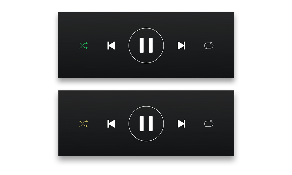
1 – Spotify Shuffle Button
In a reddit form, a user requested, that the shuffle button in the Spotify app would have a circle around it, since they are color blind and have a hard time seeing the difference between the active and inactive shuffle button. (see picture below) (cf. Reddit) Put simply, this might have happened due to a blind spot affecting Spotifys design team. Not all people perceive colors the same way, some have a hard time, especially seeing red and green. Approximately 8% of men and 0.5% of women are affected by this type of color blindness. (cf. the Guardian) This simple change could be a big difference for certain subsets of users.
2 – Cars and Seat Belts
Here is a fun one, in the 1960s, most crash test for cars were done with crash test dummy, modeled after an average male physique (height, weight & stature). Therefore safety design decisions were mostly tailored to men, neglecting woman, children, smaller or bigger individuals. Although crash test have been conducted with “female” crash test dummies, but they were only placed in the passenger seat. (cf. User interviews) When talking about safety, one hopes, that all possible users have been considered.
This happened very likely due to the “sampling bias”: “Sampling bias occurs when a sample does not accurately represent the population being studied. This can happen when there are systematic errors in the sampling process, leading to over-representation or under-representation of certain groups within the sample.” (Simply Psychology)
3 – Facebooks “Year in Review”
In 2014 Facebook introduced the “year in review” feature, which showed the user their best performing posts of the past year. The algorithm would identify the “best” posts/moments depending on the amount of likes. Now this is all fun and games, until you see a lost loved one in your year review. While the algorithm might work for most users, some will have a different, less satisfying experience. (cf. Forbes)
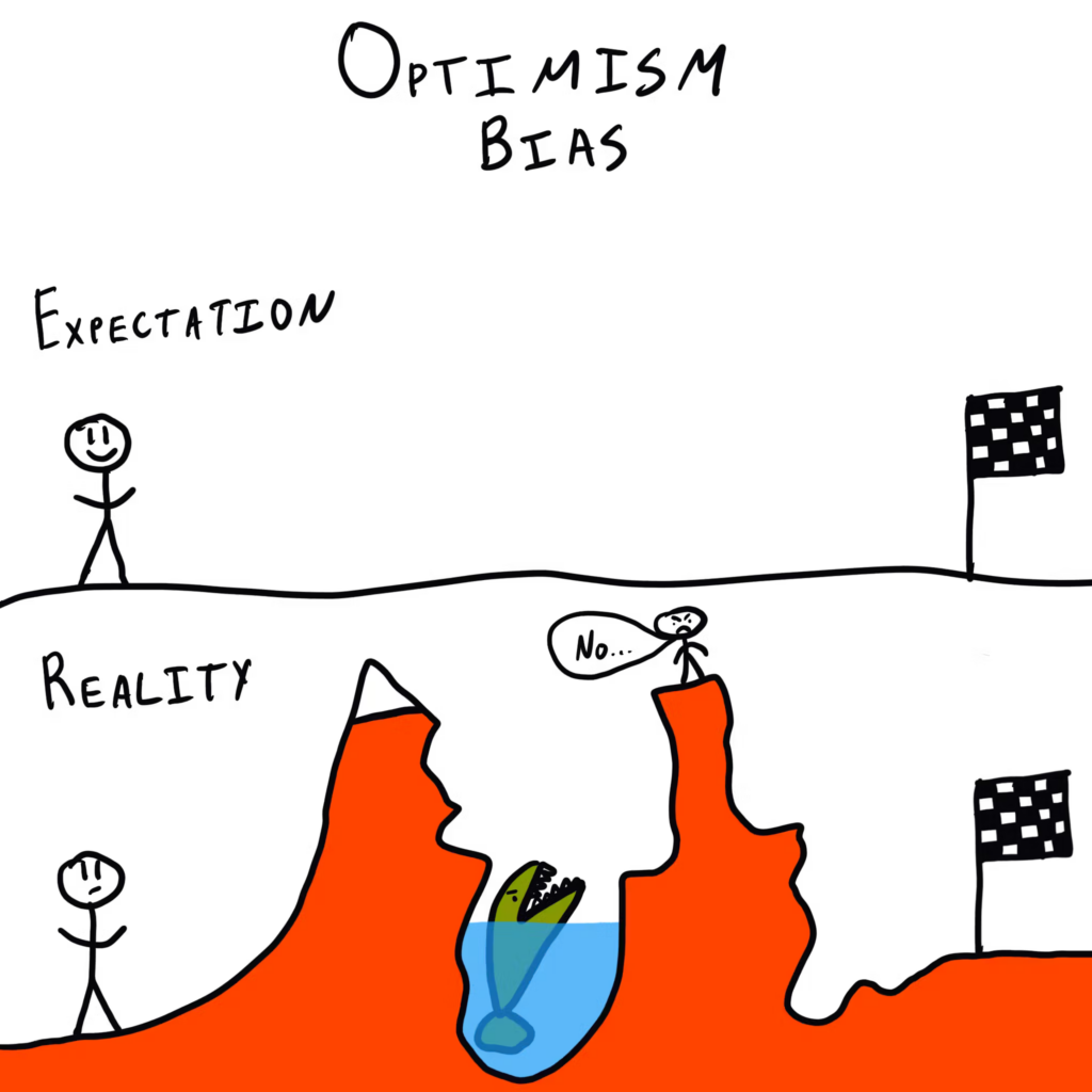
Who ever had the idea for this feature, handed their bias over to the algorithm who automatically creates these reviews. Due to the optimism bias people to believe that they are less likely to experience negative events and more likely to experience positive ones. This bias can lead to overly optimistic expectations about the future, underestimating risks, or failing to prepare for potential challenges. Designers assumed that users’ most engaged photos and moments would always be joyful, leading to a feature that unintentionally surfaced painful memories for some users.(cf. The Decision Lab)
These are just three examples of how biases can affect design and there are many more, this was just the beginning. Although I have noticed, that a lot of bias related “fails” happened, because the designers or researchers focused on one part of their users. There is another bias, that might be the basis for all of this: The majority bias, cognitive bias where people focus on the larger or more visible part of a group, often overlooking minority perspectives. This bias assumes the majority is representative or correct, leading to the neglect of smaller groups or less common viewpoints. Which could lead to neglect of a bunch of smaller groups, which all together would form the majority. (cf Nature)