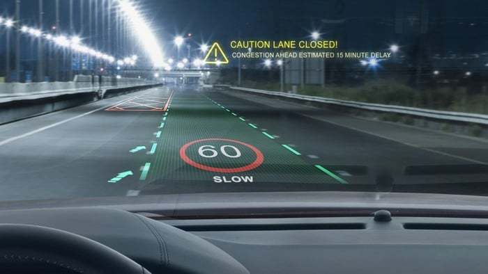
Head-Up Displays (HUDs) have revolutionised the way drivers access key information without taking their eyes off the road. However, with data such as speed, navigation and incoming calls competing for attention, ensuring clarity and usability is critical. The key to achieving this balance is to master the visual hierarchy and effectively prioritise information.
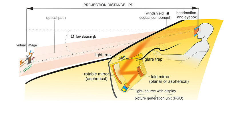
(source: https://www.researchgate.net/figure/How-a-Head-up-display-works_fig5_301776934)
Understanding visual hierarchy
Visual hierarchy refers to the arrangement and presentation of elements in a way that reflects their importance. In HUDs, critical information such as speed, navigation cues and safety alerts need to be immediately recognisable, while secondary details – such as media controls or environmental data – should remain accessible but less prominent.
Key strategies for creating visual hierarchy
- Size and placement: Larger and centrally placed elements attract attention first. For example, displaying speed prominently in the centre of the HUD ensures immediate visibility, while positioning navigation arrows slightly offset can direct the driver’s attention as needed.
- Contrast and colour: The use of bright or contrasting colours can highlight important information. For example, a red warning symbol will stand out against a neutral background and attract immediate attention.
- Grouping and spacing: Organising related data into clusters reduces cognitive load. Grouping metrics such as speed, fuel level and engine alerts together creates logical associations, making it easier for drivers to process information quickly.
- Typography: Choosing legible fonts and appropriate sizes ensures quick readability. Key metrics such as speed should be in bold, large type, while less critical details can use smaller, more subtle typography.

(source: https://magic-holo.com/en/all-about-head-up-display-hud/)
Balancing critical and supplemental data
A key challenge in HUD design is to present critical data without cluttering the display. Designers should limit the amount of information displayed at any one time and use progressive display to show additional data only when necessary. For example, navigation directions might only appear when a turn is approaching, reducing unnecessary distractions.
(source: https://www.nuvisionautoglass.com/guide/what-is-a-heads-up-display-in-a-car-windshield/)
Avoiding cognitive overload
To avoid overwhelming the driver, simplicity is key. Studies show that humans can only process a limited amount of information at one time. By focusing on key metrics and minimising distractions, HUDs can improve safety and usability.
Real world examples
Car manufacturers such as BMW have implemented an effective visual hierarchy in their HUDs. BMW’s augmented reality HUD integrates navigation cues directly onto the windscreen, allowing the driver to follow directions without shifting focus.

(source: https://www.becker-tiemann.de/faq/bmw-head-up-display/)