Advising for Sustainability in Graphic Design

Building Client Buy-In for Sustainable Design

  1. Educating Clients
    Many clients are unaware of the environmental impacts of traditional design practices. Designers can bridge this gap by presenting evidence-based insights. For example:
    • Highlight lifecycle impacts, such as the energy consumption of digital assets or the deforestation risks linked to non-FSC-certified paper.
    • Share case studies like Patagonia’s eco-conscious branding or IKEA’s circular design innovations to demonstrate that sustainability aligns with quality and consumer appeal (Packaging Sustainability, Jedlicka, 2011).
  2. Presenting Cost-Effective Solutions
    A common misconception is that sustainability always comes at a high cost. Designers can dispel this by proposing cost-neutral or even cost-saving strategies:
    • Digital optimization reduces hosting costs while enhancing sustainability.
    • Using recycled materials and lightweight packaging can lower shipping expenses.
  3. Framing Sustainability as a Brand Differentiator
    Sustainability isn’t just an environmental choice, it’s a strategic advantage. Consumers are increasingly favoring brands that demonstrate environmental responsibility. Designers can position sustainable solutions as a way to enhance brand reputation and customer loyalty (Green Graphic Design, Dougherty, 2008).

Fostering Industry Conversations

Graphic designers are influential participants in broader conversations about sustainability. Advocacy at the industry level can amplify their impact:

  • Joining Professional Networks
    Organizations like the AIGA Sustainability Task Force or the Green Web Foundation provide platforms for designers to share best practices and collaborate on solutions.
  • Hosting Workshops or Panels
    Designers can host events that explore sustainable innovations, engaging clients and industry peers in meaningful discussions.
  • Pushing for Standards and Certifications
    Encouraging adoption of eco-labels like FSC certification or energy-efficient hosting standards can help normalize sustainable practices.

References

  • Dougherty, B. (2008). Green graphic design. Allworth Press.
  • Jedlicka, W. (2011). Packaging sustainability: Tools, systems, and strategies for innovative package design. Wiley.
  • McDonough, W., & Braungart, M. (2002). Cradle to cradle: Remaking the way we make things. North Point Press.
1.2 The Science of Color Psychology: How Shades Influence Mental Health in App Design

A World of Color and Emotion

Colors play a significant role in shaping how we feel and interact with the world. They influence emotions, guide decisions, and even impact mental well-being, making them a powerful tool in designing mental health apps. The right colors can create an environment that feels calming, inviting, and supportive – essential qualities for apps aimed at improving mental health.

Research shows that cool colors, like blues and greens, are strongly associated with calmness, relaxation, and trust. These shades are often used in mental health apps to create a sense of serenity and support. On the other hand, warm colors, such as yellows and oranges, can evoke energy and optimism but must be used sparingly to avoid overstimulation.

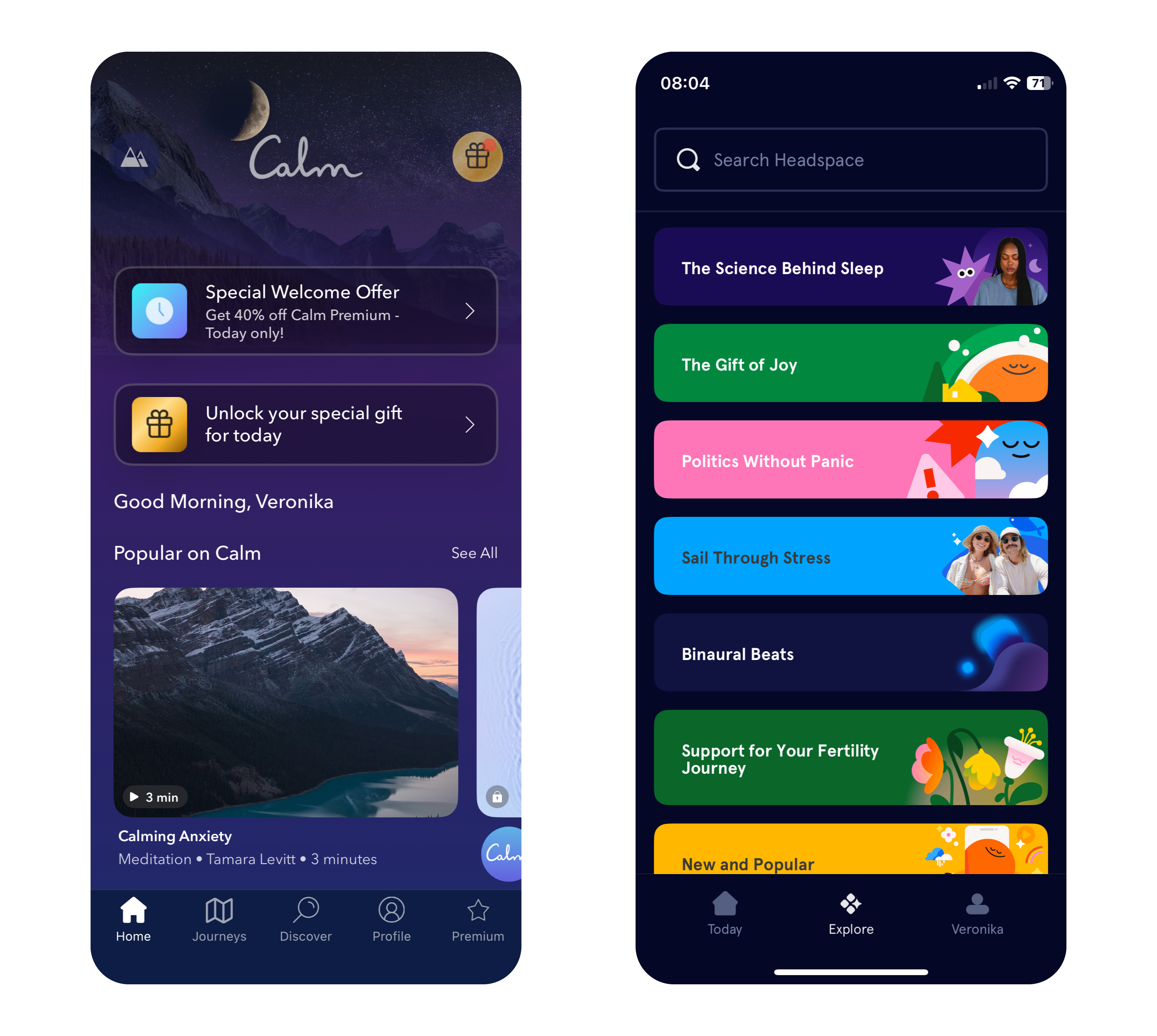
Apps like Calm and Headspace use color in very different ways to great effect. Calm primarily employs soothing shades of blue and purple to evoke tranquility, while Headspace takes a bold approach with its vibrant and varied palette. This variety helps make meditation and mindfulness more approachable, particularly for younger users who may be new to these practices.

Why Color Choices Matter in Mental Health Apps

The connection between color and emotion is deeply rooted in psychology. Blue and green tones, often linked to nature and open spaces, can subconsciously reduce stress and promote relaxation. In contrast, red, while energizing in small doses, may heighten anxiety if overused, making it less suitable for calming designs.

The neurological effects of color also play a key role. Studies show that exposure to blue tones can lower heart rates, while green shades improve focus and concentration – both valuable qualities for mindfulness and mental health practices. By leveraging these responses, designers can craft apps that not only look appealing but also enhance users’ mental states​​.

Insights from Research: Colors for Personalities and App Types

Personality traits influence color preferences. Extroverts tend to favor vivid, warm colors like red, orange, and yellow, while introverts prefer cooler, softer shades like blue, green, and pastel tones. Gender can also play a role, with women often gravitating toward softer hues like purple and light blue, while men tend to prefer bold primary colors like strong blues and greens.

Dynamic color schemes, where apps adjust their hues based on the user’s mood or time of day, are gaining popularity. For example, an app might use vibrant tones in the morning to energize users and shift to muted blues in the evening to promote relaxation. This adaptability can create a more personalized and supportive experience for users​.

Balancing Color with Function in Mental Health Apps

Color choices should enhance an app’s purpose rather than detract from it. While greens and blues are staples in mental health app design, designers must carefully balance them with accents to maintain engagement without overstimulating users.

Headspace’s vibrant palette provides an excellent example of balance. By pairing warm hues like orange and yellow with cool tones, it creates a playful yet calming environment. This blend ensures the app remains visually engaging while maintaining its focus on mindfulness and relaxation. In contrast, Calm leans into simplicity, using gradients and minimalistic design to immerse users in tranquility.

Consistency in color use is equally important. Abrupt changes in tone can confuse users or create unease, especially for those managing anxiety or mood disorders. A seamless visual flow across an app reassures users and enhances their experience, encouraging them to engage more regularly with the app’s features.

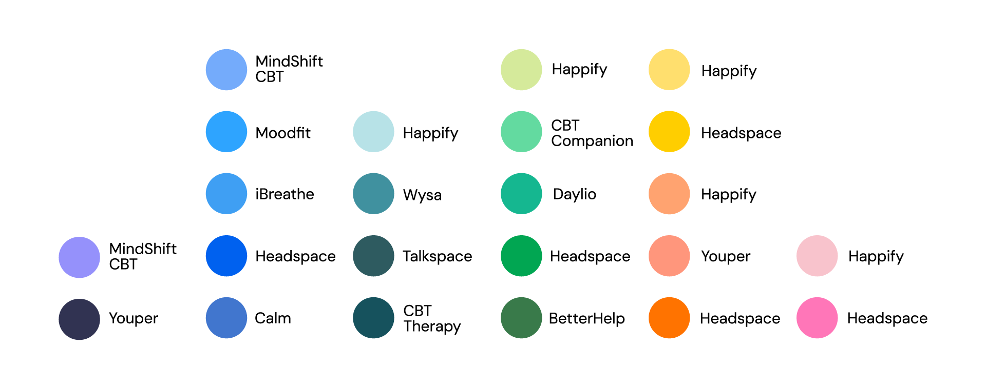
Image: Primary Colors in Popular Mental Health Apps

Sources

  1. A. Volkova & H. Cho. (2024). Warm for fun, cool for work: the effect of color temperature on users’ attitudes and behaviors toward hedonic vs. utilitarian mobile apps. Journal of Research in Interactive Marketing, Vol. ahead-of-print, No. ahead-of-print. https://doi.org/10.1108/JRIM-03-2024-0149
  2. „Calm – The #1 App for Meditation and Sleep.“ Calm. Accessed: Dec. 9, 2024. [Online.] Available: https://www.calm.com/
  3. „Headspace: Meditation and Sleep Made Simple.“ Headspace. Accessed: Dec. 9, 2024. [Online.] Available: https://www.headspace.com/
  4. R. Rider. (2010). Color Psychology and Graphic Design Applications. Senior Honors Theses, 111. https://digitalcommons.liberty.edu/honors/111
  5. R. M. Romeh, D. M. Elhawary, T. M. Maghraby, A. E. Elhag & A. G. Hassabo. (2024). Psychology of the color of advertising in marketing and consumer psychology. Journal of Textiles, Coloration and Polymer Science, Vol. 23, No. 2. doi: 10.21608/jtcps.2024.259025.1272
  6. S. Garrido, B. Doran, E. Olliver & K. Boydell. (2024). Desirable design: What aesthetics are important to young people when designing a mental health app? Health Informatics Journal, Vol. 30, No. 4. https://doi.org/10.1177/14604582241295948

Inclusive Design

Inclusivity means recognizing the diverse needs and perspectives of users and making intentional choices that reflect that diversity. That’s why it goes beyond aesthetics and ensures that products, experiences, and communication are accessible and meaningful to all people, regardless of gender, background, or ability.

When it comes to typography, iconography, and visual elements, inclusivity starts with challenging traditional norms. Avoiding gendered fonts and symbols can help create more neutral designs that appeal to a broader audience. For example, opting for clean, simple typography without overt associations to masculinity or femininity helps ensure that the message remains the focal point, not the stereotypes embedded in the design.

More than gender

Using universally recognized symbols, avoiding cultural biases, and designing for clarity and simplicity ensures that icons are easily understood by diverse groups. It’s important to consider how different symbols are interpreted across cultures, as the meaning of an icon can shift depending on context. For example, certain color choices or shapes may hold different connotations in various regions, so being mindful of this variability is essential for inclusivity. Incorporating accessibility and considering the needs of individuals with visual, auditory, cognitive, or physical disabilities through using high-contrast color schemes, ensuring that fonts are legible, providing alt text for images, and offering multiple ways of interaction are all part of creating a design that works for everyone. Testing designs with diverse user groups and iterating based on their feedback ensures that the design is truly inclusive, rather than assuming it works for everyone based on one perspective.

Challenges in Moving Beyond Gendered Design

Inclusive design presents several challenges, starting with balancing the diverse needs of users. Ensuring that designs work for people with different abilities, backgrounds, and preferences requires compromises between accessibility, usability, and aesthetics. Designers must navigate cultural differences, as color associations vary widely across regions. For instance, while white symbolizes purity in Western cultures, it is associated with mourning in many Asian countries. Balancing global relevance with local sensitivity is crucial in creating truly inclusive designs.

Resistance to change can be another barrier, especially in industries with traditional design approaches. Technological constraints, such as platform limitations or issues with responsive design, can also hinder accessibility. Additionally, some critics argue that removing all gendered elements risks creating designs that feel overly generic or lacking in personality. The challenge for designers lies in striking a balance between neutrality and distinctiveness.

Ultimately, inclusive design requires empathy, awareness, and a commitment to creating products and experiences that reflect the richness of human diversity. By consciously integrating these principles into design processes, we can build a more equitable and accessible world for all.

#05 Visualization Impacts: How Data and Gamification Drive Eco-Consciousness

In a world saturated with information, visualization and gamification have emerged as powerful tools to simplify complex ideas, improve learning, and influence behavior. When it comes to sustainability, presenting data visually—through tools like infographics, interactive apps, or gamified experiences—can significantly boost awareness and motivate eco-conscious actions or promoting digital sustainability.

The Power of Data Visualization

Data visualization transforms abstract numbers into meaningful insights. Studies show that:

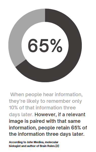
90% of information transmitted to the brain is visual, and people process visuals 60,000 times faster than text. Infographics, charts, and other visual tools increase the likelihood of remembering information , this means that carbon emissions, energy usage, or waste statistics—often hidden in dense reports—become instantly understandable when visualized. For example, seeing a pie chart that breaks down carbon emissions by activity makes it easier to grasp where one’s biggest impacts lie.

Gamification Makes Learning Stick

Gamification—adding game-like elements such as goals, rewards, or challenges—enhances engagement and motivates users to take action.

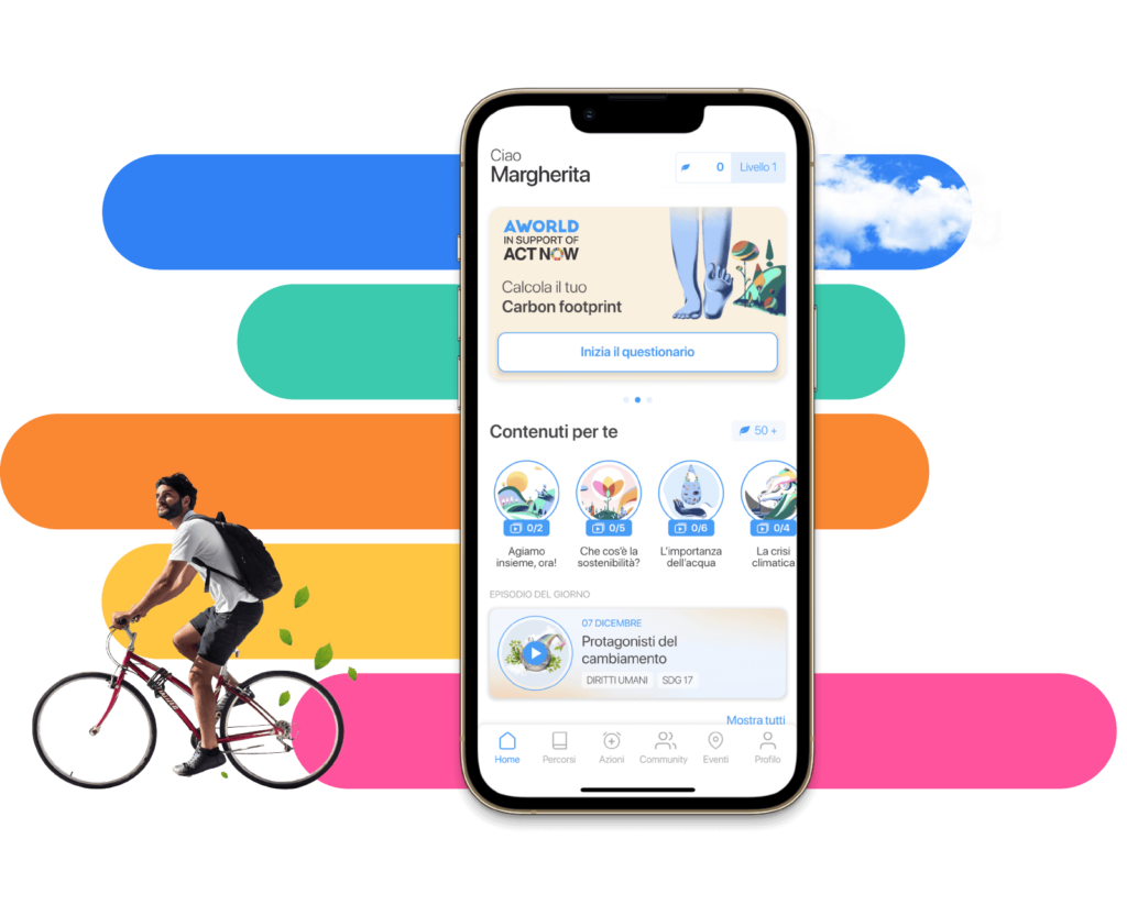
  • Gamified apps like eco2log, which track and reward users for reducing their carbon footprint, turn data into a journey of self-improvement.
  • Users are more likely to retain information and build habits when feedback is interactive and rewarding.

For example, an app might visualize a user’s digital energy use (like GB streamed) as a tree. The tree thrives when they make sustainable choices, such as streaming in lower resolutions or reducing data usage.

Successful Examples of Visualization in Action

UN’s Carbon Footprint Calculator
The United Nations’ online tool uses interactive sliders and graphs to show how choices in transport, food, and housing affect emissions. It’s an excellent example of visualizing complex data in an engaging, accessible way.

https://peggada.com/en/4-apps-to-help-you-calculate-and-reduce-your-carbon-footprint/

Chasing Ice Documentary
This film used stunning time-lapse visuals of melting glaciers to drive awareness of climate change. The emotional impact of visuals was a key factor in its success.

Piktochart Campaigns
Infographics created with platforms like Piktochart have simplified sustainability statistics, making them widely shareable on social media and accessible to non-expert audiences .

Visualization has the potential to transform how we understand and act on sustainability. When data is clear, engaging, and actionable, it sticks with us—and motivates change.

Resources:
https://www.tiny.cloud/blog/content-visual-imagery-guide/#stk-2-6

https://piktochart.com/blog/data-visualization-statistics/#the-effectiveness-of-data-visualization

#04 Can awareness help?

How do the users behave and respond to design interventions, such as carbon impact calculators or green streaming options? In the next paragraphs I would like to describe one scientific research from Germany made in January 2024 aimed to understand how feedback from the CFTA eco2log app affects consumer behavior and their carbon footprint.

The Study

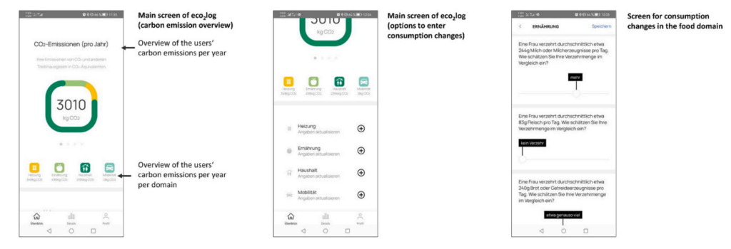
This research involved 216 university students who used the CFTA eco2log app—a tool designed to calculate individual carbon emissions in four major consumption areas: mobility, food, heating, and household activities. Participants entered their current consumption habits into the app, which provided detailed feedback on their carbon footprint, both overall and in each domain.[1]

Screenshots of the App, https://www.sciencedirect.com/science/article/pii/S0959652623041392#dfig1

After receiving feedback, participants planned modifications to their consumption and entered these future plans into the app. The app then recalculated their estimated emissions based on these planned changes, giving participants an opportunity to reflect on their behaviors and make more sustainable choices.[1]

Key Findings

Awareness Sparks Action

The study revealed that awareness drives change. When participants were confronted with their actual carbon footprint, they were motivated to plan significant reductions in their emissions. On average, participants aimed to reduce their overall carbon emissions by 22.5%.However, the reductions varied by domain:

  • Household activities saw the largest reduction (34.7%).
  • Heating came next (26.9%), followed by food (16.4%).
  • Mobility had the smallest reduction (12.0%), and this change was only marginally significant.

Feedback Drives Domain-Specific Changes

Interestingly, the app’s feedback was most effective in encouraging changes in the exact area where it highlighted high emissions. For example, feedback about high emissions from heating inspired participants to plan significant reductions in heating-related consumption. There were minimal cross-effects—feedback on one domain (e.g., mobility) didn’t strongly influence behavior in other areas (e.g., food).

Awareness Gaps

The study also showed that participants struggled to estimate their carbon footprint accurately, especially in specific domains. While they could gauge their overall footprint somewhat reliably, they often underestimated or overestimated emissions in individual areas like food or heating. This underscores the importance of tools like the CFTA app, which provide precise, data-driven feedback.[1]

What Does This Mean for Sustainability?

The study demonstrates that design interventions like the CFTA eco2log app can effectively encourage more sustainable behaviors by raising awareness and providing actionable feedback. However, it also highlights the need for tailored approaches. Not all users respond equally—some changes, like reducing food-related emissions, require different strategies than those for mobility or household activities.

Conclusion

Awareness alone is a powerful first step, but tools that provide specific, domain-focused insights are key to driving meaningful, lasting behavior changes. The principles tested in the study—awareness, actionable feedback, and domain-specific insights—are equally relevant and powerful in encouraging more sustainable behaviors in the digital world. Creating tools to measure and share the energy footprint of online activities could be the first step toward a greener digital future.

Resources:

[1] Stefan Hoffmann, Carbon footprint tracking apps. Does feedback help reduce carbon emissions?,
Journal of Cleaner Production, Volume 434, 2024, 139981, ISSN 0959-6526,https://www.sciencedirect.com/science/article/pii/S0959652623041392#dfig1

#4 Editorial Illustration

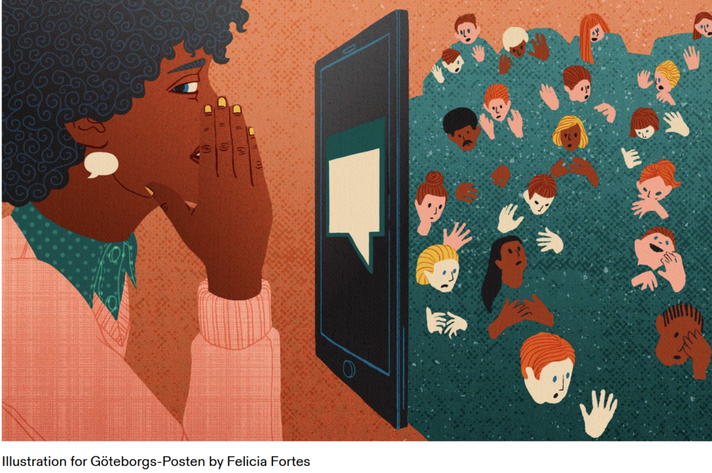
Editorial illustrations are creative and artistic images used in print and digital media such as magazines, books, newspapers, or even social media articles and blogs. These illustrations are meant to visually represent the content of the text or support a message.

Editorial illustrators have a responsibility, especially when dealing with sensitive topics like politics, society, race, or gender. The way they present these topics can significantly influence how readers perceive them. They need to be aware of the possible impact of their representations and ensure their work doesn’t reinforce stereotypes or prejudices. This ethical responsibility is an important part of editorial work.

Purpose

The main role of editorial illustrations is to make text easier to understand. They help to explain complex or abstract ideas more clearly and can evoke emotions that bring the reader closer to the topic. By highlighting certain aspects of the content, illustrations can emphasize key points or leave room for interpretation. In addition to engaging with the text, illustrations also help capture the reader’s attention and break up monotonous text.

Styles and Techniques

Editorial illustrations can use different styles depending on the message or mood that needs to be conveyed. These can range from traditional hand-drawn images to modern digital designs. Techniques like collage, infographics, or minimalist drawings are also common. The style often depends on the medium. For example, graphics in internet blogs may use simple, flat designs, while children’s books often feature more playful and detailed illustrations.

The creative process

The creative process in editorial illustration involves several steps. First, illustrators need to understand the themes and concepts of the article or story to create relevant and appealing visuals. They typically work closely with editors or art directors to make sure their illustrations support the main message of the text clearly and effectively. It’s also important for illustrators to work within the required deadlines for publication.

Resources

#03 Everyday impact of basic individual actions online

Whether we’re scrolling through TikTok, sharing moments on Instagram, or firing off texts and emails, our days are filled with digital interactions. These actions feel easy and harmless, but they carry an environmental cost many of us overlook. By understanding the true cost of our digital habits, we can take small, informed steps toward reducing our online carbon footprint.

Which age group has the biggest impact?

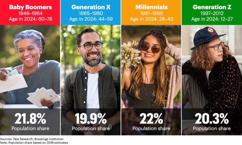
While all age groups contribute to the digital carbon footprint, it’s no surprise that Gen Z has the largest impact. Individuals aged 18-24 send an average of 124 text messages per day, which results in 652.3 grams of CO2 annually. This is roughly equivalent to a 5 km car ride! In comparison, older age groups, like those aged 55 and above, produce significantly fewer emissions. It’s important to recognize that while younger generations are the most active digital consumers, their habits also present an opportunity for change. [1]

https://www.quad.com/insights/leaving-the-nest-as-generation-z-comes-of-age-household-care-brands-see-a-golden-opportunity-for-growth

The Environmental Impact Of “Doom Scrolling”

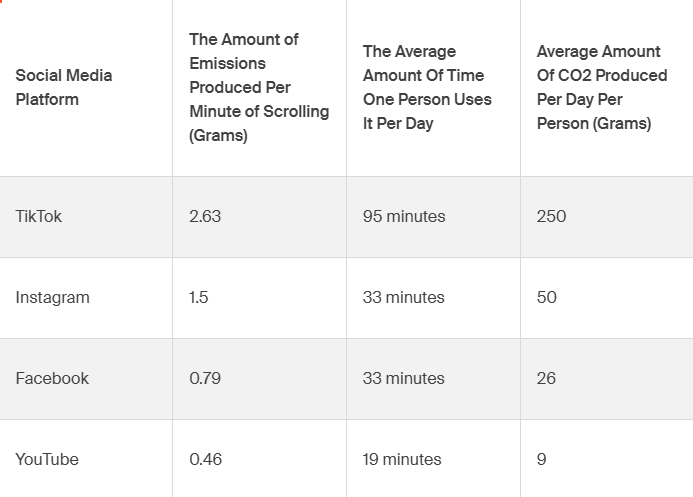
Social media platforms like TikTok and Instagram are part of daily life for billions of people. However, each minute spent scrolling contributes to a significant carbon footprint due to the energy consumption of the data centers that power these platforms. TikTok, for instance, emits 2.63 grams of CO2 per minute of use. With an average user spending 95 minutes per day on the app, this results in over 250 grams of CO2 daily, which is comparable to driving a car for 4 km. [1]

Which social media platforms produce the most emissions? 

Not all social media platforms have the same environmental impact. TikTok leads the way in terms of emissions, as its video-heavy content consumes more data and energy. On average, TikTok emits 2.63 grams of CO2 per minute of use. Instagram follows closely behind, with its visual-based content requiring significant data storage. Platforms like Facebook and YouTube also contribute heavily due to their massive user bases and video streaming services, making them some of the most energy-intensive platforms to use.

“To put this even more into perspective, air travel emits around 133 grams of CO2 per mile per passenger for short-haul flights. So, doom-scrolling for one day equates, on average, to the same emissions for about seven passengers per mile on one of these flights.[1]”

The Environmental Impact Of Mindless Texts And Emails

Even sending a simple “LOL” or a quick “OK” by text adds up. In the U.S., the average person sends 61 texts per day, and each message emits 0.014 grams of CO2. Over a year, this equates to 310 grams of CO2, or the same as charging your phone 32 times. Similarly, sending work emails can have a surprisingly large environmental cost. On average, each email contributes about 2 grams of CO2, leading to over 2,000 grams per year.[1]

Resources:

[1] Cody Slingerland, Tech Carbon Footprint: How Much Does Online Activity Contribute To Emissions? https://www.cloudzero.com/blog/tech-carbon-footprint

What Tesla Got Right (and Wrong) About UX/UI Design

Tesla has long been a leader in transforming the way we think about cars, especially when it comes to technology and user experience. The company’s bold design decisions, such as the large touch interface, have revolutionised the automotive industry. But with innovation comes both praise and criticism. Here’s a closer look at what Tesla’s UX/UI design has done well – and where it could improve.

(Source: https://ecomento.de/2019/09/02/tesla-model-3-interieur-jetzt-ohne-leder/)

What Tesla has done well:

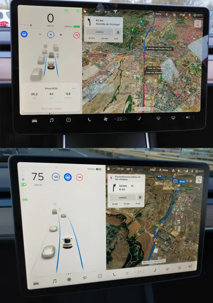
One of Tesla’s most notable contributions to the automotive world is its minimalist design, especially in the dashboard of its vehicles. The central touchscreen of the Tesla Model S and Model 3 is sleek and streamlined, allowing users to interact with many of the car’s features through an intuitive digital interface. The move has eliminated the need for many physical buttons, simplifying the driving experience and creating a more modern, technically advanced feel.

Tesla also stands out by integrating software updates through an over-the-air (OTA) system. This means that, even after purchase, a Tesla car is continually upgraded with new features and bug fixes delivered directly to the vehicle, similar to how smartphones are updated. This user experience flexibility is a game changer in automotive design.

(Source: https://uxplanet.org/case-study-wellnesslivings-ux-ui-design-team-s-enhancements-to-tesla-s-new-v11-0-dashboard-design-21730e00178e)

What Tesla did wrong:

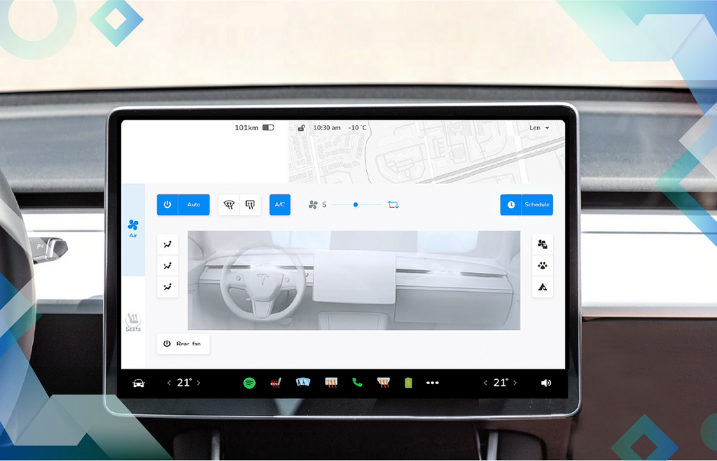
However, not all aspects of Tesla’s UX/UI have been widely complimented. One of the most common criticisms is the size and placement of some of the buttons on the touchscreen. Many users find that adjusting basic functions like the HVAC system or wipers while driving can be frustrating. These controls are often small and not always intuitively located, making it difficult for drivers to access them quickly and safely.

Another common complaint is the lack of customisation of Tesla’s infotainment system. Unlike some competitors, Tesla does not offer Apple CarPlay or Android Auto, which could provide users with additional navigation options, such as Waze integration. While Tesla’s large map display is much appreciated, the system lacks route planning for multiple destinations, which can be a significant annoyance for users who rely on complex navigation for their trips.

(Source: https://uxplanet.org/analyzing-the-new-tesla-ui-2020-48-26-8dccd52dd594)

Opinion:

Overall, Tesla has pushed the boundaries of automotive UX/UI design, making cars more like smartphones on wheels. The integration of cutting-edge technologies like touchscreen interfaces and OTA updates has changed the face of the industry. However, the company needs to continue to refine its design, especially when it comes to usability during active driving. As Tesla and other manufacturers continue to innovate, it will be interesting to see how they manage to balance futuristic design with practical and user-friendly interfaces that keep safety and ease of use in mind.

References:

https://uxmag.com/articles/teslas-groundbreaking-ux-an-interview-with-user-interface-manager-brennan-boblett

https://www.invisionapp.com/inside-design/tesla-ui-design/

https://ux.rachelsdesign.com/tesla-case-study/

https://uxplanet.org/case-study-wellnesslivings-ux-ui-design-team-s-enhancements-to-tesla-s-new-v11-0-dashboard-design-21730e00178e

The Future of Automotive UX

The automotive industry is undergoing a change and user experience (UX) design is at the forefront of this development. As vehicles become more connected, intelligent and user-centric, the future of automotive UX promises to redefine the way we interact with cars. Below is a look at the key developments that are shaping this future.

Sustainability and Intelligent Design

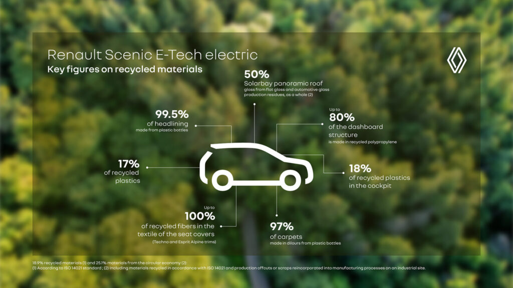
As sustainability becomes a global priority, automotive UX is adapting to promote eco-friendly practices. Game-based interfaces encourage fuel-efficient driving behaviours, while electric vehicles (EVs) offer advanced features such as intelligent climate control systems that optimise energy use. In addition, automotive manufacturers are incorporating sustainable materials into vehicle interiors to align with environmental goals.

(source: https://www.renaultgroup.com/en/news-on-air/top-stories-2/design-talks-eco-design-rewrites-the-future-of-cars/)

Advanced Driver Assistance Systems (ADAS)

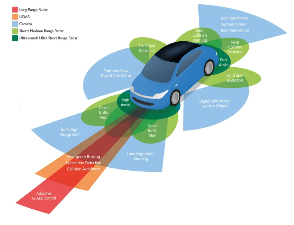
Safety remains at the forefront of automotive UX innovation. Advanced Driver Assistance Systems (ADAS) include features such as forward collision warning, lane departure warning, adaptive cruise control and automated parking. These technologies not only improve safety, but also reduce driver stress by taking over repetitive or difficult tasks.

(Source: https://www.wardsauto.com/vehicles/transforming-the-future-of-vehicle-ownership-with-adas-technology)

AI-driven personalisation

Artificial Intelligence (AI) is revolutionising the in-car experience by enabling hyper-personalisation. Vehicles are now able to learn user preferences, such as seat positioning, climate control and entertainment choices, to create tailored experiences. AI-powered voice assistants are also becoming more intuitive, enabling natural conversations that eliminate the need for memorised commands. This integration of generative AI enhances convenience while fostering a deeper connection between users and their vehicles.

(Source: https://www.ramotion.com/blog/automotive-ux-design/)

References:

https://nix-united.com/blog/ai-in-automotive-a-new-edge-of-the-automotive-industry/

https://www.uxconnections.com/future-trends-and-innovation-in-the-automotive-industry/

https://rightware.com/blog/the-future-of-automotive-ux-from-the-designers-perspective/

https://medium.com/@sreelakshmis.dilip/exploring-the-latest-trends-in-automotive-ux-a39ec4f9e95c

1.1. Bridging the Physical and Digital Worlds: Transforming Museum Experiences through Interactive Technologies

Traditional museum experiences typically involve passive observation. However, by integrating interactive technologies such as touch screens, VR/AR, and motion-sensing installations, museums can improve their exhibits and make them more engaging. Additionally, incorporating DIY elements that allow visitors to create or contribute actively ensures a participatory and enriching experience.

Research Question and Sub-Questions
My central research question is:
How do DIY elements (visitors creating their own experience) and interactive technologies improve engagement and retention in learning within museums?

This question is supported by sub-questions like:
How can these methods be adapted for different age groups?
Can these methods foster community building within museum spaces?
Can DIY experiences remain truly “hands-on” when combined with advanced tech?

DIY Elements:
DIY elements in museums enable visitors to actively engage by creating or developing exhibits. This hands-on participation boosts creativity, problem-solving, and a deeper connection to the content, improving both engagement and learning. Studies show that visitor satisfaction increases significantly when exhibits involve personal input, with 49% of respondents preferring interactive exhibits. [1]

Interactive Technologies:
Technologies like AR, VR, and motion sensors offer dynamic, immersive experiences, enriching emotional and intellectual engagement. AR overlays digital content on physical exhibits, while VR transports visitors to virtual spaces, increasing their understanding. Research highlights how these technologies create personalized, engaging experiences. [2]

image source: Science Museum

Relevant Institutions
A list of museums and science centers that I intend to explore in greater depth. This research will focus on their exhibits, educational programs, and the impact they have on the community.

Personal Motivation
By exploring this topic, I hope to uncover creative methods to make museums more interactive and engaging. My goal is to transform these spaces into environments where learning is enjoyable and becomes a shared adventure. In doing so, I hope to help people connect with one another and create memorable experiences that they can truly enjoy together.

Next Steps
In the next steps, I plan to:

  • Analyze existing examples of interactive museum experiences. (reference “Relevant Institutions”)
  • Investigate how community building happens through cooperative DIY activities.
  • Evaluate the impact of interactive exhibits on information retention.
  • Compare non-technology-based tangible interactions to those using tech in museum settings.

Sources

  1. X. Li, “Interactive elements in museum design,” Journal of Museum Studies, vol. 15, no. 3, pp. 211–230, 2020.
  2. D. Baker and R. White, “The effectiveness of digital technologies for the visitor’s experience,” Journal of Digital Learning, vol. 11, no. 2, pp. 145–160, 2018.
  3. Exploratorium. [Online]. Available: https://www.exploratorium.edu.
  4. Science Museum. [Online]. Available: https://www.sciencemuseum.org.uk.
  5. CoSA Graz. [Online]. Available: https://www.museum-joanneum.at/cosa-graz.
  6. Experimentarium. [Online]. Available: https://www.experimentarium.dk.
  7. The Tech Interactive. [Online]. Available: https://www.thetech.org.