In a world where the average attention span rivals that of a goldfish (an often disproven myth, by the way, but we’ll save that for another time), it’s hardly surprising that web design has become one of the deciding factors in the success of a digital platform. What is often overlooked, however, are the neuropsychological mechanisms behind a functioning design. Welcome to a humorously academic journey into the art and science of web design – or, as we might call it: What does the brain actually think when it looks at a website?
1. Cognitive Load: The Foundation of Simplicity in Design
At the heart of effective web design lies a concept critical to the human brain’s processing power: cognitive load. This principle refers to the amount of mental effort required to absorb and process information. The cognitive load theory, popularized by psychologist John Sweller in the late 1980s, emphasizes that the brain has limited working memory, meaning that designs requiring excessive mental effort can overwhelm users and degrade their experience.
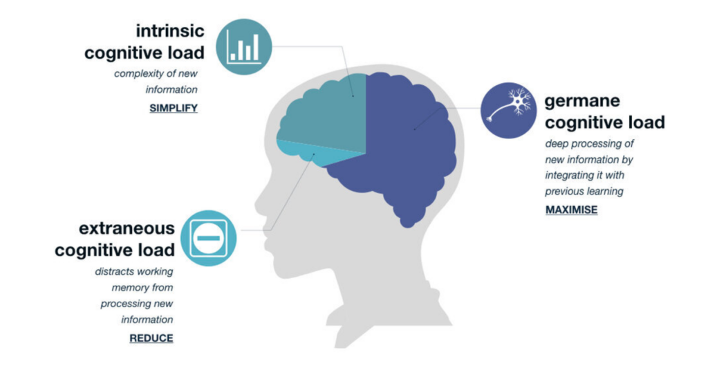
The theory revolves around a simple yet profound idea: our brains, despite all their brilliance, aren’t limitless processors capable of handling endless streams of information. Imagine your brain is a web browser with 50 tabs open—sure, it’s working, but it’s struggling. The more complex the information on each tab, the closer you are to a cognitive meltdown. Sweller proposed that learning, problem-solving, and interacting with any form of information all require cognitive resources, but those resources are finite. At its core, Sweller breaks the cognitive load into three types:
Germane Load – This is the good kind of cognitive load! It refers to the mental effort directed toward constructing useful knowledge and schema. Think of it as your brain’s attempt to make sense of new information by connecting it to what you already know, like remembering that the mitochondria are the powerhouse of the cell (yes, that fact will always stick with you).
Intrinsic Load – This is the unavoidable cognitive effort required by the task itself. If you’re trying to learn quantum physics or navigate a government website (often equally mind-boggling), your brain has no choice but to exert effort.
Extraneous Load – This is the cognitive load introduced by poorly designed instructional materials or distractions. It’s like trying to solve a math problem while someone plays “Baby Shark” on loop in the background. Extraneous load is unnecessary and should be minimized.
Sweller’s interest in cognitive load started with problem-solving research in education. He noticed something peculiar: complex problems often didn’t lead to better learning outcomes. In fact, sometimes the very act of problem-solving was so mentally draining that learners couldn’t retain much information afterward. It was as if their mental energy was entirely spent on juggling too many variables, leaving no capacity to actually understand or store what they’d learned.
Sweller’s work was heavily influenced by working memory research, particularly the famous “magical number seven” concept by George A. Miller.
Proposed by George A. Miller in 1956, this law suggests that the average person can hold about seven (plus or minus two) items in their working memory. This has profound implications for web design. Overly complex websites with too many navigation options, crowded layouts, or large blocks of text can quickly overwhelm users. A good web design reduces cognitive load by simplifying navigation, minimizing distractions, and organizing information into manageable chunks.
The principles of gestalt psychology also offer critical insights here. Gestalt theory, originally developed by psychologists such as Max Wertheimer, Kurt Koffka, and Wolfgang Köhler, focuses on how humans perceive visual stimuli as organized patterns rather than as isolated components. Gestalt laws, such as proximity, similarity, and closure, are essential to web design because they dictate how users naturally group and process information. When applied correctly, they reduce cognitive strain, making interfaces easier to navigate.
Research Reference:
Miller, G. A. (1956). The Magical Number Seven, Plus or Minus Two: Some Limits on Our Capacity for Processing Information. Psychological Review.
2. Color Theory: The Emotional and Cognitive Power of Color
Colors are not just decorative elements in web design; they are powerful psychological tools that evoke emotional and cognitive responses. Color psychology, a subfield of psychological research, explores how different colors affect mood, behavior, and decision-making. For instance, Angela Wright’s Color Affects System connects specific hues with predictable psychological responses. While the exact science of color perception is debated, certain broad patterns are generally accepted.
- Blue is often associated with calm, trust, and security, which is why it is popular among banks and tech companies (e.g., PayPal, Facebook). It has been shown to enhance focus and is thus ideal for corporate or informational sites.
- Red, on the other hand, is a color that evokes urgency, excitement, and even danger. It is often used to highlight critical elements like “Buy Now” buttons or warnings. However, red can also increase stress levels if overused.
- Green is linked to growth, health, and peace. Its calming effect makes it an excellent choice for environmental, wellness, and financial websites.
In addition to individual color effects, complementary colors (those opposite each other on the color wheel) can create dynamic, visually stimulating designs. Analogous colors (those next to each other on the color wheel) provide harmony and can be used for smooth, aesthetically pleasing interfaces.
However, it’s important to note that color perception is also highly contextual and cultural. Eva Heller, a leading scholar in color theory, points out that while colors have universal psychological effects, their interpretation can vary across cultures. For example, white is often associated with purity in Western cultures but can symbolize mourning in some Eastern societies. Web designers should, therefore, consider both the universal and cultural meanings of colors when targeting global audiences.
Research Reference:
Wright, A. (1991). The Beginners Guide to Colour Psychology. Color Affects.
3. The Fitts’s Law: Making Interaction Easy and Intuitive
When it comes to interaction design, few principles are as foundational as Fitts’s Law, named after psychologist Paul Fitts, who formulated it in 1954. Fitts’s Law predicts the time required to move to and select a target, such as a button or link, based on its size and distance. The basic premise is that larger targets are easier and quicker to click, especially when they are positioned closer to the user’s cursor or touchpoint.
This principle is highly relevant for user interface (UI) design, particularly when it comes to call-to-action buttons and navigation links. Fitts’s Law advises designers to make clickable elements large and place them in easily accessible areas, such as the center of the screen or along the edges, where users naturally focus their attention.
- Large buttons with clear labels are easier to click, reducing user frustration. This is especially critical on mobile devices, where smaller targets can lead to misclicks.
- Important actions, such as submitting a form or finalizing a purchase, should have prominent buttons that are easy to find and click. Fitts’s Law would suggest making these elements more visible and larger than secondary actions like cancel buttons.
Furthermore, the concept aligns with the law of least effort, which states that users prefer paths of least resistance. By minimizing the effort needed to perform actions, web designers can create more satisfying and efficient user experiences.
Research Reference:
Fitts, P. M. (1954). The Information Capacity of the Human Motor System in Controlling the Amplitude of Movement. Journal of Experimental Psychology.