In a world saturated with information, visualization and gamification have emerged as powerful tools to simplify complex ideas, improve learning, and influence behavior. When it comes to sustainability, presenting data visually—through tools like infographics, interactive apps, or gamified experiences—can significantly boost awareness and motivate eco-conscious actions or promoting digital sustainability.
The Power of Data Visualization
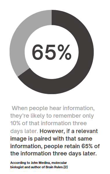
Data visualization transforms abstract numbers into meaningful insights. Studies show that:
90% of information transmitted to the brain is visual, and people process visuals 60,000 times faster than text. Infographics, charts, and other visual tools increase the likelihood of remembering information , this means that carbon emissions, energy usage, or waste statistics—often hidden in dense reports—become instantly understandable when visualized. For example, seeing a pie chart that breaks down carbon emissions by activity makes it easier to grasp where one’s biggest impacts lie.
Gamification Makes Learning Stick
Gamification—adding game-like elements such as goals, rewards, or challenges—enhances engagement and motivates users to take action.
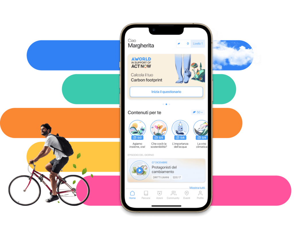
- Gamified apps like eco2log, which track and reward users for reducing their carbon footprint, turn data into a journey of self-improvement.
- Users are more likely to retain information and build habits when feedback is interactive and rewarding.
For example, an app might visualize a user’s digital energy use (like GB streamed) as a tree. The tree thrives when they make sustainable choices, such as streaming in lower resolutions or reducing data usage.
Successful Examples of Visualization in Action
UN’s Carbon Footprint Calculator
The United Nations’ online tool uses interactive sliders and graphs to show how choices in transport, food, and housing affect emissions. It’s an excellent example of visualizing complex data in an engaging, accessible way.
https://peggada.com/en/4-apps-to-help-you-calculate-and-reduce-your-carbon-footprint/
Chasing Ice Documentary
This film used stunning time-lapse visuals of melting glaciers to drive awareness of climate change. The emotional impact of visuals was a key factor in its success.
Piktochart Campaigns
Infographics created with platforms like Piktochart have simplified sustainability statistics, making them widely shareable on social media and accessible to non-expert audiences .
Visualization has the potential to transform how we understand and act on sustainability. When data is clear, engaging, and actionable, it sticks with us—and motivates change.
Resources:
https://www.tiny.cloud/blog/content-visual-imagery-guide/#stk-2-6
https://piktochart.com/blog/data-visualization-statistics/#the-effectiveness-of-data-visualization