When I arrived in Austria as an international student, I expected that most of my challenges would come from my still-developing German skills (aber ich lerne es!). And ofc as it always happens after a few months of my arrival, I needed to see a doctor.
But to my surprise, the real problem wasn’t finding a doctor.It was booking the appointment.
Most clinics required a phone call. And most receptionists spoke only German. After four failed calls, I finally found a local doctor who could help and book an appointment. Lucky me!
But when I spoke to other international students, I realized this wasn’t just my problem:
“After a few calls, I gave up and asked my Austrian friend to call.” – Orlaith, 22, Ireland “I accidentally booked a vaccination instead of a check-up.” – Younes, 23, Algeria “Yes, I booked the appointment… but it took 40 minutes!” – Elske, 30, Netherlands
This process is frustrating for everyone involved: patients feel confused and helpless, and clinics lose time (and possibly clients) and money
So I started wondering:
What if booking an appointment didn’t require fluent German?
How could this process be simpler and less stressful?
Could we implement ideas from other countries’ systems?
Most websites in my country offer virtual assistance or a chatbot on messengers. So, what if I develop a chatbot that works in both German and English? It would guide international patients step by step, collect necessary details, and ease the burden on receptionists without requiring extra staff or app downloads.
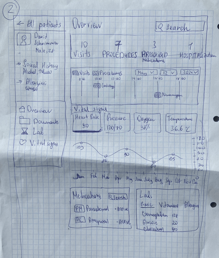
Since my Master’s thesis is connected to medicine, I’ve been exploring how to make traditionally “boring” content more engaging using gamification. In previous blog posts, I shared some early ideas, and now I’ve taken it a step further by sketching out what kind of information should be shown on the platform’s main page—for both patients and doctors.
It only took me about 10 minutes to create a rough sketch, but I focused on highlighting what I think are the most important data points: things like “Number of Procedures” “Number of Visits” “Medications Prescribed” “Appointment Calendar” and vital stats like “Heart Rate” “Blood Pressure” “Oxygen Levels” “Temperature” and etc.
User Feedback:
All participants understood the layout quickly and found the dashboard structure clear.
Everyone liked the overall concept and said they’d actually use it.
Some asked if the platform was just for doctors or also for patients—and if it would be available on Apple Watches in addition to phones and desktops.
One person even said the idea was TED Talk-worthy and suggested I reach out to medical startups to pitch it.
Final Thoughts & What’s Next:
This session was both fun and super productive. It really helped confirm that the idea has potential—especially from the patient’s perspective. The exciting news is, I already found a startup here in Graz that’s working on something very similar, and I’d love to explore the possibility of collaborating with them. Of course, that kind of process takes time.
In the meantime, I’ve decided to focus on another area of the project: making it easier for non-German speakers to book doctor appointments. In my next blog post, I’ll share more about this idea and how I plan to move forward with it.
How would you design an elevator interface for a 1000-story building? While this scenario may seem surreal, it presents an exciting challenge in user experience design. Inspired by a Google interview question, I decided to explore this concept and create a lo-fi prototype. The goal was to think through the navigation experience in such an extreme case, considering how users would interact with the system efficiently and intuitively.
Defining the Context & Target Users
To make this concept work, I first established some basic assumptions:
The building serves both residential and office purposes, potentially housing thousands of people
Multiple elevators exist, but each one needs a way to direct users efficiently
The elevators operate using a restricted access system where only authorized individuals can reach specific floors
The target users would include:
Residents – People living in the building
Employees – People working in office spaces
Visitors – Guests visiting residents or businesses
Security Persons – Ensuring safety and restricted access where necessary
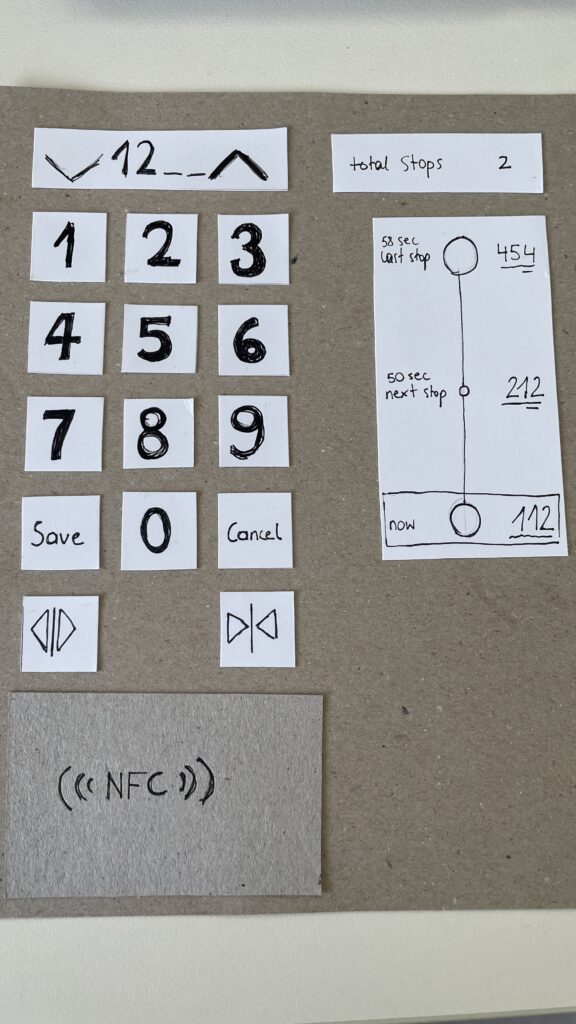
The Prototype: Navigating this big Skyscraper
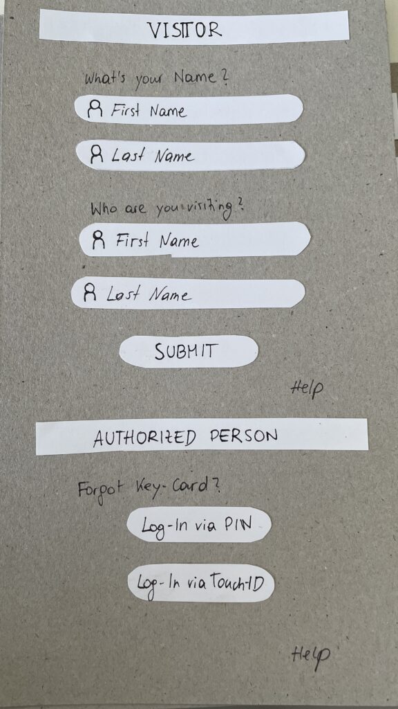
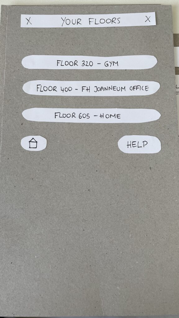
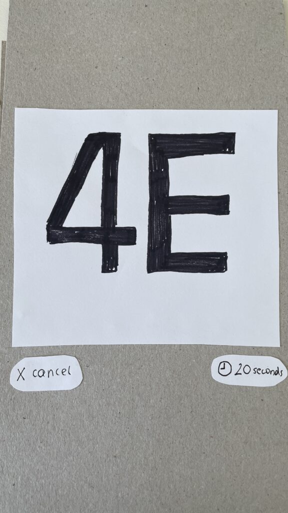
My prototype focused on the elevator interface, aiming to make navigation simple despite the overwhelming number of floors. In that 20 Minute Prototype Session was included:
Entry Screen – Users authenticate using an NFC card, PIN, or biometric login to verify access / Guests login via their name and the name of the host
Floor Selection – A personalized interface displaying only authorized floors to reduce cognitive overload
Elevator Assignment – Users are directed to a specific elevator to optimize efficiency
In-Elevator Controls – A secondary screen inside the elevator allows floor changes or emergency actions, ensuring flexibility mid-ride
The Speed-Dating session provided invaluable feedback from different perspectives. Here are some key insights:
1. Initial Reactions – What Problem Am I Solving?
Many participants struggled to recognize the interface as an elevator control system
Some assumed it was a hotel check-in or a security login screen
The concept of restricted floor access confused some users
2. Feature Suggestions – What Would You Add?
Instead of buttons labeled Save and Cancel, participants suggested clearer icons like a checkmark and a [X]
Emergency contact options were missing and should be easily accessible
Accessibility concerns arose, suggesting the need for a tactile number pad and Braille support
3. If My Prototype Had a Dating Profile…
The elevator system would market itself as “Your fastest and most efficient ride to success” or “Seamless mobility, one floor at a time.”
While the system served everyday users, i think the real customers would be building developers looking to optimize user flow in high-rise buildings
4. Future Vision – What Would Make This TED-Worthy?
While no 1000-story buildings exist today, high-rise architecture continues to evolve
Future cities may require advanced wayfinding systems, making this prototype a glimpse into possible urban design challenges
5. Unexpected Feedback – What Surprised Me?
The first login screen was misleading, making users think they were logging into a website rather than an elevator
Participants felt that unauthorized users could bypass security by following someone into restricted floors
The experience was unusual since most people are accustomed to standard button-based elevator panels
Final Thoughts & Next Steps
Exploring this extreme scenario was a fun and thought-provoking design exercise. However, given its impracticality, I won’t continue developing this prototype. Instead, I want to shift my focus to real-world mobility and wayfinding challenges, potentially designing solutions for navigation in large public spaces like airports, malls, or grocery stores.
This experience has reinforced how UX design is about clarity, accessibility, and user expectations. Designing for mobility is not just about efficiency, it’s about making interactions intuitive and seamless.
In the next blog post, I will explore potential project directions that build upon the learnings from this prototype.
Interactive installations can transform public spaces into hubs of creativity and connection. Yet, designing interactive installations that do more than capture attention — that genuinely engage people — requires more than just technical expertise. It takes a deep understanding of human behavior, user experience, and the dynamics of engagement. Designing for engagement means creating experiences that are intuitive, immersive, and meaningful; it means creating work that users will interact with and connect to on a deep level.
Only when people are truly engaged, can we as designers create an environment that allows for lasting memories to be made, shared with others, and revisited. As I’ve described in my previous blog posts, fostering engagement in public spaces can reduce social isolation and strengthen the sense of belonging. The goal is not just to capture attention but to transform fleeting moments into moments of connection.
User Experience in Interactive Installations
User experience is fundamental to the success of any interactive installation. It includes emotional, physical, intellectual, and social aspects, making each experience distinct and significant. UX is informed by various fields, as noted by several experts like Nathan Shedroff and Don Norman, who emphasize the need to design for emotions, enjoyment, and meaningful interactions. UX cannot be simplified to separate components; rather, it arises from the interaction among people, technologies, activities, and the broader social and cultural environments. 1
Understanding Engagement
Building on the foundation of a solid user experience, engagement takes it a step further by ensuring that users aren’t just interacting but becoming fully immersed in the experience. Engagement is not just participation – it is about ensuring that the interaction flows. Shedroff identifies five key features of engagement: identity, adaptivity, narrative, immersion and flow.
Identity: “Identity is needed for authenticity in the experience and expression of the self. The authenticity of an experience is about ensuring experiences are real, or realistic, and consistent.”
Adaptivity: “Adaptivity is to do with change and personalization and with changing levels of difficulty, pace and movement.”
Narrative: “Narrative is to do with telling a good story, with convincing characters, plot and suspense. Narrative is not just about fiction, however. […]”
Immersion: “Immersion is the feeling of being wholly involved within something, with being taken over and transported somewhere else. You can get immersed in all manner of things (such as reading a book) so immersion is not about the medium; it is a quality of the design.”
Flow: “[…] flow is the sense of smooth movement, the gradual change from one state to another.” 1
How to Design for Engagement
Know your Audience Knowing and understanding the target audience is crucial to creating engaging and interactive installations. It makes a big difference whether the audience consists of children, tech-savvy individuals, or a broad general public, as each group requires a specific and tailored approach. The better the installation is adapted to the needs and abilities of the audience; the more likely people are to actively engage with it.
Prioritize Intuitive Interactions It is important that interactive installations are designed to be intuitive and straightforward. Research on intuitive interactions in public spaces shows that overly complex and confusing interfaces and interactions can hinder user engagement. 3 Affordances play a crucial role here, as they define the relationship between the design of an installation and the user’s capabilities. According to Norman in “The Design of Everyday Things”, perceived affordances are particularly important — these are the action possibilities that are made obvious through design. 4When an installation’s affordances are clear and aligned with users’ expectations and abilities, it enhances ease of use and promotes more meaningful interaction, ultimately improving user engagement.
Accessibility and Inclusivity To truly engage diverse audiences, designers must ensure installations are accessible to everyone. This includes providing physical access, sensory accommodations, and possibly language-neutral designs. 5
Storytelling Good storytelling engages the user by creating an emotional connection and leaving lasting impressions. Through experiences that evoke strong emotions — such as awe, joy, sadness, or curiosity — strong engagement can be fostered. A compelling story, whether abstract or real, gives people the feeling of purpose and discovery. Through emotional resonance, the experience becomes not only memorable but also increases the likelihood that people will share it, thereby amplifying its impact. 6 7
Incorporating Multisensory Experiences Incorporating multisensory experiences into interactive installations enhances user engagement by appealing to multiple senses, such as sight, sound, touch, and even smell or taste. This approach creates more immersive and memorable experiences. 8
Personalization Personalization in interactive installations significantly enhances engagement by allowing participants to shape the experience through their actions. It could be visual feedback, sound, or even changing environmental elements. Customizing the experience empowers users, making them feel more connected and involved, as their choices directly influence the outcome. 9
Enjoyment Designers are increasingly focusing on integrating pleasure into their designs alongside usability, enhancing both emotional and hedonistic appeal. The focus is on creating enjoyable experiences by addressing physical, social, and psychological aspects in design. Don Norman also emphasizes these factors in improving user experience. Additionally, gamification principles explore how different types of fun — such as challenging, relaxing, meaningful, and social—drive engagement, enjoyment, and learning, highlighting the emotional impact of well-designed interactive experiences.1
Aesthetics Aesthetics is rooted in the appreciation of beauty, how things are sensed, felt and judged. It plays a significant role in interactive installations. Experiences can be divided into pragmatic attributes (effectiveness and efficiency) and hedonic attributes (emotion and enjoyment). Emotions are the core of experiences, as they are closely intertwined with cognition, motivation and action. 1
Social Interactions Social interactions play a crucial role in increasing engagement in interactive installations, particularly through collaboration. These social dynamics shape how participants connect with the installation and each other, enhancing their overall experience. Installations become more engaging when they allow people to share the experience, leading to deeper emotional connections. 10
As designers, our task is beyond creating eye-catching installations — we are shaping the future of public spaces. So, as we move forward, let’s ask ourselves: how can we continue to break barriers and design experiences that invite people to engage not just with the technology, but with each other, building a more connected and inclusive world?
Inspired by the acclaimed 21 Balançoires (21 Swings) installation, The Swings: An Exercise in Musical Cooperation is a standalone, touring musical installation designed for international audiences. This interactive artwork features a series of musical swings that create harmonized melodies when used collectively. Certain musical patterns emerge only through cooperation, encouraging participants to synchronize their movements with others. It’s a playful experience that fosters connection and collaboration from the very first swing. With The Swings, participants engage their entire bodies to make music, fostering a sense of togetherness and shared ownership of public space. The result is a large-scale, collective instrument that unites people of all ages and backgrounds. Designed to transform urban environments, festivals, and special events, this installation offers a unique approach to communal music-making. Since its debut in 2011, the original 21 Swings installation has drawn millions of visitors to Montréal’s Quartier des Spectacles, where each swing moves an average of 8.500 times per day. 11
It draws the public in positive ways. It made our city feel like a genuine urban destination.
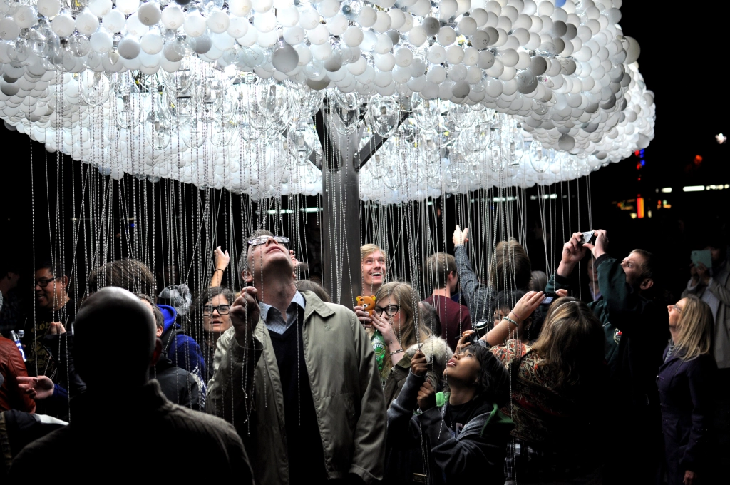
CLOUD is an interactive light sculpture, composed of 6.000 repurposed incandescent bulbs. Using pull-chain switches, participants work together to animate bursts of light, creating a shifting display reminiscent of lightning.
Blending playfulness with collaboration, CLOUD transforms viewers into performers, illustrating how individual actions contribute to a greater whole. The artwork offers both participation and contemplation, as those beneath the sculpture shape its movement while others observe the evolving patterns. Drawing on the universal imagery of rain clouds, CLOUD transcends cultural and language barriers, inviting shared wonder and connection. 12
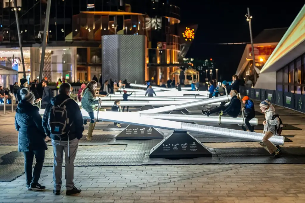
Impulse invites you into a playful, multisensory experience centered around a childhood classic: the seesaw. This interactive installation features a series of seesaws that respond to movement with shifting lights and sounds, transforming public space into an ever-evolving spectacle. More than just a playful ride, Impulse is designed with intentionality. Inspired by serialism — a structured musical composition technique — the installation creates dynamic zones of energy and tranquility, ensuring a harmonious blend of motion and sound.
Encouraging play, laughter, and connection, Impulse fosters a shared experience that brings people together, turning a simple act of movement into a joyful expression of community. 13
Sources
[1] D. Benyon, Spaces of Interaction, Places for Experience. 2014. doi: 10.2200/S00595ED1V01Y201409HCI022.
[2] N. Shedroff, Experience Design, a Manifesto for the Creation of Experiences. New Riders, 2009, pp. 9–10.
[3] L. Hespanhol and M. Tomitsch, “Strategies for intuitive interaction in public urban spaces,” Interacting with Computers, vol. 27, no. 3, pp. 311–326, May 2015, doi: 10.1093/iwc/iwu051.
[4] D. Norman, The Design of Everyday Things: Revised and Expanded Edition. Hachette UK, 2013.
[5] „What is inclusive design?“ https://www.inclusivedesigntoolkit.com/whatis/whatis.html
[6] „What is Storytelling?“, The Interaction Design Foundation, 30. November 2024. https://www.interaction-design.org/literature/topics/storytelling?srsltid=AfmBOooli8H26zn96VkuoNycaHkmn_oTQgdY-NcWh1BKTjmWxgABHoDz#how_storytelling_works_in_design-1
[7] M. L. H. M. Hanapiah und S. M. Nasir, „A Systematic Review towards Evolution of Interactive Storytelling and Audience Engagement in Films“, International Journal Of Creative Multimedia, Bd. 5, Nr. 1, S. 55–73, Apr. 2024, doi: 10.33093/ijcm.2024.5.1.4.
[8] L. Lin and L. Lu, “Research on the Design of Multisensory Interactive Experiences in Museums Based on Embodied Cognition,” in HCI International 2024 Posters, C. Stephanidis, M. Antona, S. Ntoa, and G. Salvendy, Eds., vol. 2119, Cham, Switzerland: Springer, 2024, pp. 1-10. [Online]. Available: https://doi.org/10.1007/978-3-031-61966-3_23.
[9] B. Moggridge, Designing Interactions. The MIT Press, 2006.
[10] J. Schell, The Art of Game Design. 2008. [Online]. Verfügbar unter: https://dx.doi.org/10.1201/9780080919171