So, this is the last blog post I’m writing for this semester and, essentially, for my studies here at FH. In this post, I want to reflect on the pre-research phase I’ve been working through over the past three months: what I kept, what I changed, what new directions emerged, and what I will do next.
Throughout these posts, you might notice some gaps in how I describe my progress and decisions. I treated this series more like a space to think out loud than a clean research documentation. Still, it shows my process in a raw and honest way.
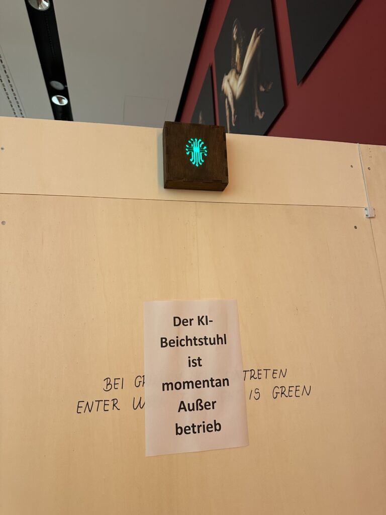
My writing has been heavily focused on Play. Before even naming social anxiety as a core research pillar, I already knew I wanted to explore play and closely related topics like gamification, board games, and video games. In the end, I did not directly include those formats in my topic. However, play remained central. I now treat it as a design perspective rather than as something tied to traditional definitions of play. I am especially interested in social play, since social anxiety is deeply connected to relationships between people and to how we experience ourselves in social spaces.
Social Anxiety, which I dedicated post #2 to, is what has shaped my theoretical frame so far. I am no longer trying to “represent” social anxiety as a state or a label. Instead, I am moving toward designing for social comfort and emotional safety through interaction. To do this responsibly, I still need to research its characteristics and emotional qualities more deeply through literature, as well as through interviews with therapists or practitioners. This will allow me to ground my design decisions in real experiences rather than assumptions.
From the beginning, I imagined Tangibility, or Tangible Interaction, as the main way people would engage with my artefact. Lately, I’ve realised that tangibility alone may not automatically serve what I want to achieve. What has started to matter more to me now is not just what people touch, but how their body is involved in the interaction. This is where Embodied Interaction comes in for me.
Instead of thinking only about screens, objects, or interfaces, Embodied Interaction looks at how meaning is shaped through the body. Through posture, movement, distance to others, breathing, and the way we physically respond to situations. That feels very close to social anxiety, because anxiety is not only something you “think.” It shows up in the body: in tightness, in hesitation, in avoiding eye contact, in staying still when you want to move, or moving when you want to disappear.
Working with the body allows me to explore these qualities in a more direct and experiential way, instead of only talking about them.
This is also where Soma Design fits into my thinking. It builds on Embodied Interaction but focuses even more on awareness, sensation, and subtle bodily shifts. It helps me pay attention to what is felt, not just what is seen or understood. RtD gives me a structure to think through making, Soma Design gives me a sensitivity to lived experience, and prototyping becomes the way I actually think, not just the way I produce outcomes.
I am also beginning to explore empathy not just as understanding, but as something that can be felt through the body. My goal is not to explain social anxiety, but to create conditions where people can sense what it is like to navigate difficult emotions in social situations. Playful, gentle, and subtle interactions can act as entry points into these experiences without forcing people into exposure.
Wearables are a possible direction here, not as gadgets, but as tools for private, intimate interaction that combine the analog and digital by directly involving the body. They can support embodied, somatic experiences that remain personal rather than performative.
How my way of thinking has changed:
At the beginning, I focused mostly on the outcome: what technology to use, how things might look, what form the artefact could take. Now I understand that this comes after the conceptual work, which is shaped by the theoretical framework and the methods. I am learning to let meaning lead form, not the other way around.
So far, this is the theoretical base I’ve ended up with:
- Social Anxiety: characteristics & emotional qualities
- Embodied Interaction
- (Social) Play
- Soma Design – Kristina Höök
- Research through Design (RtD)
- Prototyping
- Analog-Digital
- (Empathy)
- (Wearables)
Over the next few months of developing the thesis, I want to continue working in this way, moving from reading and reflecting into small material experiments.
AI was used for corrections, better wording, and enhancements.