IMPULSE #4 – TED Talks

For my last blogpost in November, and with the deadline suddenly very close, I decided not to overthink what activity to choose. Instead, I made myself a TED Talk evening, letting myself wander, research, and explore until I found talks that could spark something meaningful. And surprisingly, I found a lot. Five talks, all circling around creativity, identity, and what it means to navigate the design world with many interests at once.

The art of being yourself by Caroline McHugh

McHugh talks about identity as something you grow into, not something you force. Her reminder that we spend too much time comparing ourselves to others felt painfully accurate. Comparison is constant in design. This talk made me reflect on how designers form their identities in a field that almost encourages fragmentation. It helped me see that having many interests doesn’t weaken identity, it shapes it. Identity in a multidisciplinary industry isn’t about choosing one path, it’s about understanding your own mix.

The power of creative constraints by Brandon Rodriguez

Rodriguez argues that constraints aren’t the boundaries of creativity, but the foundation of it. Drawing from engineering and scientific history, he shows how many major discoveries were made by accident and how those “mistakes” revealed new constraints that pushed innovation even further. In science, limits don’t shut creativity down, they activate it. And the same is true in design. As someone who often feels overwhelmed by endless possibilities, this talk reminded me that constraints, whether tools, time, or even my own abilities, can actually guide ideas instead of restricting them.

Embrace the Shake by Phil Hansen

In art school, Phil Hansen developed a hand tremor that made his signature pointillist drawings impossible. He felt lost, like his entire creative identity had collapsed, until a neurologist told him something simple: embrace the limitation. That shift changed everything. Instead of fighting the shake, Hansen used it, exploring new materials, motions, and techniques. His story shows that creativity doesn’t vanish when a skill becomes shaky; it evolves. And for generalist designers pressured to “excel” at everything, this is a powerful reminder: working with our limitations, not against them, can open up completely new creative paths.

Where good ideas come from by Steven Johnson

People often credit their ideas to individual “Eureka!” moments. But Johnson shows that history tells a different story. He takes us on a fascinating tour, from the “liquid networks” of London’s coffee houses to Charles Darwin’s long, slow hunch, all the way to today’s high-velocity web. Creativity, he explains, emerges from the slow collision of many influences rather than sudden inspiration. Again, an impulse connected to exploring multiple interests, showing that a broad mix of experiences can be the fertile ground where ideas grow and intersect.

How to build your creative confidence by David Kelley

Is your school or workplace divided into creatives versus practical people? Kelley challenges this notion, emphasizing that creativity isn’t reserved for a chosen few. Drawing from his legendary design career and personal experiences, he shares how confidence to create comes from taking small risks repeatedly. Throughout my life, my biggest obstacle has been people discouraging my ideas, but I am learning that I have to ignore them to succeed. Kelley’s message resonates deeply for anyone navigating multiple roles or interests: creativity grows when you trust yourself and keep experimenting, even in the face of doubt.

In the past, watching TED Talks often felt like a task (assigned by teachers or professors), something to check off a list. This evening, however, it was entirely different. I watched out of genuine curiosity, letting myself be inspired, challenged, and surprised. Sometimes, the most valuable insights come when we follow our own impulses and let ideas find us.

Disclaimer: This blog post was written with the help of AI for better grammar and correct spelling.

IMPULSE #3 – George UX Conf 2025: a talk by Mick Champayne

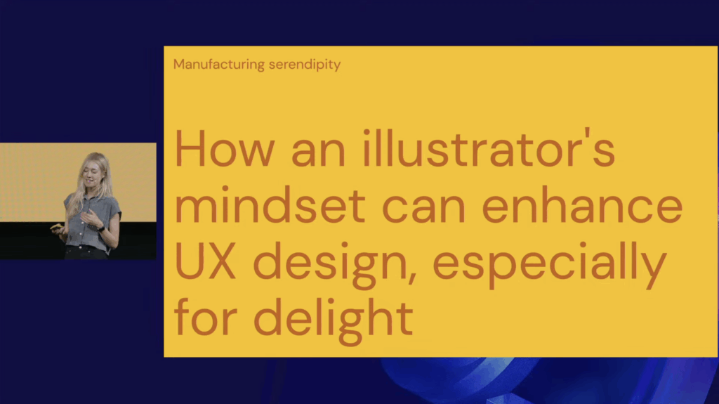
Even though I couldn’t attend the George UX Conference in Vienna on 5th of November, I watched the recorded talks afterward. One immediately stood out: “Manufacturing Serendipity: Designing Delight at Scale with a Little Help from AI” by Mick Champayne, an illustrator-designer from Google. The talk unexpectedly resonated with the direction my master’s thesis is slowly taking: multidisciplinary design identity, AI as a creative bridge, staying calm amidst many skills, and the psychology of being a generalist designer.

At first, I wasn’t excited about revisiting AI in my research. Lately, it has felt overwhelming, and I even thought: “Let’s move away from AI this semester.” But then… the talk reminded me: AI is the elephant in the room. You can’t escape it, and its presence has moved from novelty to ubiquity. Mick presented it not as a threat, but as a playful, human tool, a spark for creativity.

Mick shared how being both an illustrator and a UX designer initially felt like living in two worlds: order equals UX, chaos equals illustration. This resonated deeply with me because I’ve often felt split between multiple design selves: UI/UX, visual storytelling, graphic design, motion design, interaction design … Her experience reassured me that embracing these differences doesn’t dilute identity, it can strengthen it.

A particularly fascinating part was how she trained her own AI model using her illustration work. She fed the machine her best pieces as a data set, and the results at first were bizarre: strange proportions, odd humor. Instead of rejecting the accidents, she embraced them, now using AI mostly for first drafts. She redraws and reinterprets the outputs, extending her own style rather than replacing it. This combination of machine draft and human reinterpretation felt directly relevant to my thesis: AI can act as a bridge connecting skills, not a replacement.

Mick also described using AI as a “creative spark factory”, particularly for projects outside her expertise. For example, she helped design Google easter eggs for Swifties (Taylor Swift fans), creating a playful scavenger-hunt-like experience that blended illustration, pop culture, storytelling, and UX. Her principles for creativity, translating feelings, fostering curiosity, and looking for happy accidents, felt like rules for surviving and thriving as a generalist.

Another highlight was her process of “vibe coding” in Gemini, moving rapidly from idea to tiny playable prototype. Her team even holds DGIF: Delightful Generation of Ideas and Features every Friday. And her definition of delight, shifting something from “it works” to “I love it”, captured something essential about creating meaningful experiences. I also appreciated her humor: her illustrations are playful, sometimes chaotic, often feminine, incorporating absurdities like butts, boobs, and farts, showing how personality and joy can coexist in professional design.

Watching this talk sparked a personal realization: I want to start digital illustration. One of my “other design selves” seems ready to be explored. More importantly, it reassured me that exploring multiple creative paths isn’t a distraction, it’s central to my identity as a designer. For my thesis, it clarified something vital: it’s not about choosing a single design identity, but understanding how multiple identities can coexist and fuel creativity. Mick’s work demonstrates a real-world example of blending art, UX, and AI into a coherent practice, showing that curiosity, experimentation, and calm engagement with chaos can be a source of innovation.

Stuff Worth Clicking A.K.A. Accompanying Links

Disclaimer: This blog post was written with the help of AI for better grammar and correct spelling.

IMPULSE #2 – Everything is a Remix: video essays by Kirby Ferguson

This impulse started in the most unplanned way possible: boredom. I was aimlessly scrolling through YouTube when the original Everything Is a Remix series popped up. I clicked on it just to have something in the background, and then ended up watching the whole thing, plus the 2023 edition right after.

At first, it didn’t seem relevant to my Design & Research work at all. The documentary begins with the music industry, showing how songs recycle melodies and structures. Then it shifts to movies, pointing out how Hollywood endlessly reuses storylines, characters, and visuals. I didn’t expect any of this to spark anything academically useful… but it did.

The more I watched, the more the core message hit me: creativity is combination. Nothing begins as a pure, untouched idea. Designers, musicians, filmmakers, we’re all remixers. We borrow, reshape, merge, distort, and evolve things that already exist. That’s not a flaw of the creative process, it is the creative process.

This came at the perfect moment for me, because I’ve been stressing a lot about finding a unique topic for my Master’s thesis. The fear of “this isn’t original enough” has been in my head for months. But this documentary reminded me that originality is kind of a myth. Every famous movie, interface, or design moment has roots somewhere else. Creativity happens through exposure to many sources, not by inventing something out of thin air.

One part I loved was the reminder that copying is how we learn. Nobody starts out original. Kids copy drawings. Musicians learn by copying songs. Designers remake interfaces, posters, and layouts before they know how to create their own style. Copying gives you understanding, transforming gives you creativity. That’s exactly what the documentary showed again and again.

The most interesting section for me was about interfaces. It showed how early computers developed (especially Apple’s Macintosh) and how much of it came from remixing ideas from Xerox PARC and other pioneers. Even the updated 2023 version keeps those examples, but adds new ones from the 2020s, which makes it even easier to understand today in 2025. Interfaces evolve the same way music and film do: through constant borrowing and refining.

Then came the AI chapter, which was uncomfortable in a good way. The documentary explained diffusion models: how AI takes noise and patterns it into images based on millions of existing pictures. But is that learning? Or copying? It’s a controversial space where remixing meets ethics, and it made me think a lot about how designers work with tools that blur the lines between influence and imitation. Even memes, which get remixed endlessly, raise questions about ownership.

What surprised me most was how directly this documentary ties into the things I maybe want to explore this semester, especially around being a multidisciplinary designer and navigating all the influences, tools, and expectations that come with that. It made me think: How do designers form their identity when everything they create is built from other things? What does “original” even mean in a world where everything is borrowed, remixed, and reinterpreted? And how do generalist designers stay grounded when there are endless directions to pull inspiration from?

The series didn’t answer these questions, but it opened the door to them. It reminded me that having many interests isn’t a weakness or a sign of being unfocused, it’s actually the raw material creativity feeds on. Being a generalist might feel overwhelming at times, but it also gives you a wider palette to work with.

So yes, a random YouTube suggestion ended up calming me down. I don’t need to chase some impossible idea of “pure originality.” I just need to keep remixing, learning, and combining things in my own way.

Stuff Worth Clicking A.K.A. Accompanying Links

Disclaimer: This blog post was written with the help of AI for better grammar and correct spelling.
IMPULSE #1 – Keep Going: a book by Austin Kleon

The past two months have honestly felt like a creative fog. After spending two semesters researching mental-health apps, accessibility, calming UX elements, and the role of AI in emotional support, I hit a wall. I wasn’t excited about pushing that topic any further, even though I still care about it. It just didn’t feel like the direction I wanted to take for my Master’s thesis.

So I started looking for something new.
For a short while, I explored AI in education: AI tutors, learning tools, digital classrooms. I listened to podcasts, skimmed articles, tried to “feel it”… but it didn’t grab me. It felt interesting, yes, but not like “my” topic. And because nothing lit that spark, I kept delaying these Impulse blogs. There simply wasn’t anything I could honestly call an impulse, until I picked up Keep Going by Austin Kleon.

Reading this book didn’t suddenly give me the perfect thesis idea, but it gave me something I really needed: a sense of movement again.

What Keep Going Gave Me

One of the big ideas in the book is that creativity isn’t a dramatic, once-in-a-while moment. It’s more like a daily rhythm. Kleon compares it to waking up in Groundhog Day – every day you start again. That made me feel a bit calmer about not knowing my direction yet. Maybe not having “the” idea right now is normal, not a failure.

His idea of a “bliss station” stayed with me too. Basically, a little mental or physical space where you disconnect from the noise and let your thoughts breathe. Lately, I’ve been drowning myself in information about what my thesis could be: podcasts, articles, trends, AI debates. Constant noise. Kleon reminded me that creativity sometimes comes from doing less, not more. From quiet, boredom, or even a messy desk.

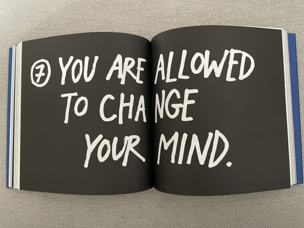
Another chapter that hit home was “You Are Allowed to Change Your Mind.” This felt almost like permission I didn’t know I needed. I had convinced myself that because I had spent so much time on my previous topic, I must continue with it. Changing direction felt wrong, like giving up. But Kleon says it’s completely normal to shift, to rethink, to explore something new. That idea made me feel less guilty about stepping away from mental health apps and not fully clicking with AI in education. Maybe changing my mind is just part of the creative process.

He also talks a lot about focusing on the verb rather than the noun. Not “being a student looking for a topic,” but actually researching, playing, trying things out. That mindset feels much lighter and more fun.

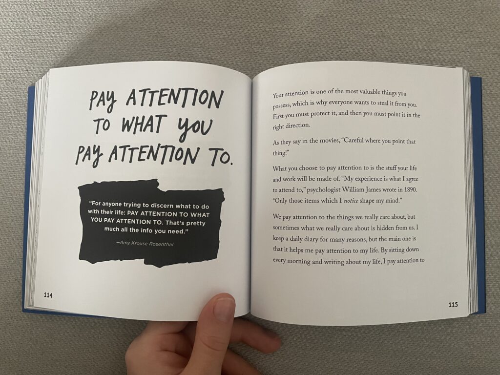
And finally, one line keeps repeating in my head:
“Pay attention to what you pay attention to.”
Maybe the things that naturally grab my curiosity in the next weeks, small things, random things, might slowly point me toward my thesis direction.

How This Helps Me Moving Forward

I still don’t know my final topic. But after reading Keep Going, I don’t feel stuck anymore. I feel more open, more patient with myself, and more willing to explore without pressure. My thesis will come from what I genuinely care about next, not from panic or noise.

For now, this book was exactly the impulse I needed to… well, keep going.

Stuff Worth Clicking A.K.A. Accompanying Links

Disclaimer: This blog post was written with the help of AI for better grammar and correct spelling.

Proseminar Task III: Evaluation of a Master’s Thesis

Author: Francesca Fusco
Title: Child-AI Creativity Support Tools: A Co-Design Study with Children
Year of Publication: 2024
University: University of Illinois at Chicago
Degree: Master of Science in Computer Science
Source: Politecnico di Torino Webthesis Libraries

Introduction

I chose this master’s thesis because I want to write my own research about e-learning for children supported by AI. I am interested in how technology can make learning more creative and personal. This thesis explores how children imagine and design tools that help them be creative together with AI. I think this is very relevant for my topic because understanding how children think about AI can help design learning environments that feel natural and supportive, not intimidating or overly technical.

Overall Presentation Quality

The thesis has a clear and professional structure, moving from theory to practical work and ending with strong reflections. It includes a summary, visuals, tables, and a conceptual model that helps readers understand the findings. The documentation of the design sessions is detailed and transparent. However, some chapters, especially the methods, are very long and could be shorter without losing clarity. Overall, the presentation is high-quality and shows strong academic effort.

Degree of Innovation

This thesis is innovative because it looks at how children co-design AI creativity tools, rather than just testing finished products. It introduces new ideas like “negotiation,” “division of work,” and “input methods” between children and AI partners. This is an original contribution to the field of child–computer interaction. However, the innovation is mostly conceptual, since no working prototype or long-term study was developed. The results are valuable but more theoretical than practical.

Independence

The author demonstrates strong independence in planning, conducting, and analyzing the co-design study. She clearly took initiative in organizing sessions and interpreting the data. The writing shows personal understanding and critical thinking. While she collaborated with a research team, her own contribution and perspective are visible throughout. Some sections could show even more of her individual interpretation rather than describing the process step by step, but overall, the independence level is very good.

Organization and Structure

The structure of the thesis is logical and easy to follow. Each part connects to the research questions, and the tables and diagrams support understanding. However, the transitions between chapters are sometimes abrupt, and the text could benefit from short summaries after each section. The structure fits academic expectations and shows a clear flow from research context to findings, even if it feels slightly overloaded with details in some places.

Communication

The author communicates her ideas clearly and uses suitable academic language. The introduction and discussion are well written and make the research questions easy to follow, though some sentences are quite long. Visuals and diagrams support understanding, but I didn’t really like the overall design and layout. The typography and images look very technical and plain, which is typical for a computer science thesis but feels a bit dry. In our study program, visual presentation is more important, so this difference stood out. Still, the communication is clear and consistent, even if the visual design could be more engaging.

Scope

The scope of the study is suitable for a master’s thesis. The author worked with seven children aged 8–13 over several co-design sessions. The amount of data is large and well analyzed. Still, the thesis focuses mainly on creativity and interaction, not directly on learning outcomes. For my own work about e-learning, I would like to see more about how such AI systems can support children’s actual learning progress. Nevertheless, the scope fits the research goal and provides deep insights.

Accuracy and Attention to Detail

The thesis is carefully written and well formatted. Figures and tables are clear and correctly referenced. The text is free from major language or spelling errors. Some sentences could be shorter and more precise, but the overall accuracy and attention to detail are strong. It is clear that the author invested significant time in ensuring the quality and correctness of the work.

Literature

The literature review is comprehensive and well organized. The author includes recent studies from child–computer interaction, AI in education, and creativity research. The sources are relevant and academic. Some references could be updated with even newer works on generative AI tools, but the overall literature base is strong and supports the study’s goals effectively.

Overall Assessment

This master’s thesis offers an original and thoughtful look at how children imagine working with AI in creative storytelling, showing a good understanding of their perspectives. Its strengths are a clear structure, detailed documentation, good visuals, and a meaningful contribution to child–AI design. Weaknesses include being mostly conceptual, sometimes repetitive, and having chapter transitions that could be smoother. Still, it provides useful ideas for future research on AI-supported learning, showing that AI should help, not replace, children’s creativity. Overall, I would rate this thesis as good (2) for its originality, depth, and professional presentation.

Disclaimer: This blog post was written with the help of AI (ChatGPT) for better structure and phrasing.

2.6 Final Video: Prototyping Calm with the Breathing Circle

In this final blog post, I’m presenting a short video that showcases the development and insight behind my analog prototype, the Breathing Circle. Designed as a screen-free, tactile tool for guided breathing, this project explores how physical interaction can support emotional regulation in everyday life. From early sketches to laser-cut textures and user testing, the process revealed how simplicity, materiality, and intuitive design can foster moments of calm. The video summarizes my journey, shares user reactions, and reflects on what future iterations could look like.

2.5 Quick User Tests: Observations and Future Directions

Over the past few days, I conducted three quick user tests to gain early feedback on my analog prototype – the breathing circle. Although the tests were informal and low-pressure, they offered helpful insights into how others interpret and interact with the object. I invited Žiga (26), Nika (24), and Črtomir (62) to try it out. Each session lasted around 5 minutes.

Test Setup

I placed the plywood breathing circle on a table and gave minimal instructions: “This is a tool for guided breathing. Feel free to explore it and describe what you think it’s doing or how you would use it.” I asked them to use the think aloud method, meaning they should voice their thoughts as they interact with the object: what they believe it is, what it might do, and how they feel using it.

The goal was to observe how people interacted with the object naturally, especially how they understood the engraved inhale–hold–exhale sections, the circular form, and the rotating movement of the top plate.

After each test, we spent some time discussing their experience and gathering suggestions for improvements and potential uses.

User 1: Žiga (26, software developer)

Žiga intuitively understood what the breathing circle was for. Without much hesitation, he picked it up, started turning the top plate, and said something like, “Ah, this is for breathing, right?” He immediately began mimicking the rhythm of inhale–hold–exhale as he turned the plate. He noted that the movement felt a bit stiff and suggested a smoother surface or finish to make the rotation feel more meditative and pleasant.

He also raised several ideas during our conversation afterward: “I’d use this during online meetings. I often catch myself scrolling or clicking random things without paying attention. Having this in my hand would keep my fingers busy and help me focus.”

He added that he would be more likely to use it if it were smaller and made of a more satisfying material, something smoother and less rough than bare plywood. He liked the idea of it being minimalistic and aesthetically pleasing: “If it looked like a clean, white decorative piece, I’d definitely keep it on my desk. It could be like a fidget toy for adults.”

Key takeaway: Žiga saw real use potential in focused work contexts and as a physical alternative to digital distractions. He emphasized the importance of both feel and aesthetics, suggesting that people might be more likely to use something that feels good in the hand and looks good in the environment.

User 2: Nika (24, pedagogy master’s student & HR assistant)

Nika was initially unsure how to interact with the breathing circle. She wondered aloud whether she should turn it only one way or back and forth. After some time exploring, she closed her eyes to focus more on the texture. She liked the tactile feel and suggested the engraved areas could be more pronounced so the different phases of the breathing cycle are easier to recognize by touch alone. Although she didn’t see herself using it frequently, she said she might carry a smaller version in her purse if it were about the size of a fidget spinner.

Drawing from her background working with children, she immediately thought about potential classroom uses, especially for kids with attention difficulties. “I see more and more kids who can’t calm down. Something like this could help them focus during class, they could use it with one hand while listening or drawing. If they focused on this, maybe they wouldn’t be so ‘naughty.’” She emphasized that a child-friendly design is important: sturdy, colorful, and available in different versions with language-appropriate text. She sees real potential for the breathing circle as a calming tool for kids.

“I really enjoy doing breathing exercises without screens. I never liked guided YouTube meditations. This feels more real.”

Key takeaway: Nika prefers meditating without any digital interfaces and enjoys practicing breathing exercises undistracted. She sees strong potential for the breathing circle to support children with attention and self-regulation challenges, especially in educational settings. Enhancing the tactile experience and making the design kid-friendly could open valuable new applications.

User 3: Črtomir (62, electrical engineer)

At first, Črtomir had some difficulty understanding the English words engraved on the breathing circle, but with his basic knowledge, he soon figured out the inhale–hold–exhale instructions. He said, “I wasn’t sure at first what these words meant, but I got it after a moment.”

He shared that he has never tried meditation before but could see this tool being useful for people who are stressed or those who always feel the need to hold something in their hands. He also agreed that the breathing circle could work well for children in school settings. When asked how he might use it, he said, “Maybe before bed or while watching TV, something to help you relax.”

Since he didn’t understand the concept right away, I explained a bit more about its purpose before we discussed further. Črtomir thought it was a smart and simple solution but suggested some digital enhancements, such as connecting to a phone to show heart rate. He recommended versions with instructions in different languages and a brief explanation on the device to help new users. He joked about the size, saying it should be made for bigger fingers too.

Key takeaway: Črtomir appreciated the simplicity of the breathing circle and its potential to help people manage stress or restlessness, even if they’re new to meditation. Clear instructions and multilingual options would improve accessibility, and some might value digital features for added feedback. Making the design inclusive for different hand sizes could also broaden its appeal.

What I Learned

  • Users value a smooth, satisfying rotational movement and a pleasant material feel.
  • Size matters: many suggested smaller, more portable versions.
  • Clear tactile differentiation for inhale–hold–exhale phases is important.
  • Different user groups have distinct needs: minimalistic and elegant for adults; sturdy, colorful, and kid-friendly for children.
  • Clear instructions or icons help users understand how to use the tool quickly.
  • Some users are interested in optional digital features but want to keep the core experience analog and distraction-free.

Next Iteration Ideas

  • Experiment with different materials and surface finishes to improve rotation smoothness and tactile satisfaction.
  • Develop smaller versions suitable for carrying in a purse or pocket.
  • Enhance tactile cues with deeper engraving or raised elements for easier recognition by touch.
  • Design variants tailored for children: durable, colorful, and with language-appropriate text.
  • Integrate subtle instructional text or simple icons on the device to aid understanding.
  • Explore potential optional digital integrations, like app connectivity, while maintaining a primarily analog experience.

What’s Next?

This initial round of testing provided valuable insights that will guide the next steps in refining the breathing circle. In my upcoming blog post, I’ll share a video showcasing this stage of the prototype in action and reflect on whether it’s meaningful to develop the concept further. Stay tuned to see how this simple analog tool might evolve into a practical aid for mindful breathing and focus.

2.4 BTS: Laser Cutting and Assembly of My Prototype

After finishing the design phase, I moved on to creating the physical prototype using the university’s Lasercutter CO2 Trotec Speedy 360. The material I chose was 4mm thin plywood, sturdy enough for the breathing circle but still easy to work with. Before starting the machine, I prepared my design in Adobe Illustrator. To make sure the laser cutter knows what to cut and what to engrave, I used two different colors in the file: red lines show where the laser should cut completely through the plywood, outlining each piece of the breathing circle, black lines and textures represent areas to engrave, like the tactile patterns for the inhale, hold, and exhale sections, plus small text labels.

This separation is important because engraving only burns the surface lightly, creating texture and detail without cutting all the way through. Since I’m relatively new to laser cutting, I was careful not to engrave too deeply – wood can start to burn quickly if the settings are too strong. This cautious approach helped me keep the surface textures clear and clean.

Once the file was ready, I set up the materials and workspace with the 4mm plywood sheets and M4 size plastic screws. These screws allow the plates to rotate smoothly while keeping the holes minimal and unobtrusive, maintaining a clean and minimalistic look.

The laser cutter produced very precise pieces with clean edges. The engraved sections added subtle textures that can be felt by touch, which is essential for the breathing circle’s interactive experience.

At this stage, the prototype pieces were not yet assembled, but it was exciting to see the parts come to life physically. The cutouts and engraving matched the digital design well, making assembly straightforward.

Final Thoughts

Using the laser cutter was a key step in turning the concept into something tangible. This process allowed me to explore the tactile qualities of the breathing circle and how the physical form supports the interaction. Even though the prototype isn’t complete, the precise cuts and engraved textures already give a strong sense of how users might experience it.

This phase reinforced how prototyping, especially analog and lo-fi methods, can reveal important insights early in the design process. It’s not just about finishing a perfect product but about thinking through the physical experience, testing ideas, and learning along the way.

Next, I will do some user testing to gather feedback and observe how the prototype works in practice.

2.3 Sketching and Developing the Breathing Circle

What kinds of interactions actually support mental focus in everyday life? And how can something as simple as a small, analog object stand up to the constant pull of digital notifications?

These questions guided me as I moved from concept into the practical development of the Breathing Circle. This was the moment where abstract ideas started becoming real: sketching, measuring, refining. But it wasn’t just about making a “nice object”, it was about intentionally designing a pause. A pause that resists the speed and urgency of digital life.

Here’s how I started shaping that pause into form.

Sketch of the Breathing Circle

Turning Breath into Form

I wanted each part of the breathing process to feel different, so that people don’t have to think about what comes next, they can simply follow the texture with their fingers and focus on their breath. Since the prototype will be laser-cut, I chose engraved textures over raised ones. The engraved patterns are subtle but distinct, providing just enough tactile guidance without being distracting or overstimulating.

The Three Phases of Breath
  1. INHALE – Straight Lines – Why? Inhaling feels like steadily drawing in air, filling the lungs. The lines guide the fingers steadily inward, like gathering energy.
  2. HOLD – Smooth / Flat – Why? Holding the breath is a still moment. By removing texture, I’m reinforcing that pause, offering tactile neutrality to match the emotional neutrality of holding.
  3. EXHALE – Engraved Dots – Why? Exhaling is about release. The dotted texture creates a gentle sense of dispersal, like bubbles or soft particles letting go.
Proportions of the Circle

2/5 inhale, 1/5 hold, 2/5 exhale – Why? This ratio reflects a calming breathing rhythm, with enough space for a longer exhale to naturally relax the body.

Other Functional Details
  • Center hole for screwing together both plates, allowing rotation.
  • Indicator hole to show which breathing phase you’re currently on (“inhale,” “hold,” or “exhale”).
  • Text engravings to match, visible through the moving layer, guiding the flow.

Why Analog? Why This?

Screens offer too much speed. This small, analog tool offers something different: focus through simplicity. For me, this isn’t just a prototype, it’s a way to answer a frustration I’ve experienced myself: forgetting to breathe properly in stressful, digital spaces. Making this helps turn that small frustration into a thoughtful pause.

Next, I’ll bring this sketch into reality through laser cutting, testing proportions and feel. In the following blogposts, I’ll reflect on that process, and eventually create a video that brings the whole journey together.

👩🏽‍💻 WebExpo Conference: Survival kit for advertising jungle by Kateřina Huňová & Vladimír Zikmund

This talk stood out with its metaphorical yet practical framework: surviving the modern advertising jungle. Kateřina Huňová and Vladimír Zikmund offered 10 sharp, memorable tips that went beyond theory, highlighting real campaigns, missteps, and surprisingly simple creative ideas.

Here’s the survival kit they proposed:

1. Get your survival kit
Know your brand, your product or service, and, most importantly, your audience. Messaging only works when it aligns with identity. Ryanair’s chaotic memes and British Airways’ premium tone couldn’t be swapped. Know who you are, and stay in your lane.

2. Enter with courage
Courage in advertising can mean budget bravery (like Lays going all-in on football and music) or daring to be different. Kaufland’s idea to hand out ice packs of carrots to hockey players is absurd, and that’s exactly why it worked. It was cheap, simple, and memorable.

3. Hunt one animal
Focus on one thing: one product, one message, one feeling. Trying to do everything results in nothing. Klarna’s “smooth fish” campaign was absurd but effective. The Ordinary, too, owns its scientific tone with brutally plain product names. Simplicity is power.

4. Stay on the path
Consistency and integration are critical. Skoda’s visual metaphor using plus and minus signs doubled campaign awareness. Long-term consistency, like Snickers’ “You’re not you when you’re hungry” builds recognition and emotional memory.

5. Take a buddy
Mascots work, whether they’re cute (like DuoLingo’s owl), absurd (like the Panda who gets mad if you say no to milk), or even annoying. If your tone is strong and consistent, your audience will remember it.

6. Climb the tree for better perspective
Think differently. IBM made clever physical installations to demonstrate smart ideas. Jeep used unexpected ad placements (like bizarre parking spots). Dog food brands made frisbees shaped like gym weights. Unexpected formats create attention.

7. Follow the river flow
Trend moments are fast and short-lived, like “brat summer” or meme formats. You can ride them, but don’t rely on them. Heineken’s flippable phone device for distraction-free cheering was a brilliant trend-relevant product.

8. Cooperate with indigenous people
Influencers can help, but only when they truly fit. Jeremy Allen White for Calvin Klein worked. But Kendall Jenner for Pepsi? A disaster. Influencers are not the idea, they’re just one tool, and they must align with your brand values.

9. Obstacles can’t stop you
Barriers can spark creativity. Legal restrictions in Brazil banned beer logos on football jerseys, so Brahma used hair dye to create beer-colored hairstyles. Penny fought consumer price-blindness by printing huge prices on product packaging.

10. Celebrate at the end
After surviving the jungle, don’t forget to appreciate your wins. Analyze your results, celebrate your team, and enjoy the moment. Every good campaign is a journey.

This was one of the most engaging and creatively structured talks at WebExpo. Even if advertising isn’t your main field, these lessons about clarity, creativity, and boldness are easily applied across all types of design and communication.