Blog Post 7: Final Video and Reflection of EV Charging UX Project

i

Reflection

After completing all six blogposts, I can honestly say this project has been one of the most meaningful and eye-opening experiences in my design journey so far. Coming from a background where I mostly design websites, this was one of the first times I actively left my comfort zone. Instead of staying behind the screen, I went out into the real world to observe and interact with actual users, something that brought an entirely new perspective to my design process.

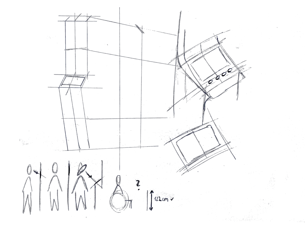
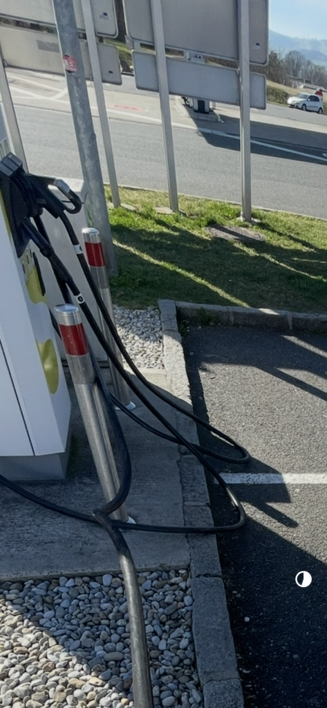
One of the biggest challenges during this project was balancing university life with on-field research. It was often hard to find time between classes and other commitments, but I realized how important it was to physically be on-site, at charging stations, in parking lots, observing real behaviors and asking the right questions. This kind of research, although sometimes chaotic or unplanned, gave me insights I would never have gained just by doing desk research.

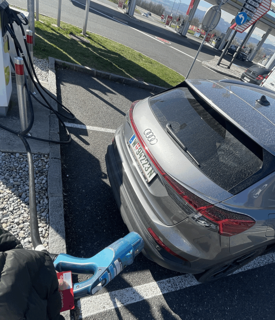
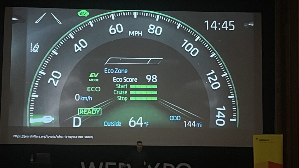
A big thank you goes to my girlfriend for helping me throughout the process and also to her father, who kindly provided his electric vehicle for testing and documentation. Without their support, I wouldn’t have been able to simulate such realistic use scenarios.

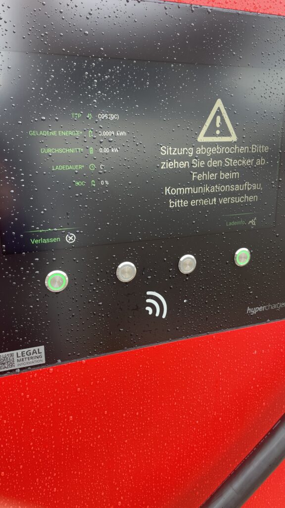
Through the user tests I conducted and the interviews I held, I became much more aware of how inconsistent and often frustrating the user experience at EV charging stations still is today, from unclear interfaces and error messages to accessibility issues that are simply being ignored. It’s something I just couldn’t leave as it is, so I decided to dive in and see how design can actually help.

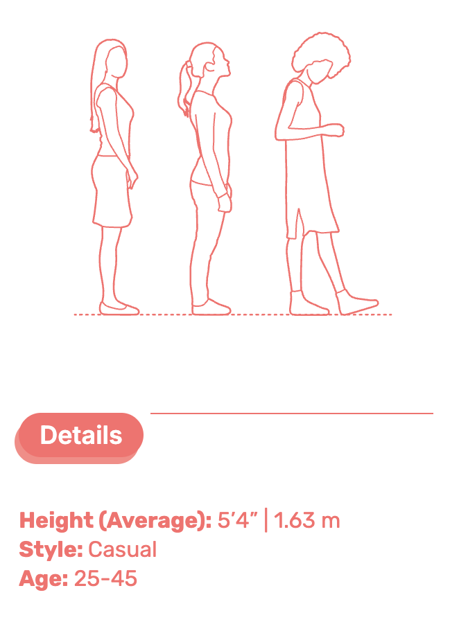
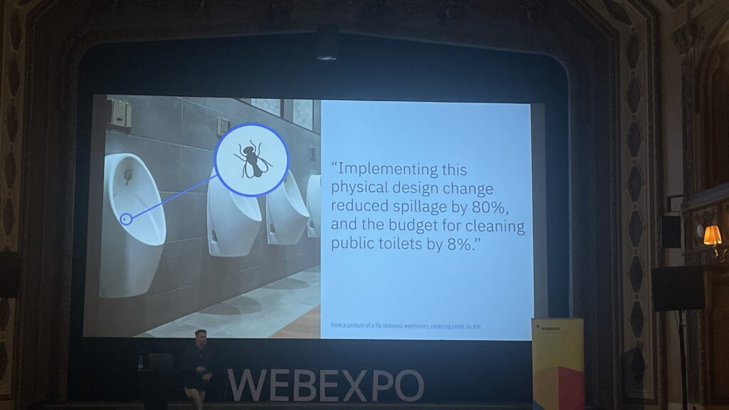
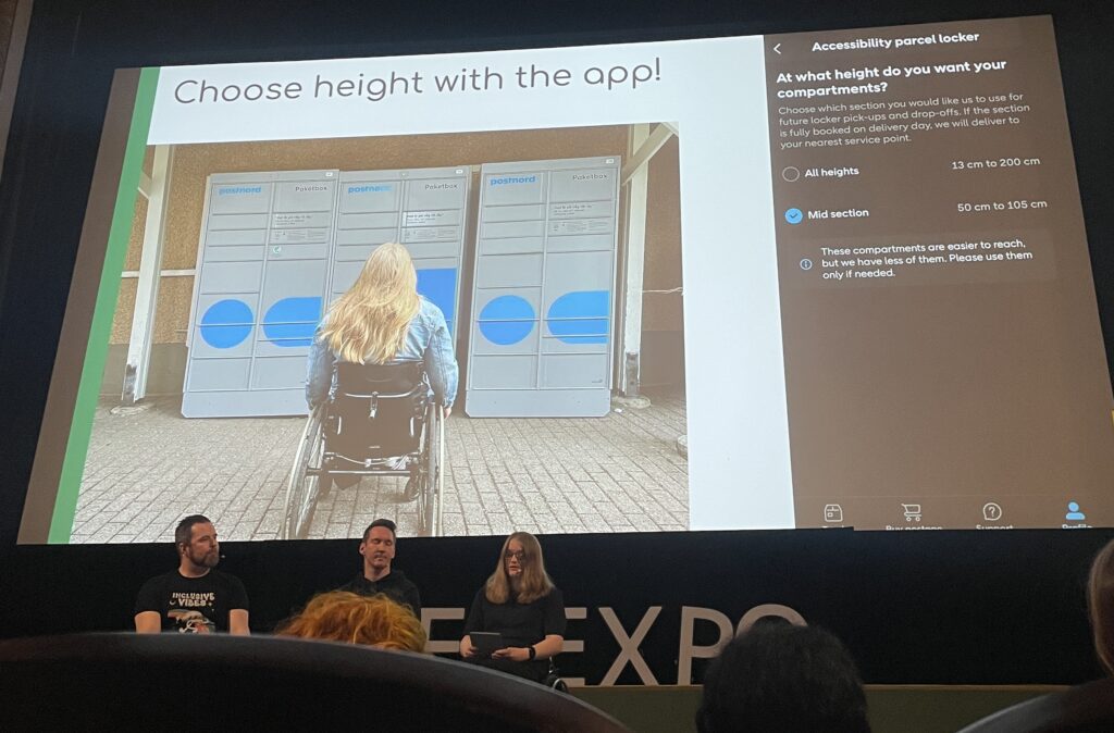
What really pushed me to include accessibility in my scope was a talk I attended at WebExpo, which reminded me that inclusive design doesn’t happen by accident. It has to be a conscious decision. Even though I wasn’t able to interview users in wheelchairs for this phase, it became clear to me how critical their needs are and that they are still often overlooked in public infrastructure. That’s why I’ve decided to explore this further in my Master’s thesis, where I’ll have more time and space to go deeper and also include more diverse perspectives.

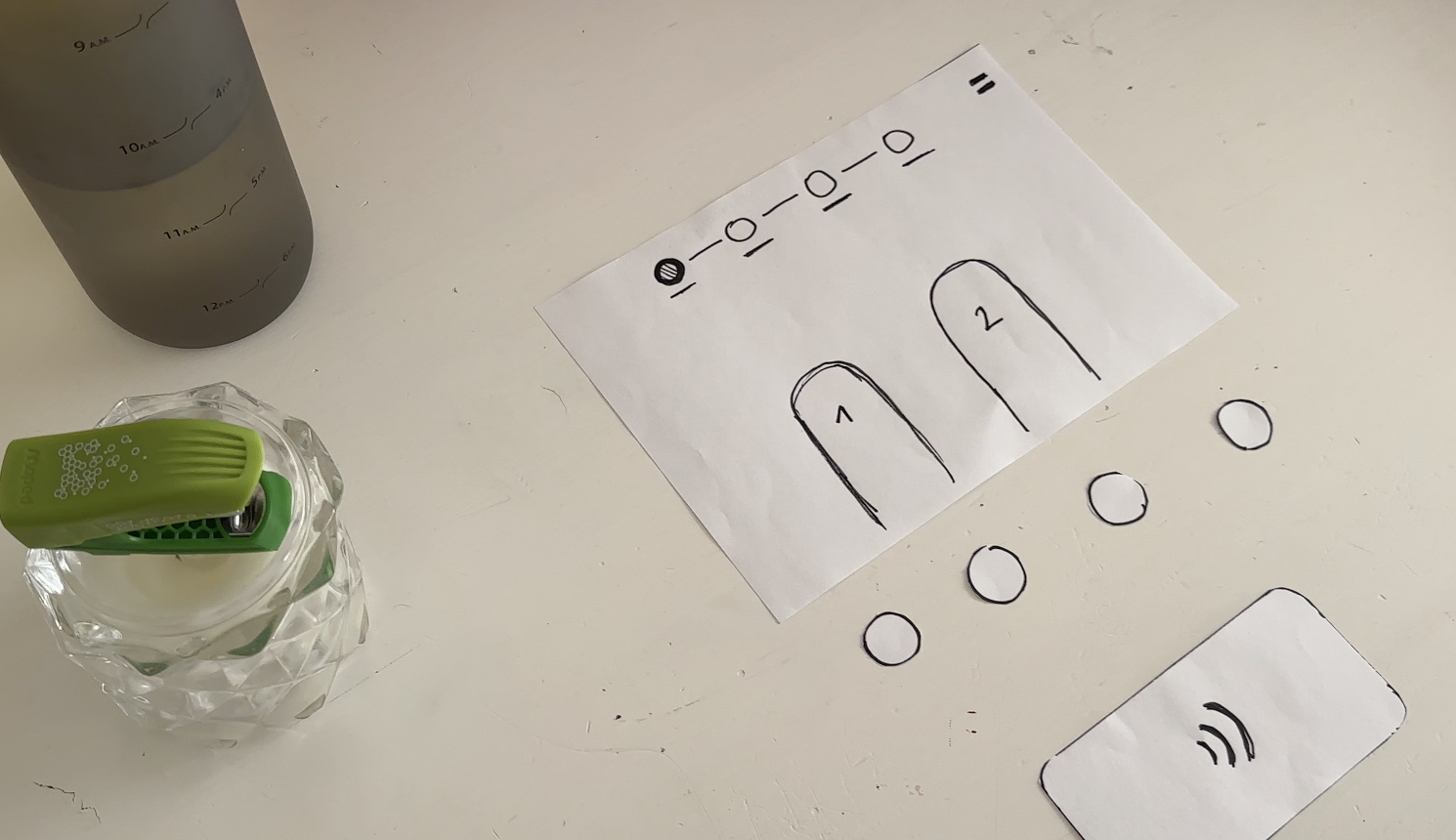
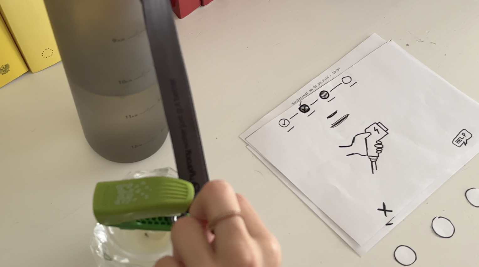
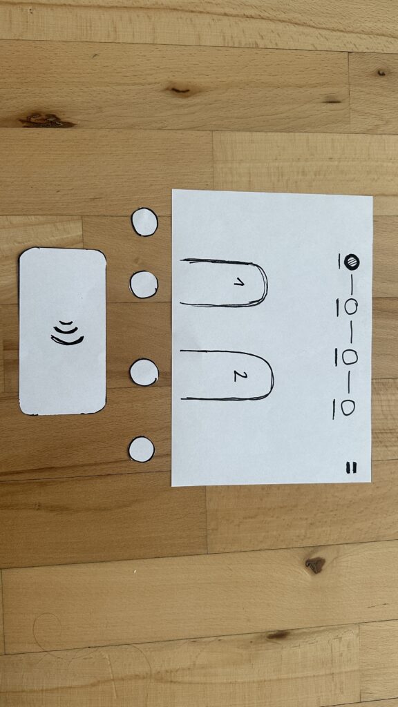
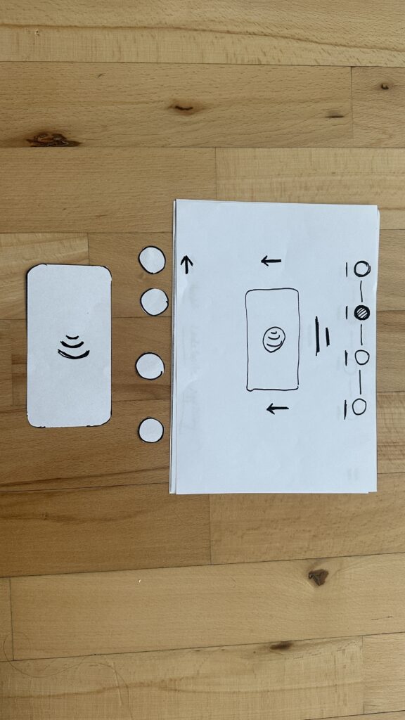
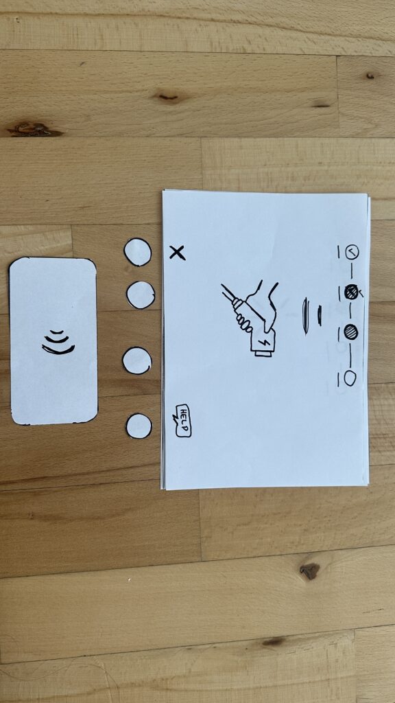
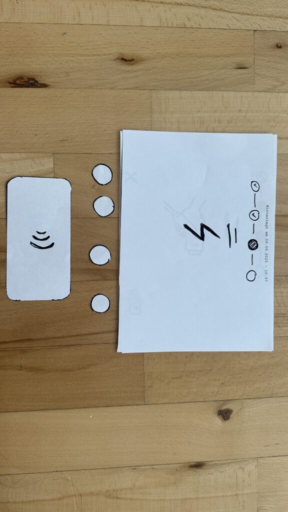
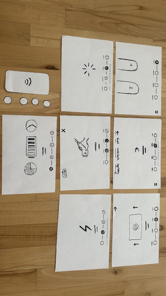
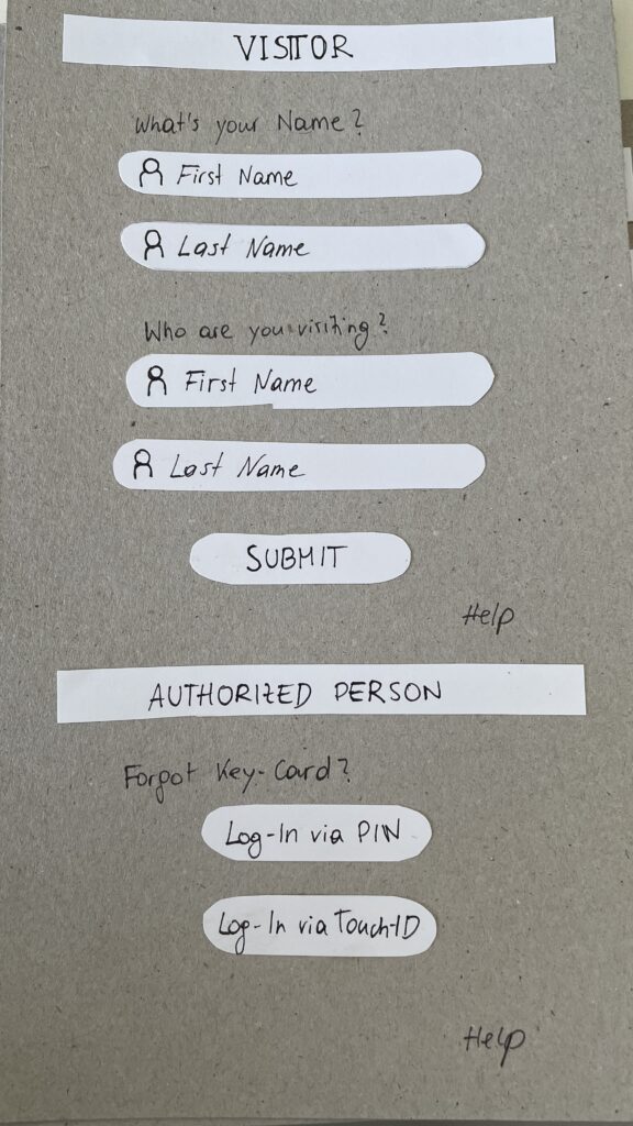
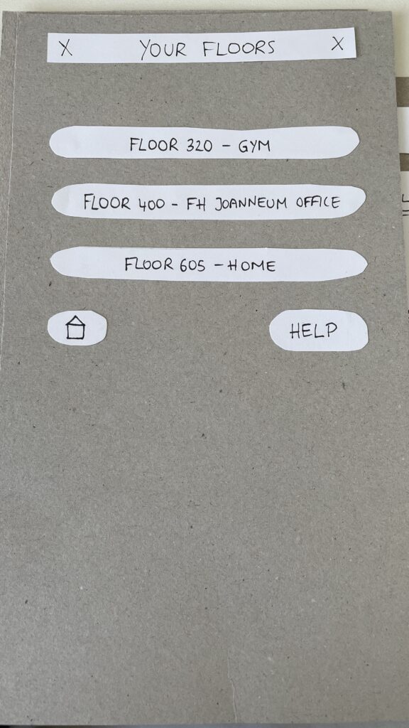
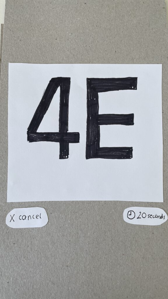
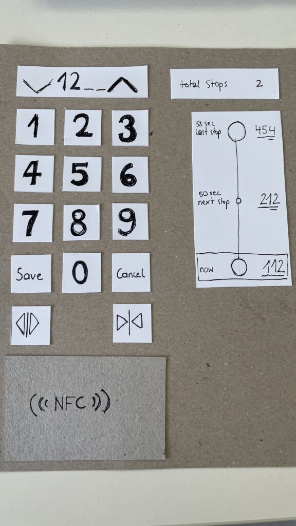
The prototype I created is not a finished product, it’s a set of mid- to high-fidelity frames that visualize potential solutions. But even at this stage, seeing things come to life helped me immensely in understanding where the problems lie and how users interact with the interface. These prototypes made testing and iteration so much more tangible and I gained valuable feedback that will shape the next versions.

Looking back, I’ve not only developed skills in field research, user testing, and accessibility, I’ve also learned to trust the process of going out, listening, observing, and embracing the unpredictable. It’s exciting to think that this might just be the beginning of a much bigger journey in designing more inclusive and user-friendly mobility experiences.

Blog Post 6: Sketching an Inclusive EV Charger

Over the past week I dove into sketching my very first EV charging station interface, on paper, low-fi style. My goal? A clean, intuitive flow that anyone, whether standing or in a wheelchair, can use without a hitch.

1. First Sketches: Facing the Screen

I started by thinking about how the display sits in real life. Based on some research I’d gathered (https://www.sciencedirect.com/science/article/abs/pii/S0169814197000875), I initially tilted the screen at about 45° for comfortable reach and visibility. Drawing a single-column station with that slanted display felt natural…until I grabbed a ruler and realized wheelchair users would struggle to see or reach it. Back to the sketchbook.

2. Measuring for Everyone

Next, I looked up anthropometric data: average standing height (around 1.63 m for women) and wheelchair eye level (about 1.30 m). That research told me the top of the screen should sit at roughly 1.60 m, with the row of buttons falling around 1.20 m. Everyone’s arm and line-of-sight reach now fall squarely within easy range.

3. Second Sketches: Flat & Accessible

Armed with those new dimensions, I redrew the station. This time the screen is perfectly vertical, no tilt, so a seated user can see the full interface. On each side: charging cables loop neatly above the column. From past frustration I know that having the cable hang above the car inlet gives you full freedom of movement, if it came from below, you’d scrape against bumpers or crouch awkwardly. The cable’s plug snaps in and out with minimal force and a clear click, avoiding any wrestling match.

4. Interaction Storyboard

  1. Welcome Screen (140 cm high): A crisp display text and 4 sturdy physical buttons. Underneath, the payment pad glows green when it’s your turn to tap.
  2. Scan Step: Three payment methods—bank card tap, RFID charge card, or QR code scan. A left-arrow “Back” button stays red until you choose.
  3. Plug Step: You pull the cable from its cradle, align it to your car’s port, and push in. A simple animated diagram on screen guides you.
  4. Confirmation Lights: With each successful step—scan, plug, start—an LED ring pulses green. If something’s off, it flashes yellow for “check connection.”
  5. Charging Dashboard: Once juice is flowing, you see real-time kWh delivered, state-of-charge %, and an estimated “Time Remaining.” A big “End Session” button waits for you.


5. Beyond the Screen: Real-World Accessibility

A few extra thoughts, courtesy of accessibility best practices:

  • Pathway Design: The route from parking spot to station needs a gentle ramp or smooth, level surface (no hidden curbs)
  • Color & Contrast: Color-blind or low-vision users need high-contrast icons and optional haptic or audio cues. Long-press “Touch to Speech” could read aloud on-screen labels.
  • Height Considerations: Remember: 130 cm eye height for wheelchair users vs. 163 cm average standing height. Buttons and screens must accommodate both.
  • Future-Proofing: As self-driving cars roll in, drivers that are visually impaired should also be able to interact with the Charging Station

What’s next? I will turn my sketches from the last post into more mid-to-heigh-fidelity wireframes, then run two rounds of user tests. I’ll watch them scan, tap, and plug in. Their real-time reactions will guide the next iteration: adjusting button sizes, tweaking the cable loop, or even adding voice prompts.

Every scribble, every measurement, and every user test brings me closer to a charging experience that’s not just functional, but truly inclusive, so that plugging in your EV feels as natural as unlocking your phone. Stay tuned for my prototype reveal in the video and my reflection and learnings of this project.

Blog Post 5: Early User Tests of My EV Charging Interface

Over the past week, I ran two quick paper-prototype tests to see how real people would navigate my simple, button-based EV charger interface. I recruited Sophie (23, student) and Kathi (22, student), both had tried charging an EV before and shared the frustrations I’ve heard from others. Here’s what happened, what I learned, and what I’ll change next.

Test Setup

I handed each person a series of 7 low-fidelity sketches in the correct order. Next to the paper “station” was a bottle (the charger) and a taker (the EV). Below each screen sketch sat four real buttons. I asked them to imagine they’d just pulled up to a public charger and needed to top off their battery.

User Test 1: Sophie

  1. Choose Charger
    Sophie thought the paper screen itself was the touchscreen. She tried tapping the display until she noticed the real buttons below. Because the screen elements were so faint, she assumed she was already in the payment step and held her credit card to the empty reader.
  2. Verify Payment
    Once she realized the three payment buttons lived below, she quickly picked “Credit Card” and instantly understood she needed to tap her card.
  3. Plug In
    The cable illustration on screen made sense immediately. When I “lit” the screen green for success, she smiled and said, “Great—now it’s actually charging.”
  4. Charging Overview
    Sophie grasped the countdown timer and energy bar at once. She even joked she’d never mind waiting with such clear feedback.

Key takeaway: Sophie’s background with touchscreens made her expect the whole area to be tappable. I need stronger visual cues, bolder borders or shadows, so she spots the physical buttons first.

User Test 2: Kathi

  1. Choose Charger
    Kathi also tapped the screen, then grew impatient and pressed every button in turn, her usual “I don’t know what to do” tactic. After a few presses, she landed on “RFID Charge-Card” and paused.
  2. Verify Payment
    She tried to tap her card again before any prompt appeared. When nothing happened, she read more closely and picked her button first, then held her card when prompted.
  3. Plug In
    She confused the static “Charging” screen, thinking the top progress bar might also be buttons, until I introduced the cable illustration. Then it clicked.
  4. Charging Overview
    Once the final screen lit up with time remaining and a moving bar, Kathi relaxed and said, “Okay, I get it.”

Key takeaway: Kathi needed clearer icons on the first screen to recognize the charger slots. She also misread the progress bar as interactive.

Charging the EV

What I Learned

  • Visual Clarity Matters: Make charger-slot outlines, icons, and buttons bold.
  • Step Prompts: Add a short text label—“Step 1: Pick Charger” instead of just a number.
  • Non-Touch Expectations: Users often expect the whole screen to be tappable. I’ll accentuate the physical buttons with shadows or color bands.

Next Iteration

  1. Bold Icons & Labels: Draw clear charger shapes and label each step in large text.
  2. Highlight Active Buttons: Only light up the relevant payment button when it’s time.
  3. Test with Accessibility in Mind: Invite a visually impaired or wheelchair-using participant to see how the interface holds up.
  4. Prototype On-Station Mock-Up: Build a cardboard station with real cables at the right height and angle—so I can check reach, screen glare, and button feel.

My next post will share those refined sketches and fresh user-test results. Until then, I’ll keep iterating and learning from each tap, click, and cable plug. Stay tuned!

Blog 4: Sketching an Intuitive EV Charging Interface

After my first wild prototype about a 1,000‑floor elevator, I realized I really want to stick with mobility. EV charging stations are such a timely, real‑world challenge plus, I’ve experienced the pain myself! My girlfriend’s dad owns an EV, and I’ve helped him charge it only to run into confusing screens and awkward cables. Others I chatted with have plenty of frustrating stories, too. So I decided: let’s start by sketching a super‑simple, button‑based interface and see how two real users feel about it. (User Testing Informationen available in the next Post)

Four Clear Steps

On paper, I drew these low‑fidelity screens, focusing on clarity over bells and whistles:

  1. Choose Your Charger
    • A simple map shows two plugs at a station.
    • Green plug: available. Red plug: occupied.
    • A progress bar at the top displays “Step 1 of 4”, so you always know where you are.
    • Why? Users often fumble for which port is free. Clear colors and a step indicator keep anxiety low.
  2. Verify Payment
    • Three big buttons let you pick Credit Card, RFID Charge‑Card, or App‑QR Code.
    • A Back button (which lights red if you tap it) lets you switch methods at any time.
    • Once you choose, a screen prompts you to hold your card or show the QR code.
    • Why? Real stations offer multiple payment options. Lumping them into three buttons matches user expectations and avoids tiny menu lists.
  3. Plug In Cable
  • An animated cable slides out of the station.
  • A simple diagram shows “Cable → Car Port.”
  • If it clicks in correctly, the station glows green. If it fails, it glows red. A gentle blue pulse means “charging.”
  • Why? Physical actions need instant feedback. Color and motion reassure the user that they plugged in correctly.

    4. Charging Overview
  • Time Remaining: Counts down so you know when you’re done.
  • Battery Icon + Bar: State‑of‑charge advances in real time.
  • Power Delivered (kW): Shows exactly how fast you’re charging.
  • Big buttons: “End Session,” “Help,” “Info,” and “Language.”
  • Why? These are the four most‑asked questions: How long? How full? How fast? And what if I need help or another language?

Design Choices & Future Accessibility

  • Physical Buttons vs. Full Touchscreen: Early users can look, press, and go (no searching menus)
  • Progress Bar: Keeps people calm by showing exactly where they are in the flow.
  • Language Toggle: Always visible in case you need English, German, or any other option.
  • Text‑to‑Speech Future: With a long press on a touchscreen button, an image‑to‑speech API could read the label aloud for visually impaired users.

I’ll soon interview blind or wheelchair‑using drivers to see what adaptations they need. In a world of self‑driving cars, everyone should be able to charge their own vehicle of course.

Next: Real‑World User Tests

As a next step, I’ll ask some volunteers to walk through these sketches:

  • Where do they pause?
  • Which buttons feel unclear?
  • Do they spot the back arrow or language switch easily?
  • How do they react to red/green/blue feedback?

I’ll refine the flow based on their comments, then build clickable wireframes or maybe a cardboard prototype with LEGO. Iteration will tell me what works best.

Early References & Inspiration

  • Intuitive UI example: technagon.de/intuitive-user-interface-laden-kann-so-einfach-sein/
  • EV station UX tips: altia.com/2023/08/16/enhancing-ev-charging-station-ux-and-why-it-matters/
  • Payment variety today: ekoenergetyka.com/blog/how-do-ev-charging-stations-work/
  • Kempower design guide: kempower.com/user-experience-ev-charger-design/

These resources helped me understand real pain points and best practices. I’ll keep updating this blog as I refine the design and test with real users because the journey from sketch to screen is just beginning.

Blog 3: Current problems in EV Charging (Focus on User Experience and Accessibility)

On my current research and hands on experience with Chargers, I noticed that public charging infrastructure hasn’t caught up in terms of user experience and inclusivity. In this post i just want to dive little bit deeper and for that I did a small desk research. Here’s what’s going wrong:

Inconsistent User Interfaces & Unclear Feedback

  • Every station looks and acts differently. Menus vary wildly, icons are confusing and messaging like “Error 47” doesn’t explain much. Users often struggle to initiate charging or interpret unclear statuses
  • No real-time clarity. Displays frequently fail to show clear information like charging progress or estimated time remaining—making users feel uncertain and anxious

Accessibility Design Gaps

  • Physical barriers: No ramps or extra-wide spaces for wheelchair users. Many stations have high-mounted screens and stiff, heavy cables that require extra strength to operate .
  • Cable issues: CCS and other fast-charging cables are weighty and inflexible due to cooling needs. They’re often too short or too long making them hard to plug in for many users.
Own Image Documentation

Environmental & Spatial Constraints

  • Tight, unprotected spaces: Narrow bays, poor lighting, lack of shelter, all uncomfortable design choices, especially in bad weather or for vulnerable users
  • No tactile or audio support: Stations rarely include braille, haptic feedback, or voice prompts, ignoring users with visual or dexterity issues

Technical Unreliability & App Dependency

  • High failure rates: About 27% of public fast chargers are out of commission at any given time -> broken screens, failed connectors, or payment system glitches
  • App-only access: Many chargers demand app use for payment or activation, making usability dependent on the quality of the app and user connectivity
  • Multiple apps, multiple frustrations: Switching between brand-specific apps for each station is a constant headache for EV drivers

So why it is important to think of

  1. Creates anxiety & frustration
    Unpredictable errors and poor guidance lead to “range anxiety” and erode trust in the EV charging system.
  2. Excludes vulnerable users
    People with disabilities, seniors, or those less tech-savvy often find stations unusable, limiting EV adoption.
  3. Undermines wider EV adoption
    If charging remains cumbersome, many potential EV drivers will stick to fossil fuels, slowing sustainable transport progress.

What needs to Change

To make EV charging intuitive and inclusive there are some steps to consider:

  • Standardized UI elements: Clear steps like “Plug in, Tap to Start, Charging…” with robust feedback via visual, auditory, and haptic cues.
  • Inclusive hardware design: Adjustable screen heights, lighter cables (or cable reels), tactile buttons, braille labels, and wide, ramp-equipped bays.
  • Safety & comfort enhancements: Covered, well-lit stations with seats or resting areas especially important for longer charging waits.
  • Reliable offline access: Card readers plus app options, chargers that work even without mobile signal
  • Unified interfaces across networks: Consistent flows and minimal apps, drivers shouldn’t have to learn a new system at every station

Next Step: Rapid Prototyping

With these insights, my next step is to build or sketch something quick and to test it and iterate of course. With this i mean low-cost prototypes, sketches, cardboard interfaces, or simple physical models to validate ideas, also thinking about lego prototype:

  • trying out a height-adjustable screen mock-up with clear call-to-action buttons.
  • maybe simulating cable-handling ergonomics with also light feedback threw makey makey
  • Test feedback designs (LED, sound, or haptics).
  • Role-play station use in cramped or wheelchair-accessible scenarios.

These hands-on prototypes will reveal what truly makes charging intuitive and comfortable giving valuable, user-driven data before moving to high-fidelity design.

Clifford, J., Savargaonkar, M., Rumsey, P., Quinn, C., Varghese, B., & Smart, J. (2024). Understanding EV Charging Pain Points through Deep Learning Analysis. Idaho National Laboratory. SSRN. https://ssrn.com/abstract=5031126

https://www.evaglobal.com/news/accessible-charging-for-all-a-solutions-approach#:~:text=In%20a%20public%20charging%20environment,critical%20for%20public%20charging%20infrastructure

https://kempower.com/user-experience-ev-charger-design

Blog 2: Shifting Focus to EV Charging Station Experience

After some reflection I realized my original idea (How to design an Elevator for a 1000-Story Building) was a bit unrealistic obviously. Instead, I am now focusing on the user experience at Electric Vehicle (EV) Charging Stations, a practical and urgent issue. Charging is widely reported as a major pain point for EV drivers (info from literature -> pdf footnote). For example, one study notes that EV owners often complain about broken chargers, long charging times, confusing locations and high costs. These issues make charging frustrating. This topic matters because as EV adoption grows, smooth charging experiences are essential to keep drivers confident and satisfied.

I should note I don’t own an EV myself, but I have tried charging one a couple of times, in fact the dad of my girldriend owns one. I remember fumbling with the cable and wondering, how do I actually start charging? When it didn’t begin at first, I panicked a bit. There were also other issues with the paying method because you have like 4 different cards to pay at the station which is really confusing. In Austria there are more then 8 different types of Charging Stations all designed differently from different company’s.
Talking to other EV users confirmed my gut feeling: nearly everyone has stories of confusing chargers or unexpected problems. Many complained about chargers not starting properly and so on. Hearing these firsthand, common pain points jumped out: unclear signage, cables that are too short or heavy, crowded stations, and unfamiliar payment apps. These conversations have only made me more eager to dive into this problem.
When I talk about cables that are too short I once experienced this exact situatuion. This frustrating experience was when I had to wait around 10 minutes because both cables at the station were in use. When one car finally left, I parked and got ready to charge—but then realized the cable didn’t reach my car’s charging port. It was simply too short. The port was on the right side of the car, and there was no way to reposition it to make it work. Luckily, there was another cable available that did reach, but this situation felt like a clear UX fail. I took a photo afterward to remember it.

To deepen my understanding, I’m planning some field research. I’ll visit a few public EV charging stations in person, watching how real users plug in and charge their cars. I’ll sit nearby and take notes (from a respectful distance), then do short interviews with drivers. I have a list of questions ready: How do you find this station? Did everything work as expected? What (if anything) was frustrating about the screen, cable, or payment process? By observing and asking, I hope to catch issues I might not have thought of alone. (For instance, reviews often mention problems categorized as “Finding a charger” or “Starting a charge” like inaccurate locations or broken components, I’ll see if these come up in real life.)

I’m also thinking a lot about accessibility and inclusion. A WebExpo talk on inclusive design reminded me that about one in six people has some form of disability and even temporary injuries or age can affect how someone uses technology. Charging stations aren’t just digital screens, they are physical setups too. So I’ll pay attention to questions like: Are the screens and plugs at a good height? Is text large and clear enough? Is there space for a wheelchair or a stroller? I’m not there yet, but it’s exciting to consider how this research could eventually help all users.

Next steps in the design process: I’m laying out a clear path forward.

  • Research: Finish the site visits and interviews to gather real pain points. I’ll compare my findings to published research (for example, a thesis on first-time EV users confirms that “charging and range” are where beginners struggle the mostfile-vtpiq6sngdvzfiz8n25kdp).
  • Define Problems: Make a list of the key issues we’ve uncovered (e.g. broken hardware, confusing UIs, long wait timesfile-hum5jgwhy7zfzamxlwtuf6file-hum5jgwhy7zfzamxlwtuf6, and any accessibility gaps).
  • Ideation: Brainstorm solutions with sketches and discussion. This might include simple ideas like clearer signage or better instructions, or more novel ones like an app that shows available chargers and reserves a spot to avoid wait linesecharge4drivers.eu.
  • Prototyping: Build quick, low-fidelity models. For digital screens I’ll draw wireframes. For the physical station itself I might use cardboard or LEGO to mock up the layout. Sometimes a little hands-on model sparks insights you don’t get on paper. I’ll also consider user-friendly features suggested by others, like large integrated info screens that guide you “before, during and after” chargingecharge4drivers.eu, plug-and-charge authentication, and multiple plug types for different vehiclesecharge4drivers.eu.

I’ve leaned on three helpful documents to guide this direction. The first highlights that new EV drivers often “struggle with learning about charging”. The second (a deep review analysis) categorizes common charger pain points, things like chargers that are offline or blocked, slow charging, and poor safety/comfort (dark, dirty areas). The third (an EU project report) emphasizes making charging user-friendly: offering varied plug types and levels, large info displays, and even booking features to minimize wait times. These insights support focusing on the actual charging experience and informed my plans.

All in all, this has become a bit of a learning adventure for me. I’m curious and reflective about each step. And of course, this direction may still evolve as I gather more feedback. New insights could shift the focus again, for now, though, understanding real users frustrations at charging stations feels like a solid, people-centered research path.

Bibliography:

Martin Treiber and Arne Kesting, User Experience at EV Charging Stations: Empirical Findings and Design Recommendations (Journal of Artificial Intelligence Research, 2023), PDF

Steffen Lepa, Understanding the EV Charging Journey: A Multi-Method Study of First-Time Users (Social Science Research Network, 2024), PDF

eCharge4Drivers Consortium, Apriori Users Concerns and Expectations Relevant to EV Charging (2021), PDF

WebExpo Conference: Rethinking Gamification Beyond Points and Badges

Zoltan Kollin’s talk on gamification was not just insightful, it completely shifted how I think about what gamification really means. Before this talk, I mostly thought of gamification as collecting points, completing levels, or earning badges. But Zoltan showed us that gamification can be so much more, even playful, analog, and emotional. It’s not just about digital tricks. It’s about turning everyday actions into meaningful experiences.

He began by showing how gamified training can boost engagement and productivity. One study from the University of Colorado, shown in the first image, revealed that gamified training led to a 48% increase in employee engagement and a 34% increase in productivity. That alone already proves how powerful gamification can be when it’s applied well.

One part that really stuck with me was when Zoltan talked about the “IKEA effect”, people tend to value things more when they’ve put effort into creating them. This idea was connected to customization, like on reddit, where users can customize their avatar. This emotional investment creates stronger engagement, because people feel a sense of ownership. (See image 2)

But then Zoltan really opened my mind when he showed a picture of a kid vacuuming (image 3). It wasn’t just a regular vacuum, it had a laser light at the front, making it feel like a toy or a game. Suddenly, a boring task became fun. That’s when I realized: gamification doesn’t need to be digital at all. It can be tactile, visual, playful—even a product design choice. He called this “unexpected gamification,” and it’s a brilliant way to change behavior, especially for tasks peopl usually avoid.

Another interesting example was the use of small steps, like adding musical steps to a staircase to encourage people to take the stairs instead of the escalator. Or painting a fly in a urinal in Amsterdam to improve aim. These examples prove that gamification can be subtle, simple, and still very effective.

Zoltan also talked about how gamification taps into our psychology. For instance, Duolingo uses streaks to keep people coming back. Progress bars (like the LinkedIn profile completeness) push us to finish what we started, this is known as the Zeigarnik Effect. And daily goals or eco-driving scores in cars are more examples of behavioral motivation through simple game mechanics.

This talk made me think more about my own research topic, EV charging stations. What if i could apply this kind of gamification to the charging experience? Right now, waiting while your car charges can feel boring. But what if there were small interactions, progress bars or playful moments that make it more engaging? Maybe a kid-friendly “eco mission” on screen, or a streak for smart, energy-efficient charging habits. These aren’t just fun ideas, they’re ways to design more user-centered, enjoyable experiences.

Gamification is not about making everything feel like a game, it’s about motivation, emotion, and experience. Thanks to this talk, I’ll definitely keep looking at ways to bring meaningful, playful interaction into my design projects.

WebExpo Conference: Accessibility in Everyday Interfaces (A Talk That Changed My Perspective for my further process for EV Charging)

On the first day of the WebExpo I attended a talk on accessibility that really made me stop and think not just about design in general, but specifically about my own research topic on EV charging stations. The session started by showing the common issues people with disabilities face in daily life when interacting with digital interfaces. Then the presenters (including three people with real-life impairments) gave us a deep look into their world.

One of the speakers was visually impaired and had only 1% vision. Another was in a wheelchair and one had a chronic condition like diabetes. Hearing them speak about their everyday struggles with things that most of us take for granted, like picking up a package from a pick up post station or using a touchscreen, was eye opening. It made me realize how exclusive some of our current designs still are.

One key problem they highlighted was the rise of touchscreenonly interfaces. These don’t give any tactile feedback and are often completely inaccessible to blind users. As a solution, they showed us a great concept: when a user holds their finger longer on the screen, a voice (through text-to-speech) reads aloud what the button does. This gives blind or visually impaired users the confidence to use touch interfaces, especially when there are no physical buttons or guidance cues.

They mentioned the use of the Web Speech API, which made the solution sound very practical and implementable. What I found really interesting was how this solution could relate to my own research on EV charging stations. Right now, many charging stations already have touch displays. But what happens if a blind passenger, maybe not the driver, wants to start the charging process? Or what if we think further into the future, where self-driving cars are common, and blind or wheelchair users are traveling alone?

This made me realize: accessibility shouldn’t be an “extra”, t should be part of the core design, especially for public infrastructure. I was also thinking about the aspect that probably sometimes stakeholders or companies don’t believe accessibility is needed because they assume disabled people are not part of their target audience. This is a dangerous assumption. Everyone deserves access.

Furthermore about the text to speech interface I asked myself: “How do visually impaired people even know that a product has a long-press text-to-speech function?” I need to write the speaker about this because they didn’t mention it.

The talk has truly influenced how I think about my EV charging station prototype. I now feel it’s essential to at least consider how someone with limited sight, or physical ability, might interact with the interface. Whether that means adding text-to-speech, or voice control, or rethinking the flow entirely, accessibility should be part of the process.

I’m also planning to write to the speaker to ask some follow-up questions. It’s clear to me now: accessible UX is not just nice to have, it’s a necessity for a more inclusive future.

Blog 1: Lo-Fi Prototyping & Speed-Dating Reflections: Designing an Elevator for a 1000-Story Building

Introduction: A Thought Experiment in UX Design

How would you design an elevator interface for a 1000-story building? While this scenario may seem surreal, it presents an exciting challenge in user experience design. Inspired by a Google interview question, I decided to explore this concept and create a lo-fi prototype. The goal was to think through the navigation experience in such an extreme case, considering how users would interact with the system efficiently and intuitively.

Defining the Context & Target Users

To make this concept work, I first established some basic assumptions:

  • The building serves both residential and office purposes, potentially housing thousands of people
  • Multiple elevators exist, but each one needs a way to direct users efficiently
  • The elevators operate using a restricted access system where only authorized individuals can reach specific floors

The target users would include:

  • Residents – People living in the building
  • Employees – People working in office spaces
  • Visitors – Guests visiting residents or businesses
  • Security Persons – Ensuring safety and restricted access where necessary

The Prototype: Navigating this big Skyscraper

My prototype focused on the elevator interface, aiming to make navigation simple despite the overwhelming number of floors. In that 20 Minute Prototype Session was included:

  1. Entry Screen – Users authenticate using an NFC card, PIN, or biometric login to verify access / Guests login via their name and the name of the host
  2. Floor Selection – A personalized interface displaying only authorized floors to reduce cognitive overload
  3. Elevator Assignment – Users are directed to a specific elevator to optimize efficiency
  4. In-Elevator Controls – A secondary screen inside the elevator allows floor changes or emergency actions, ensuring flexibility mid-ride
Entry Screen
Floor Selection
Elevator Assignment
In-Elevator Controlls

Speed-Dating Prototype Discussion: Key Takeaways

The Speed-Dating session provided invaluable feedback from different perspectives. Here are some key insights:

1. Initial Reactions – What Problem Am I Solving?

  • Many participants struggled to recognize the interface as an elevator control system
  • Some assumed it was a hotel check-in or a security login screen
  • The concept of restricted floor access confused some users

2. Feature Suggestions – What Would You Add?

  • Instead of buttons labeled Save and Cancel, participants suggested clearer icons like a checkmark and a [X]
  • Emergency contact options were missing and should be easily accessible
  • Accessibility concerns arose, suggesting the need for a tactile number pad and Braille support

3. If My Prototype Had a Dating Profile…

  • The elevator system would market itself as “Your fastest and most efficient ride to success” or “Seamless mobility, one floor at a time.”
  • While the system served everyday users, i think the real customers would be building developers looking to optimize user flow in high-rise buildings

4. Future Vision – What Would Make This TED-Worthy?

  • While no 1000-story buildings exist today, high-rise architecture continues to evolve
  • Future cities may require advanced wayfinding systems, making this prototype a glimpse into possible urban design challenges

5. Unexpected Feedback – What Surprised Me?

  • The first login screen was misleading, making users think they were logging into a website rather than an elevator
  • Participants felt that unauthorized users could bypass security by following someone into restricted floors
  • The experience was unusual since most people are accustomed to standard button-based elevator panels

Final Thoughts & Next Steps

Exploring this extreme scenario was a fun and thought-provoking design exercise. However, given its impracticality, I won’t continue developing this prototype. Instead, I want to shift my focus to real-world mobility and wayfinding challenges, potentially designing solutions for navigation in large public spaces like airports, malls, or grocery stores.

This experience has reinforced how UX design is about clarity, accessibility, and user expectations. Designing for mobility is not just about efficiency, it’s about making interactions intuitive and seamless.

In the next blog post, I will explore potential project directions that build upon the learnings from this prototype.

How Attention and Vision shape User Experiences

Design is more than aesthetics, it’s about creating experiences that align with how the human brain processes information. As designers, understanding how attention works and how visual and cognitive mechanisms interact is crucial to crafting meaningful interfaces. In this Blog I want to explore how the brain, working memory, and the eye’s unique structure, including the fovea and peripheral vision, influence how users perceive and engage with design.

The Brain and Attention: A Limited Resource

Human attention is a finite resource, closely tied to our working memory. Working memory acts as a mental workspace, holding information temporarily while we focus on tasks. However, its capacity is limited to around 5–7 unrelated concepts at a time.

While the brain processes an astounding 11 million bits of sensory data per second, it can only consciously handle about 50 bits. This bottleneck forces the brain to prioritize information, directing attention based on personal goals and relevance. This selective focus explains why, in moments of distraction – such as when interrupted mid-task – information in working memory is often lost.

In interface design, this limitation underscores the need for clarity and prioritization. Overloading users with information can lead to cognitive fatigue and poor retention. Simplicity is key to holding attention and enhancing usability.

Vision: The Fovea and Peripheral Guidance

The human eye is a gateway to the brain, but it doesn’t work uniformly. A tiny part of the retina, the fovea, plays a disproportionately large role in how we perceive detail. The fovea, only about 1.5 mm wide, provides high-resolution vision and transmits data directly to the brain without compression. Although it makes up just 1% of the retina, the brain dedicates nearly 50% of its visual processing resources to it.

This narrow field of focus contrasts sharply with our peripheral vision, which is low in resolution but highly sensitive to motion. Peripheral vision serves as a guide, directing the fovea to areas of interest. While peripheral vision fills in missing details based on memory and expectations, it can also deceive us, creating the illusion of seeing everything clearly.

For designers, this means users don’t view interfaces as a whole but scan them, focusing on points of contrast or motion. Ensuring key information is compact, visually distinct, and aligned with user goals is essential.

Design Principles Inspired by Attention and Vision

To optimize user experiences, design should account for the brain’s and eye’s processing limits. Here are a few key strategies:

  1. Proximity and Grouping:
    Leverage the Gestalt principle of proximity to group related elements. For example, error messages should appear near input fields to prevent users from missing them during task-focused interactions.
  1. Contrast and Motion:
    Highlight essential elements, such as call-to-action (CTA) buttons, using bold colors or subtle animations. These visual cues draw the eye and reinforce the hierarchy of information.
  1. Simplification:
    Reduce cognitive load by presenting only the most relevant information at any given moment. Clear navigation and uncluttered layouts help users process information efficiently.

Inattentional Blindness: The Pitfall of Irrelevance

Despite our brain’s remarkable ability to process sensory data, it is inherently goal-driven. Information that doesn’t align with our objectives is often filtered out, a phenomenon known as inattentional blindness. This explains why users may overlook critical details in a design unless they are highlighted with visual cues.

For instance, when users focus on completing a task – like filling out a form – they may miss an unrelated error message placed elsewhere on the page. Designers can overcome this by ensuring all relevant information is integrated within the user’s current focus area.

Looking Deeper into the Science

The science behind these findings is supported by cognitive psychology and neuroscience. Books like Designing with the Mind in Mind by Jeff Johnson provide in-depth insights into how our brain, memory, and sensory systems influence design. Other resources, such as Don’t Make Me Think by Steve Krug and The Distracted Mind by Adam Gazzaley and Larry D. Rosen, further explore the challenges of designing in an era of constant distraction.

Conclusion

By understanding how attention, vision, and memory shape user behavior, designers can create interfaces that are not only functional but also deeply intuitive. Every pixel and interaction should respect the limits of the human brain while leveraging its strengths. In doing so, we can craft experiences that feel natural, effortless, and memorable – ultimately enhancing how users connect with the products we create.

Sources

Johnson, Jeff. Designing with the Mind in Mind.

Krug, Steve. Don’t Make Me Think: A Common Sense Approach to Web Usability.

Gazzaley, Adam, and Larry D. Rosen. The Distracted Mind: Ancient Brains in a High-Tech World.

Various academic sources on cognitive psychology and attention systems.

https://uxplanet.org/designing-for-human-attention-ac0abe3d657d