IMPULSE #4: Lunch with Prof. Baumann (with some good Kebap!)

This impulse is a bit different from the others because it is not a book or a talk, but a lunch meeting with Prof. Konrad Baumann that helped me put much sharper edges around my thesis idea. The conversation was essentially my first “real” check-in with someone I would like to supervise my thesis, and it forced me to articulate my motivations and what I actually want to achieve with “effective ethical design” and digital footprints. Instead of staying in my own head, I had to explain why this topic matters to me and where I see it sitting inside UX practice and the wider industry. That alone made this meeting feel like an important impulse.

We started by reconnecting threads from a previous class discussion, where we had talked about our interests in the UX field and the kinds of industry problems we care about. For me, those questions brought back the same themes: ethical design, dark patterns, privacy, and how users are often left in the dark about their data trails. This lunch was like a continuation of that exercise, but one-on-one and more honest. Saying my thesis topic out loud and contextualising it in front of someone with experience in this area made my intentions feel more “real”, and it also exposed where my thinking was still a bit vague or too broad.

I really liked how he brought up concrete cases and pointed me toward resources, including earlier advice I had heard about noyb (Neuerungen bei Datenschutzfällen), a privacy organisation that regularly takes companies to court over data protection violations. These cases are basically “real-life stories” of where digital products and services crossed lines in how they handled user data. That was a helpful reminder that my thesis is not just theoretical; it sits in a landscape where regulators, NGOs, and companies are already fighting over what is acceptable, from tracking to dark patterns to consent models.

Afterwards, Prof. Baumann shared an interesting ORF article that discusses current tensions and developments around privacy and digital rights in Austria and Europe. Even without quoting it directly, the article makes it clear how much is at stake: from weak enforcement to high-profile cases against platforms and tech companies, it shows that “privacy by design” is not just a slogan but something that either happens in concrete interfaces or does not. For my thesis, this is a useful anchor, because it links my academic work to a living context of laws being tested, companies being challenged, and users being affected.

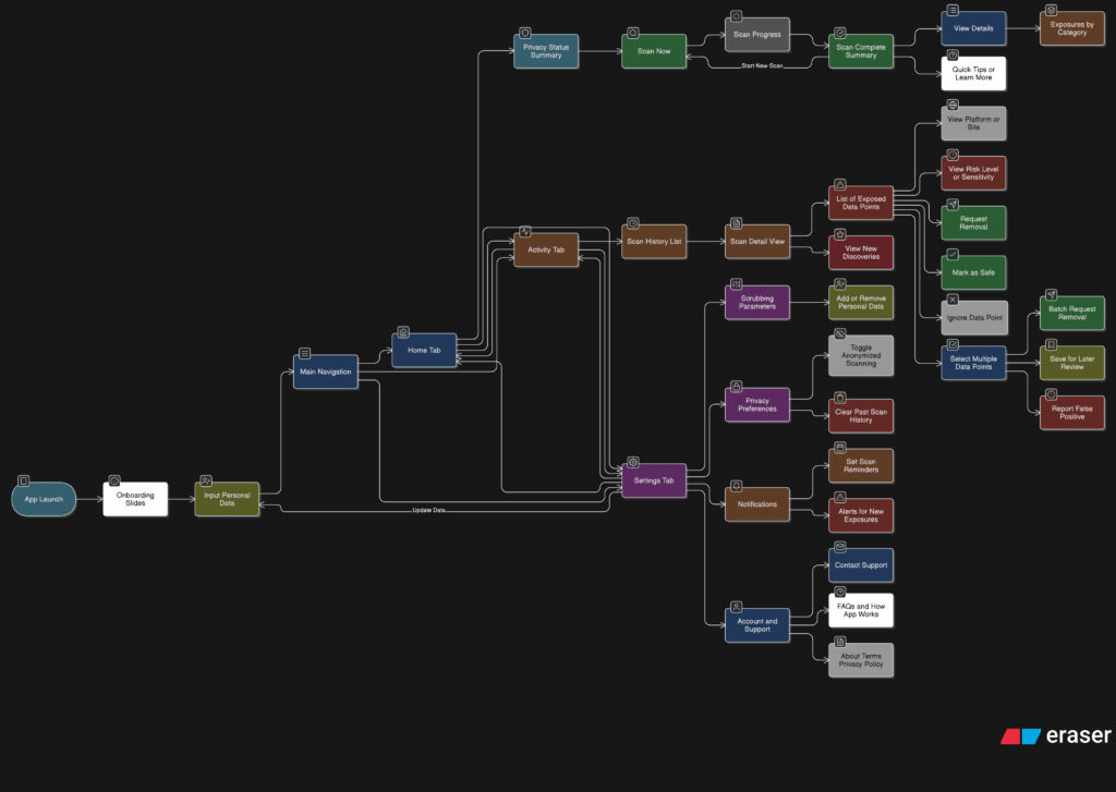
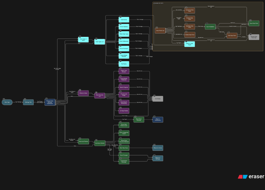
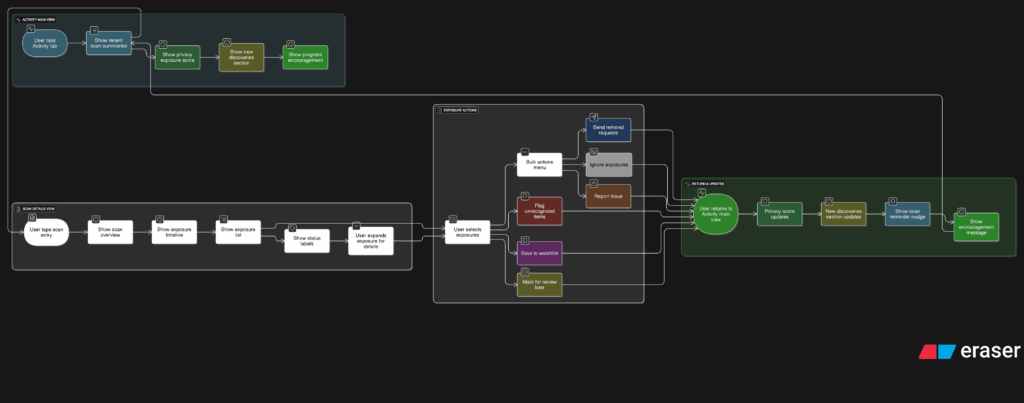
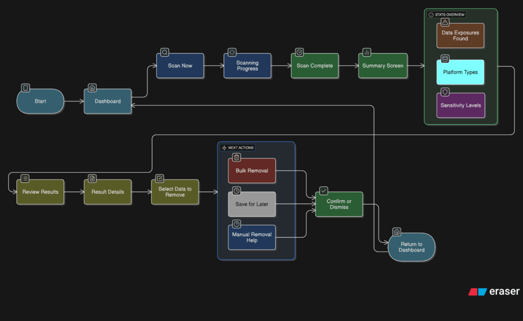
What I take from this impulse is both emotional and structural. Emotionally, it reassures me that I am not chasing a “nice sounding topic” but something that sits at the intersection of UX, law, and real harms users are experiencing. Structurally, it pushes me to frame my thesis more clearly around a few core questions: How can interaction design make digital footprints visible and manageable in everyday interfaces? How can ethical constraints and legal requirements be translated into practical patterns instead of abstract guidelines? And how can designers avoid repeating the kinds of behaviours that end up in complaints, lawsuits, or investigative articles about privacy abuses?

For my next steps, this meeting gives me three concrete moves. First, to keep mapping real cases (like those collected by noyb and highlighted in media coverage) as examples of what “unethical design” looks like in practice, and why better interaction patterns are needed. Second, to use those cases as boundary markers when I prototype: if a pattern smells like something that has already led to a complaint or enforcement, it is a red flag. Third, to stay in close conversation with Prof. Baumann as a supervisor, so that my thesis stays grounded in both design practice and the evolving legal and ethical landscape.

Link to the ORF article Prof. Baumann shared (in German), which anchors this impulse in current debates about privacy and data protection:
https://orf.at/stories/3410746/

For broader context on enforcement and complaints concerning privacy violations in Europe, especially involving companies like Clearview AI, this overview from Reuters and noyb helps show how data misuse is being challenged at a legal level:
https://www.reuters.com/sustainability/society-equity/clearview-ai-faces-criminal-complaint-austria-suspected-privacy-violations
https://noyb.eu/en/criminal-complaint-against-facial-recognition-company-clearview-ai

Finally, this Austrian consumer-focused article on dark patterns and manipulative web design provides a very concrete list of deceptive practices and explains how new regulations like the Digital Services Act aim to limit them, which connects directly back to my thesis interest in ethical interfaces and user autonomy:
https://www.konsumentenfragen.at/konsumentenfragen/Kommunikation_und_Medien/Kommunikation_und_Medien_1/Vorsicht-vor-Dark-Patterns-im-Internet.html

Disclaimer: This blog post was developed with AI assistance (Perplexity) to help with structuring and phrasing my reflections.

IMPULSE #3: Interesting read from the chapter “The Need for Ethics in Design” from The Ethical Design Handbook and how we can effectively implement ethics in our work

I started reading “The Ethical Design Handbook” by Trine Falbe, Martin Michael Frederiksen, and Kim Andersen (it was one of the very first resources I discovered and noted down in the initial gathering process that led to the choice of my thesis topic) and now, I treat it as an ongoing, dip-in resource rather than a straight-through textbook. It is framed as a practical guide for leaving dark patterns behind and making ethical design part of everyday digital product work, not just a side note. For my thesis on helping people manage their digital footprints, this book feels like a toolkit I can slowly mine: I can pick the chapters that match my current questions, use them, and then come back later when a new angle opens up.

Right now, I’m really chewing alot on the second chapter “The Need for Ethics in Design”, because it sets up why ethical design has to be more than simple legal compliance. The authors walk through consequences of unethical design and show how dark patterns, aggressive tracking, and manipulative interfaces damage trust and harm users. They also introduce ethical principles like non-instrumentalism, self-determination, responsibility, and fairness, and connect them to familiar frameworks such as Privacy by Design. Reading this as a preparatory part of my future thesis work, is really helping me sharpen the language to better describe what bothers me about many current products and services: which currently treat people purely as data sources or conversion targets, this very action breaks those core principles and undermines users’ ability to effectively understand and shape their digital footprints.

What feels especially useful is how concrete the book tries to be. It is not just “be nice to users” as an abstract value statement; it tries to build an actual working framework, including tools like the Ethical Design Scorecard and “ethical blueprints” for real design processes. The scorecard is meant to assess how a product performs on different ethical dimensions, with weighted criteria. For my thesis, this sparks a very practical idea: I could adapt or extend such a scorecard specifically around footprint-related questions like what data is collected, how transparent the flows are, how easy it is to revoke or change consent, and whether users can see or manage their historical data in meaningful ways.

This chapter also acknowledges that change has to happen inside teams and businesses, not just in individual designers’ heads. Later parts of the book (which I plan to read next) focus on “creating positive change” and “the business of ethical design”, arguing that ethical practices can be aligned with sustainable business models instead of being framed as a cost. That connects well with my thesis constraint of balancing business needs with user autonomy: if I can borrow some of the arguments and models from these chapters, I can show how ethical digital footprint management is not just “good for users” but also part of a long-term, trust-based product strategy.

As an ongoing read, I see myself using this book in two ways. First, as a language and framework source: the principles and scorecard approach help me structure the “ethical requirements” part of my thesis more clearly. Second, as a bridge to practice: the blueprints and case-studies can inform how I generally approach projects/work in my career to more genuinely support user agency instead of nudging people into over-sharing and not giving them effective ways to manage what has been overshared. ​

Here is the official site for The Ethical Design Handbook, which includes the table of contents, the ethical design scorecard, and downloadable blueprints that expand on the tools discussed in the book:
https://ethicaldesignhandbook.com

Smashing Magazine’s book page gives a good high-level overview of the book’s goals, including how it aims to help teams replace dark patterns with honest patterns while still supporting business KPIs:
https://www.smashingmagazine.com/printed-books/ethical-design-handbook/

Finally, this Smashing Magazine article announcing the handbook’s release explains why the book was written and emphasizes the need for practical, long-lasting solutions to move companies away from manipulative design and towards sustainable, ethical digital footprints:
https://www.smashingmagazine.com/2020/03/ethical-design-handbook-release/

Disclaimer: This blog post was developed with AI assistance (Perplexity) to help with structuring and phrasing my reflections.

IMPULSE #2: Reflecting on the panel discussion Privacy design, dark patterns, and speculative data futures – What if we designed for better data futures on purpose?

The panel at CPDP 2022 on “Privacy design, dark patterns, and speculative data futures” brings together researchers, regulators, and designers to talk about how current interfaces manipulate people, and how speculative design and foresight could help us imagine and build better data futures. This panel was moderated by Cristiana Santos (University of Utrecht, Netherlands) and had speakers like Régis Chatellier, Stefano Leucci, Dusan Pavlovic, Arianna Rossi and Cennydd Bowles.

The core things discussed on this panel is very close to my thesis: on one side, dark patterns and privacy-invasive mechanisms quietly exploit users; on the other side, there is a growing push for transparency-enhancing technologies and privacy-by-design approaches that could give people more control over their digital footprints.​​

One of the clear threads in the discussion is that dark patterns are not accidents; they result from deliberate choices, business pressures, and a lack of ethical guardrails in the design process. Panelists talk about building description schemas and datasets to systematically identify and classify deceptive patterns in interfaces, especially around privacy choices and access to personal data. For my thesis, this reinforces the idea that “ethical design” cannot stay abstract. If I want to help people manage their digital footprints, I need to treat dark patterns and their opposites as concrete, nameable design patterns and counter-patterns that can be recognised, tested, and avoided.​

Another important topic is how law, design, and foresight can work together. Several speakers stress that legal tools and enforcement alone are too slow and reactive to address fast-moving interface manipulation. They argue that designers and product managers hold a lot of power over whether an interface is deceptive or respectful, and that speculative methods can be used to anticipate future harms and design for better outcomes before those harms become normal. This fits directly with my research interest in “effective” ethical design: effectiveness here means not just compliance, but the ability of interfaces to prevent foreseeable harm to users’ data and autonomy.​​

Speculative design appears in the panel as a practical method, not just an art-school exercise. One example the discussion connects to is the use of speculative enactments and design fiction to help designers explore tensions between business goals and privacy rights. By staging hypothetical interfaces and futures, designers can see how certain patterns might feel manipulative or disloyal before they are deployed at scale. For my thesis, this suggests a concrete technique: using speculative prototypes to make digital footprints and their consequences visible, then inviting users or stakeholders to react to these “what if” scenarios.

The panel also raises a warning: speculative design can become trendy and superficial if it is done without a clear purpose or connection to actual decision-making. For ethical design, this means that speculative scenarios should feed into real processes like data protection impact assessments, design reviews, or pattern libraries, instead of staying as cool concept visuals. This is a useful constraint for my own work: any speculative interface I use in my thesis should be clearly tied to decisions about what data is collected, how consent is handled, and how users see and control their footprints.​​

For my research, this impulse does three things. First, it nudges me to explicitly frame dark patterns as “disloyal” design choices that work against users’ interests, especially in how their data is captured and used. Second, it shows that privacy-by-design and speculative design can be combined: speculative futures can help define the guardrails and desirable directions for ethical interaction patterns around digital footprints. Third, it highlights that designers and product teams must be at the center of this work, not just lawyers and regulators, which strengthens my argument that interaction design is a key lever for meaningful digital autonomy.​​

Some accompanying links:

Here is a link to the full panel video, which serves as the core resource for this impulse and gives the complete discussion on privacy design, dark patterns, and data futures:
https://www.youtube.com/watch?v=BbP_SjtGdkk

This conference program entry and description provide context on how the panel fits into a broader event on privacy and data protection, including its goals and questions around law, design, and foresight:
https://researchportal.vub.be/files/97144098/2022.05.22_CPDP2022.pdf

Finally, this related article on “Rationalizing Dark Patterns” explores how designers themselves rationalize or reproduce dark patterns in privacy UX, and proposes speculative enactments as a tool for more critical, privacy-aware design practice, which aligns well with the panel’s themes and my thesis:
http://www.ijdesign.org/index.php/IJDesign/article/view/4117/972

Disclaimer: This blog post was developed with AI assistance (Perplexity) to help with structuring and phrasing my reflections.

IMPULSE #1: Reflecting on the book “Designing Interactions” – What responsibility really hides behind an interface?

I got a week with Bill Moggridge’s “Designing Interactions”(huge thanks to Prof. Baumann) and it felt like sitting in a long, honest conversation with the people who built the interfaces we now use everyday. The interviews and case stories walk through the shift from early graphical interfaces and the mouse, all the way to mobile devices, games, and speculative futures, and you start to see how every design decision quietly teaches users how to think about technology. For my thesis on ethical design and digital footprints, this book is a reminder that interaction design is never neutral; it always shapes what users notice, what they ignore, and how aware they are of the traces they leave behind. Some chapters really highlight the ​importance of how design shapes how humans leave digital footprints and it really opened further curiosities.

The early GUI stories around the mouse and the desktop metaphor are a good reminder of how much power metaphors have. Designers were not only drawing icons; they were defining how people imagine “working” inside a computer, using windows, folders, and simple interactions. Translating this to my thesis, I realize current privacy banners, “activity” views, and history logs are also metaphors that teach people what a digital footprint is. If the interface hides most of the trail or wraps it in vague language, users will assume there is not much going on. That is already a design decision, not an accident.

The chapter “From the Desk to the Palm” is where the digital footprint issue becomes impossible to ignore. These chapters walk through how interactions left the desk and moved into pockets, hands, and everyday routines. Once devices became mobile and always connected, data stopped being something people “entered” and became something that is constantly generated in the background. For my work, this underlines a key ethical challenge: people are not always consciously “using” a product when their data is being collected. Ethical interaction design must therefore find ways to surface what is happening in the background without overwhelming people.

Then “Adopting Technology” stories highlight the negotiation between what is technically possible and what is acceptable or understandable for users. Designers keep running into constraints and tradeoffs, and those constraints end up shaping the final product. I see a clear parallel here with privacy-by-design: if ethical constraints and data-minimization rules are built into the process early, they can shape the interaction in the same way as technical limits. This helps me think of ethics not as an add-on checklist, but as part of the design brief.

Also, the “People and Prototypes” chapter gives me a practical hook. He describes a process grounded in talking to people, building quick prototypes, and iterating under constraints. For my thesis, I can borrow this structure and explicitly define “ethical constraints” around data collection, consent, and transparency, then test them through prototypes. Instead of just saying “this design is ethical,” I can show how those constraints influenced specific interaction choices.

There is also value in the more future-focused material. The speculative and “alternative nows” work shows designers imagining other ways technology could fit into society, not all of them comfortable. This inspires me to think about what a future interface would look like if it treated digital footprints as something to be clearly seen and managed, rather than hidden. For example, could a product visualize data trails in real time, or let users rehearse different “data futures” depending on the choices they make?

For my thesis, this impulse leads to three concrete moves: first, to treat metaphors and mental models as central when designing how people understand their digital traces. Second, to adopt a “people, prototypes, constraints” process that includes ethical and privacy constraints from the start. Third, to use speculative scenarios to question today’s defaults and imagine interfaces that actively help people manage their footprints instead of quietly expanding them.


Some relevant accompanying links:

Here is a link to the publisher’s page for “Designing Interactions”, which gives a clear overview of the structure, chapters, and focus of the book:
https://www.penguinrandomhouse.com/books/655668/designing-interactions-by-bill-moggridge/9780262134743

For another perspective, this review summarises the key themes and interviews in the book and helps me cross-check which parts are most relevant to interaction design practice and my thesis:
https://www.pdma.org/page/review_designing_int

Lastly, this introduction to interaction design offers a concise explanation of how interaction design shapes user behavior and expectations, which supports my argument that design decisions influence how people understand their digital footprints:
https://www.interaction-design.org/literature/book/the-encyclopedia-of-human-computer-interaction-2nd-ed/interaction-design-brief-intro


Disclaimer: This blog post was developed with AI assistance (Perplexity) to help structuring and phrasing my reflections.

A Review of the Thesis: Influence and Ethical Impact of Design of Technology on User Behavior

Author: Veronika Langner
Title: Influence and ethical impact of design of technology on user behavior
Year: 2023
University: Technische Hochschule Ingolstadt
Course of Study: User Experience Design
Link to Thesis: https://opus4.kobv.de/opus4-haw/frontdoor/deliver/index/docId/4046/file/I001659320Thesis.pdf

This thesis digs into how things like button color, shape, or placement in apps actually push people’s decisions, often without us even realizing it. Veronika covers nudging, persuasive tech, and all those design tricks, but she’s always asking, “Is this ethical?” She doesn’t just talk about theory. She runs a pretty solid user study with over 100 people to see which designs actually change user choices. That mix of research and practice made this stand out for me.

Presentation quality
Everything is laid out clearly. The graphics actually help explain things, and there is no clutter. The flow is sensible and it never feels lost or repetitive. You can tell care went into making sure it is easy to navigate.

Degree of innovation & independence
What I really like is her focus on the subtle stuff, how tiny UI tweaks can majorly affect behavior. She did not lean on old templates but set up her own experiments and followed them through confidently. Most studies ignore how much control users actually have over what they share or do, but she doesn’t. I do wish there was more about people outside “typical users,” especially those who might care more about tracking or privacy.

Organization and structure
No surprises here. It is logical and clear, each section building on the last. It goes from theory and research straight into the actual user study and then loops back to why these findings matter for designers.

Communication
The writing is straightforward, not clogged up with jargon. She makes complex ideas easy to get, like she is talking with you and not just writing for academics.

Scope
She goes deep enough on every topic layer without straying too far. There could be more about how these ideas play out with stricter privacy laws or in different countries, but for what she sets out to do, she delivers.

Accuracy and attention to detail
Her charts, stats, and references are solid. There is a careful approach to both the experiment and the write-up. You can trust what is there.

Literature
She brings in the big names in design and behavioral science alongside new studies. It is not just a list. The sources work with her points instead of standing alone.

Personal reflection
What really pulled me in was how this connects to my own thesis, which is about how we help users actually manage their digital footprints better. It is so easy to forget the power design has in quietly guiding what data people share and whether they feel in control or not. Reading this reminded me of the importance of designing for agency, showing people where their data goes, making privacy choices obvious and accessible, and resisting those sneaky nudges that favor the company over the user. For my own research, this thesis is a reminder to keep checking every screen and every pathway I design and keep asking, “Does this help people actually manage and understand their digital trail, or am I adding to the confusion?”

Disclaimer:
This review was shaped with AI (Perplexity) to help me capture my thoughts and structure them clearly.

17 – Clickable Prototype v1

After all the sketches, user flows, and planning, I finally pulled everything into a quick clickable prototype (Figma is awesome for this, btw). It’s still an early version, but it gives a solid feel of how the app might look and behave. I wanted to see how the Home, Activity, and Settings tabs work together and how smooth the experience feels when clicking through it all.

Here’s a short walkthrough video showing the prototype in action:

Working on this helped me catch a few small details I hadn’t noticed before, like the pacing between steps and where extra feedback could better guide the user. Overall, seeing it come to life, even in a simple form, was a great way to confirm if the structure works.

Next, I’ll refine the flow, tidy up interactions, and start testing how others respond. It’s exciting to finally transition from an idea to something tangible you can click through.

16 – Pulling It All Together

After spending time designing each part of the app on its own, I knew the next step was to figure out how it all fits together. It’s one thing to have a solid Home tab, a clear Activity tab, and a flexible Settings area. But the real challenge is making the tool feel like one connected experience instead of just three separate features sitting side by side.

So I started mapping the full user journey, from the moment someone opens the app for the first time to the moment they take their first action. The goal was to make sure every screen, every tap, and every option felt like part of a bigger flow.

It starts with Home. This is where the user gets a quick update on their privacy status and can tap one button to begin scanning. Once the scan is done, they’re either shown a clean summary that says everything looks good, or they’re nudged to go check out their results in the Activity tab.

That handoff between Home and Activity became really important. It needed to feel natural, not like you’re being dropped into another part of the app. So I kept asking myself questions like, “What happens after a scan?” and “What does the user want to do next?” The answer is usually some version of “check what was found” or “see if anything needs action.”

Once they land in Activity, the results are organized clearly. Old scans are listed with summaries, and new findings are labeled in a way that stands out without being too loud. From there, users can open a scan, review the exposed data, and decide what to do. They might request a removal, ignore it, or save it for later.

Then there’s Settings, which sits quietly in the background but plays a big role in shaping how the app works. Before a user ever hits “Scan Now,” the tool has already been set up to know what data to look for and where to search. That part happens quietly but meaningfully. And at any point, the user can return to the Settings tab to update what they’re tracking or change how often they want to scan.

Full App Flow

The more I worked on this flow, the more I realized how important rhythm is. The app should never feel like it’s asking too much at once. It should guide, not demand. There’s a gentle back-and-forth between checking your privacy, understanding your exposure, and deciding what to do about it. That rhythm is what makes the whole thing feel usable.

At this point, the main structure is starting to come together. There are still things to work out, like onboarding, empty states, and what the app says when no data is found. But now that the core journey is mapped, I feel more confident about shaping the rest of the experience.

15 – Defining What Gets Scanned

After sketching out how users would scan their data and review the results, I knew it was time to focus on something deeper. If someone’s trusting this tool to find their personal data online, they should be able to control exactly what it’s looking for and how it behaves. That’s where the Settings tab comes in, specifically, the part that lets people manage the data points the app scans for.

This is more than just a list of preferences. It’s the part of the app that decides how useful the tool really is. If it can’t scan for the right things or look in the right places, then it doesn’t matter how nice the interface looks. So I started thinking through the user journey here. What does it feel like to set this up for the first time? How easy is it to update your info later? What happens when someone wants to remove or change something?

I broke it down into a few simple flows. When someone taps into this section, they see a list of data types like full names, email addresses, phone numbers, home addresses, usernames, and social media handles. Each one has a toggle, so they can decide which categories they want the app to track. Tapping into a category opens a list of actual data points. For example, under “email addresses,” you might see:

Users can add new entries, remove old ones, or give them a label like “Work” or “Personal” to keep things organized. It should feel simple, like updating a contacts list.

User flow of the entire settings tab
Zooming into the Scan Preferences

Another part of this section is where the app should scan. Some people might want full control, while others may prefer a more hands-off setup. So I imagined a second area where users can select the types of platforms the app should search, like:

  • Public data brokers
  • Social media sites
  • Search engines
  • Forums or blogs
  • Data breach records

By default, the app could suggest a recommended setup, but users who want to go deeper can switch things on or off based on what they care about.

I also wanted to give users a quick summary before they leave this section. Something that says, “You’re scanning for 6 data points across 4 categories.” Just a simple, reassuring message that confirms everything’s set up the way they want. From there, they can either save changes or jump straight into a new scan.

This part of the tool gives people full control over what they’re sharing with the app and what the app is doing for them. It also needs to feel like something they can come back to anytime. Maybe they changed their email or want to track a new phone number. It should be easy to update without starting from scratch.

14 – What the Activity Tab Unlocks

Once I felt like the Home tab had a solid direction, I shifted my focus to the Activity tab. This is the part of the app that lets users look back and understand what the tool has found over time. If the Home tab is about quick action, the Activity tab is about reflection and detail. It’s where things get a bit more layered.

I started by asking a few questions. After a scan is done, what would someone want to do next? What would they expect to see if they tapped into their past results? The obvious answer was, they’d want to understand where their data showed up, how serious it is, and what actions they can take. So that became my starting point for the user flow.

The journey into the Activity tab begins with a list of past scans. Each entry shows the date, how many exposures were found, and a quick status, like “3 removals in progress” or “Last checked 4 days ago.” This lets the user get a feel for their privacy over time. From there, tapping into any scan opens a detailed breakdown.

Inside that scan detail view, I imagined a set of cards or sections for each exposure. Each card would show where the data was found, maybe on a marketing site, a data broker list, or a forum. It would also show what kind of data was found, like a phone number or full name, and whether the app could help remove it. There would be a clear action button like “Request Removal” or “Ignore for Now,” giving the user simple choices without pressure.

User flow of the activity tab

Another part I thought about was how to show overall progress. Maybe there’s a visual indicator on the main Activity screen that shows how your privacy is improving over time. Something like a simple line graph or a color-coded “privacy score” that updates as you take action. I don’t want it to feel gamified, but it should feel encouraging. Like you’re making progress, not just looking at problems.

One small but important touch I sketched out was what happens when there are new exposures. Maybe we highlight them with a subtle label like “New since last scan” or bump them to the top of the list. This way the user’s attention naturally goes to the most important updates.

This part of the app is where people go to feel more in control. It’s not just a log of past activity. I wanted it to feel full of helpful options without overwhelming anyone.

13 – Home Tab, How should it work?

After figuring out the broader structure of the tool, the next step was to zoom in and really understand what should happen on the Home tab. This is where everything begins. It’s the screen someone sees the moment they open the app, so it needs to be clear, simple, and useful right away.

I started thinking through the experience from a user’s point of view. What would they be trying to do here? Most likely, they just want to know how exposed their personal data is and what they can do about it. They’re not coming in to explore every setting or dig through past reports. They want a quick answer to a big question: “Am I okay online?”

So I mapped out the user flow for this part. It starts with a clean welcome screen that gives a clear privacy status. This might say something like “You have 3 data exposures found” or “You’re all clear.” Just enough to give the user a sense of where things stand. From there, the most important action is the Scan Now button. This is the main thing the app offers, and it needs to be obvious and easy to tap.

Once the user hits that button, the app begins scanning for their data across different online sources. I imagined a simple progress indicator, maybe a friendly loading animation or a visual scan bar. No need for too many details yet. Just a sense that the app is working quietly in the background to find their information.

After the scan is complete, the user is taken to a short summary. This is where the tone really matters. It shouldn’t feel scary or overwhelming. It should feel clear and in control. Something like
“We found 4 pieces of your personal data online. Tap to review and take action.”

Home tab user flow
User flow to perform a scan

I also had to think about smaller touches. What if the user has never scanned before? Do we show an empty state with a short message that explains the tool? What about returning users? Should they see their last scan result or a prompt to scan again?

These are the kinds of small questions that start to stack up once you begin thinking through a full user journey. The challenge is to give people just the right amount of information without making things feel too heavy.

At this stage, I’m keeping things flexible. The layout will probably change as I move on, but the flow feels right. Welcome the user, show them where things stand, let them take action quickly, and offer a calm, clear summary when the scan is done.