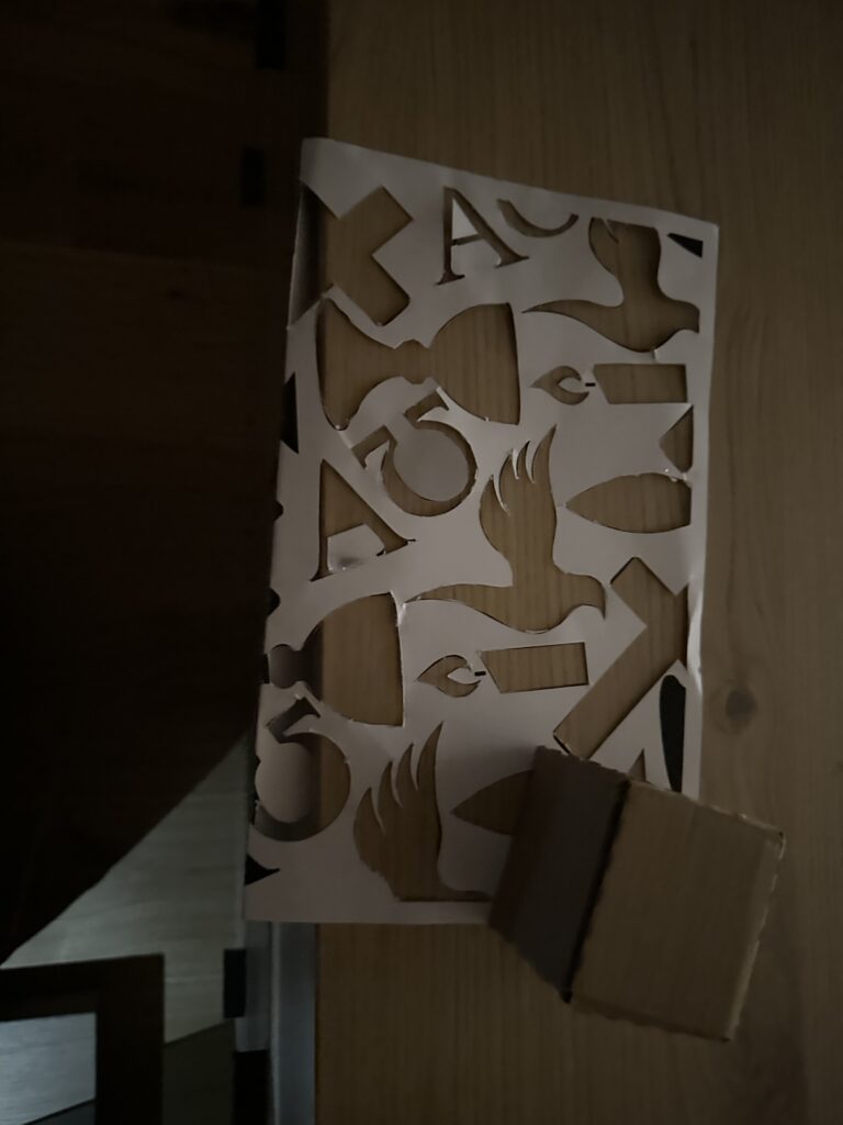
In my latest step, I started to look more closely at the symbols I associate with the Church and Christianity. I didn’t want to only rely on my personal impressions, so I also did some research on Christian iconography. Very quickly, I came across recurring motifs: the cross, a particular style of fish representation, the Alpha and Omega, the dove, and, of course, the candle. These are all powerful, recognizable elements that carry centuries of meaning and interpretation.
I decided to collect these symbols and transform them into a pattern in Illustrator. Instead of keeping them whole and perfectly visible, I chose to crop them in different ways. This meant that some parts of the pattern are cut off, others are enlarged, and some are reduced to fragments. My idea behind this was to create a visual language where not everything is always visible in its entirety. Sometimes the symbols appear distorted, sometimes they seem larger or smaller than expected. This connects to my concept of questioning clarity and authority in religious representation—how symbols are never neutral, but always shaped by context and perception.
While working with the pattern, I also experimented with its size. At first, the motifs were too large, which limited the effect I was aiming for. By reducing them, I was able to create a denser composition that worked better both visually and conceptually.
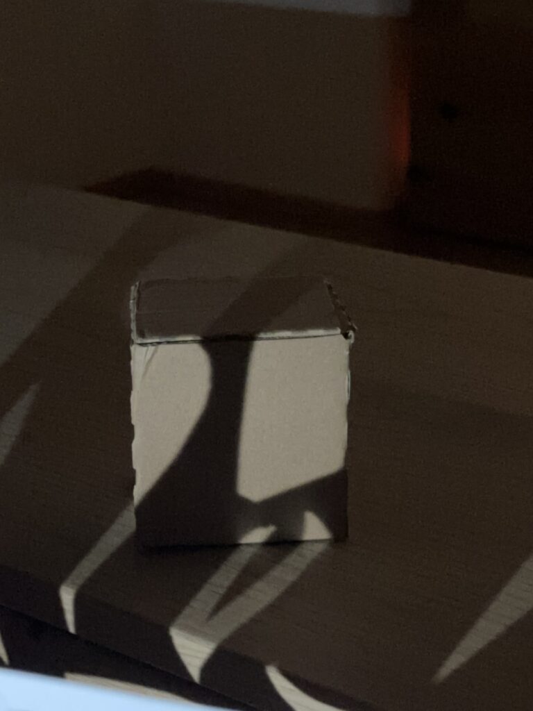
After finishing the pattern, I cut it out and began experimenting by projecting it onto my cardboard cube. I was curious to see how the cropped symbols would behave on a three-dimensional surface, and what kinds of distortions or new combinations would emerge as the light wrapped around the edges of the cube. Already, the results were interesting: the fragments became more abstract, sometimes unrecognizable, and at other times they gained a new intensity by being enlarged or stretched.
The next step will be to introduce another layer to this experiment. I decided to get a mini-beamer in order to project not just with candlelight or flashlight, but also digitally. This way, I can explore the combination of analog cut-out patterns with digital projections. For example, I could project the Illustrator pattern directly, or use an image, and layer that with the shadows created by the physical stencil. I am especially curious to see how the two techniques interact—whether they will reinforce each other or create unexpected contradictions.