A World of Color and Emotion
Colors play a significant role in shaping how we feel and interact with the world. They influence emotions, guide decisions, and even impact mental well-being, making them a powerful tool in designing mental health apps. The right colors can create an environment that feels calming, inviting, and supportive – essential qualities for apps aimed at improving mental health.
Research shows that cool colors, like blues and greens, are strongly associated with calmness, relaxation, and trust. These shades are often used in mental health apps to create a sense of serenity and support. On the other hand, warm colors, such as yellows and oranges, can evoke energy and optimism but must be used sparingly to avoid overstimulation.
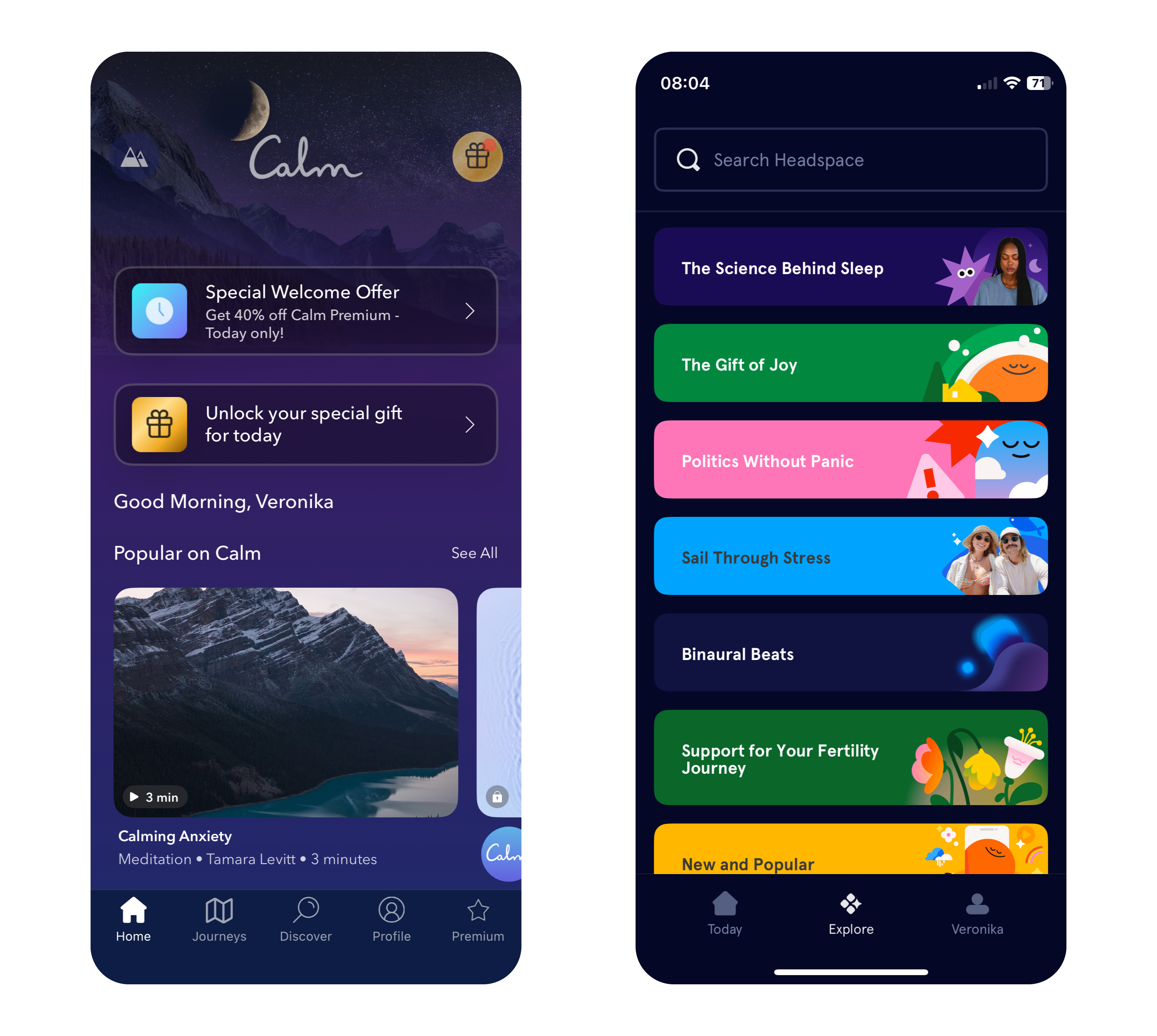
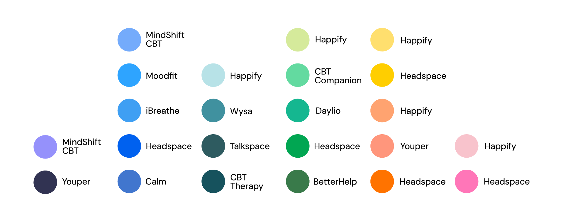
Apps like Calm and Headspace use color in very different ways to great effect. Calm primarily employs soothing shades of blue and purple to evoke tranquility, while Headspace takes a bold approach with its vibrant and varied palette. This variety helps make meditation and mindfulness more approachable, particularly for younger users who may be new to these practices.
Why Color Choices Matter in Mental Health Apps
The connection between color and emotion is deeply rooted in psychology. Blue and green tones, often linked to nature and open spaces, can subconsciously reduce stress and promote relaxation. In contrast, red, while energizing in small doses, may heighten anxiety if overused, making it less suitable for calming designs.
The neurological effects of color also play a key role. Studies show that exposure to blue tones can lower heart rates, while green shades improve focus and concentration – both valuable qualities for mindfulness and mental health practices. By leveraging these responses, designers can craft apps that not only look appealing but also enhance users’ mental states.
Insights from Research: Colors for Personalities and App Types
Personality traits influence color preferences. Extroverts tend to favor vivid, warm colors like red, orange, and yellow, while introverts prefer cooler, softer shades like blue, green, and pastel tones. Gender can also play a role, with women often gravitating toward softer hues like purple and light blue, while men tend to prefer bold primary colors like strong blues and greens.
Dynamic color schemes, where apps adjust their hues based on the user’s mood or time of day, are gaining popularity. For example, an app might use vibrant tones in the morning to energize users and shift to muted blues in the evening to promote relaxation. This adaptability can create a more personalized and supportive experience for users.
Balancing Color with Function in Mental Health Apps
Color choices should enhance an app’s purpose rather than detract from it. While greens and blues are staples in mental health app design, designers must carefully balance them with accents to maintain engagement without overstimulating users.
Headspace’s vibrant palette provides an excellent example of balance. By pairing warm hues like orange and yellow with cool tones, it creates a playful yet calming environment. This blend ensures the app remains visually engaging while maintaining its focus on mindfulness and relaxation. In contrast, Calm leans into simplicity, using gradients and minimalistic design to immerse users in tranquility.
Consistency in color use is equally important. Abrupt changes in tone can confuse users or create unease, especially for those managing anxiety or mood disorders. A seamless visual flow across an app reassures users and enhances their experience, encouraging them to engage more regularly with the app’s features.
Sources
- A. Volkova & H. Cho. (2024). Warm for fun, cool for work: the effect of color temperature on users’ attitudes and behaviors toward hedonic vs. utilitarian mobile apps. Journal of Research in Interactive Marketing, Vol. ahead-of-print, No. ahead-of-print. https://doi.org/10.1108/JRIM-03-2024-0149
- „Calm – The #1 App for Meditation and Sleep.“ Calm. Accessed: Dec. 9, 2024. [Online.] Available: https://www.calm.com/
- „Headspace: Meditation and Sleep Made Simple.“ Headspace. Accessed: Dec. 9, 2024. [Online.] Available: https://www.headspace.com/
- R. Rider. (2010). Color Psychology and Graphic Design Applications. Senior Honors Theses, 111. https://digitalcommons.liberty.edu/honors/111
- R. M. Romeh, D. M. Elhawary, T. M. Maghraby, A. E. Elhag & A. G. Hassabo. (2024). Psychology of the color of advertising in marketing and consumer psychology. Journal of Textiles, Coloration and Polymer Science, Vol. 23, No. 2. doi: 10.21608/jtcps.2024.259025.1272
- S. Garrido, B. Doran, E. Olliver & K. Boydell. (2024). Desirable design: What aesthetics are important to young people when designing a mental health app? Health Informatics Journal, Vol. 30, No. 4. https://doi.org/10.1177/14604582241295948