Icons and pictograms are basic graphic symbols. Both are means of communication that aim to convey informations in a easy way. The two types differ mainly in their purpose and context.
Icon: Icons represent either a function, an application or a concept. In contrast to pictograms they are often more colorful and detailed. Icons are often adjusted to certain design system or brand or are used in a metaphorical context. They are particulary used in digital user interfaces such as on smartphoes or computers. They are used, for emaple, to enable easier navigation or the functionality of applications, including the diskette symbol, which stands for saving. Popular icons are the apple logo, the hamburger menu on websites or the heart symbol („Like“).
Pictogram: A pictogram is highly simplified and often monochrome. They are more minimalist and abstract than icons. They are often standaradised to avoid cultural misunderstandings. They convey informations or actions regardless of language. It is more important for pictograms to be universally and culturally understandable than for icons. It is especially aimed at clarity and universalty. Pictograms are mainly used in physical or spaces, such as traffic signs or emergency exit signs.
Sometimes, however, the graphic forms are not so easy to separate from each other and mixed forms are created. Well-known icons with pictogram character are, for example, the smiley or the peace sign.
The difference to brandmarks
The difference between pictograms and icons and brandmarks lies mainly in their function. Brandmarks represent a brand, their aim is not primarily to communicate complex information. They are used in branding and marketing. Their design is primarily focused on the brand identity.
History and development
Pictograms were one of the earliest forms of communication. Cave paintings were already pictograms, conveying information about hunting, rituals or everyday life. In ancient Egypt, hieroglyphs were used to communicate. With the invention of means of transport and the possibility of global travel, the need for universally understandable symbols increased. In the 1920s-1930s, simple symbols were developed for railway stations, airports and roads. In 1964, at the Olympic Games in Tokyo, internationally standardised pictograms were developed for the first time to visually represent sports. With the development of digital technology in the 1980s, icons became important in order to simplify usability. They also had to be easily recognisable on small screens.
Design
Pictograms and icons are often designed according to the so-called “flat design”. Particular attention is paid to simple lines and shapes, as well as vivid and high-contrast colours. Shading is used only minimally or completely removed. Flat design is intended to make the graphics user-friendly, simple and timeless. “flat design” is the modern design in contrast to the previous version of “skeuomorphism”. This style tries to design digital or modern objects in such a way that they look like physical objects. The aim was to increase user-friendliness through trust. Examples of this are the earlier app icons for the calendar or the notes app, which was designed to imitate a real block. The design of Apple iOS up to version 6, for example, closely followed this style. Realistic surface structures, plasticity and attention to detail were particularly important here.
Book tip
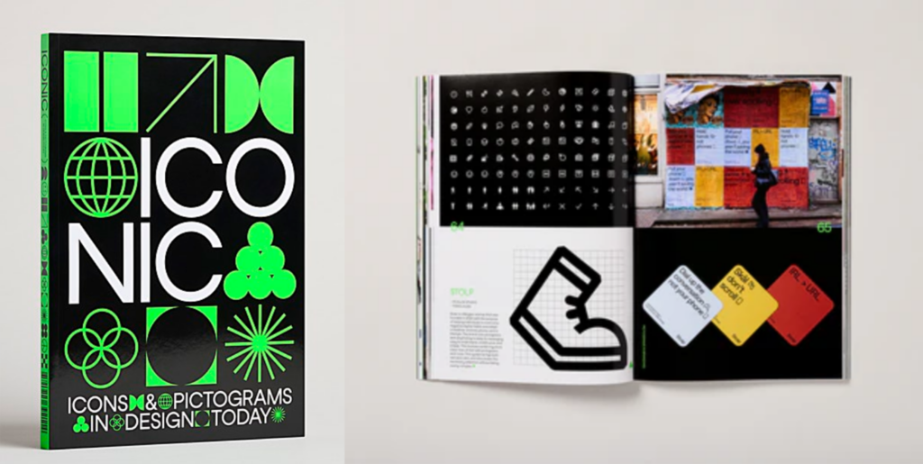
The book ‘Iconic’ examines the development and significance of pictograms and icons. It shows how graphics characterise modern designs, from branding to wayfinding, and how they function as a universal language and are used by designers worldwide.
Pictograms at the Red Dot Award
A few pictograms have already been honoured with the Red Dot Award for their effectiveness. Especially during the corona crisis, the symbols were essential for communicating safety rules. But pictograms also convey simple facts in other places such as digital interfaces. The ‘LG USP Pictogram’ programme system, for example, was developed to explain complicated functions in a simple way and won a Red Dot Award (2015).
Pictograms as an art form
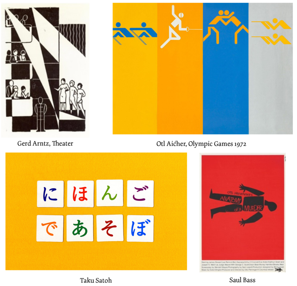
In addition to conveying information, the graphics are also used as an art form. Gerd Arntz was a German graphic artist and pictogram designer known for his minimalist illustrations of work processes and social issues. He worked on his art in the 1920s and developed pictogram systems. Otl Aicher was also a German designer who made a significant contribution to the development of modern pictograms. For example, he developed a standardised pictogram system for the 1972 Olympic Games in Munich. Saul Bass from the USA combined his film posters with pictograms and symbols of film themes. Taku Satoh is a Japanese graphic designer known for his minimalist and clear designs, which often include pictograms. He designs many logos and icons, presenting complex concepts in an easily understandable way.
Resources
www.studysmarter.de – Grafikdesign/Icon-design
ww.vial-agentur.de – Icon Design – Was hinter den Zeichen steckt, die uns im täglichen Leben begegnen; 2019
www.creativebloq.com – Logo vs icon vs symbol: all the logo terms you nedd to know
www.commarts.com – Iconic: Icons and Pictograms in Design Today book design
www.red-dot.org – The Power of Design: ausgezeichnete Piktogramme
www.artnet.de – Gerd Arntz
www.otlaicher.de – Die Regenbogen Spiele; M.Holt
www.artnet.de – Saul Bass
tokyotypedirectorsclub.org – Member Satoh Taku