Designers must navigate cultural differences, as color associations vary widely across regions. For instance, while white symbolizes purity in Western cultures, it is associated with mourning in many Asian countries. Color has also played a defining role in reinforcing gender norms in design. From the stereotypical “pink for girls” and “blue for boys” dichotomy to the subtle color cues used in advertising and branding, color theory has often been a tool for segmenting audiences along gender lines. However, as more and more people become aware of the fluidity of gender, we are beginning to challenge these conventions, seeking to create visuals that exploit these traditional norms and promote inclusivity.
The Origins of Gendered Color Associations
Let’s take a look at where the association with color and gender originates from, as it is more of a social construct rather than an inherent association. In the early 20th century, retailers and manufacturers began using color to market baby clothes and toys, with the pink/blue binary gaining prominence only in the mid-20th century. These marketing strategies reinforced cultural norms, embedding these associations into societal consciousness. But is blue really for boys and pink for girls?
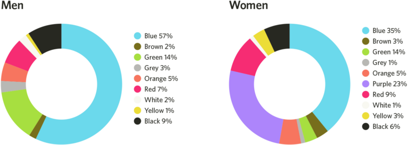
A study published in 2018 in Frontiers in Psychology examined global color preferences and found that while certain trends exist, individual preferences are shaped more by cultural and personal experiences than by gender. To add to that, blue is both men and women preferred primary color, as it’s associated with clean water, the sky, etc. This goes for a few different colors such as red and green. This challenges that specific colors are inherently masculine or feminine.
Shades or tints?
But it is also nut just the color itself, more than the tint or the shade: a study found, that women heavily prefer soft tints of colors (such as pink) whereas men prefer bright shades (such as ruby red). So although red is shown as a favorite color for both men and women, the subsets of reds they like are very different.
The genetics also play a role in this: women can see more colors than men, as the color vision depends on color cones in our eyes, which are carried on the X-chromosome. Men only inherit one X-chromosome instead of two. These cones tell our brains what color we are experiencing by interpreting wavelengths of light. Because men don’t inherit the same combinations of cones women do, men’s brains often require slightly longer wavelengths of light to experience the same colors. This may be the reason why men prefer colors with short wavelengths, like darker shades of blue and green, or they prefer shades without any wavelengths at all, like white, black, and gray.
The Solution: Gender-Inclusive Color Palettes
Many brands have moved away from rigid gendered color schemes in favor of more inclusive approaches. By doing so, they create a sense of openness and inclusivity that appeals to a broad audience. Gender-neutral color palettes in branding prioritize inclusivity and focus on balanced, universal tones such as greens, yellows, greys, or earth tones.By choosing colors that transcend traditional gender associations, brands can create more inclusive and appealing designs for diverse audiences, fostering a broader sense of belonging and engagement. This approach not only differentiates the brand but also conveys a sense of creativity and adaptability.
To implement gender-neutral color palettes, brands can focus on processes that prioritize diversity and inclusivity, like testing color combinations with diverse user groups to ensure they evoke a universal appeal. Neutral tones could be paired with complementary shades to maintain visual interest while avoiding stereotypical gender cues. But its important to also emphasize the cross-cultural and contextual meanings of colors to avoid reinforcing localized gender norms, thus creating designs that resonate globally.
Additional Sources:
https://link.springer.com/article/10.1057/s41262-020-00216-4
https://www.emerald.com/insight/content/doi/10.1108/ejm-11-2014-0723/full/html
https://www.designerinaction.de/design-wissen/genderneutrale-farben
https://core.ac.uk/download/pdf/236071469.pdf
https://www.colormatters.com/color-symbolism/gender-differences